Imagine launching a high-stakes product — one with tight deadlines, multiple teams, and many moving parts.
Now, picture trying to manage it all through countless meetings and scattered spreadsheets.
Chaos, right?
This is where Gantt charts shine. As a visual timeline showing tasks as bars to let teams track progress and deadlines, a Gantt chart brings structure to complex projects.
To help you find the best Gantt software for your needs, I tested several apps that offer this feature either through a free plan or a free trial.
Keep reading to see all the details!
WHY TRUST US?
The apps we talk about are selected, tested, and written about by human reviewers who follow strict review and editorial guidelines. We pick solutions that are practical, purposeful, and can offer real value for the specific use case or business context we’re covering — while also being justified in their pricing. Our methodology is transparent, clear, and available to everyone:
Top 12 Gantt chart tools
A total of 12 Gantt chart apps made it onto my list. Here’s what you can expect in my reviews further in the article!
| Tool | Best for | Free trial | Free plan | Lowest price |
|---|---|---|---|---|
| Plaky by CAKE.com | Affordable Gantt charts | ✔ | ✔ | $3.99/seat/month |
| Smartsheet | Excel enthusiasts | ✔ | ❌ | $9/member/month |
| monday.com | Project planning | ✔ | ✔ | $9/seat/month |
| GanttPRO | Gantt beginners | ✔ | ❌ | $7/user/month |
| ClickUp | Feature-rich customization | ✔ | ✔ | $7/user/month |
| Hive | Fast-paced teams | ✔ | ✔ | $3/user/month |
| TeamGantt | Complex projects | ✔ | ✔ | $49/month/manager |
| Asana | Task-oriented teams | ✔ | ✔ | $10.99/user/month |
| Notion | Free Gantt charts | ✔ | ✔ | $10/seat/month |
| Instagantt | Standalone Gantt simplicity | ✔ | ❌ | $12/month |
| Toggl Plan | Resource management | ✔ | ✔ | $5/user/month |
| Jira | Agile teams | ✔ | ✔ | $7.53/user/month |
Criteria for choosing Gantt chart software
Opting for the right Gantt chart tool isn’t that straightforward because not all apps offer the same benefits. However, the decision doesn’t have to be difficult either — just look into the following questions:
- Is the tool intuitive, catering to both beginners and advanced users?
- Are there templates to simplify setup?
- Can you easily create, assign, and update tasks?
- Is there an option to add custom fields?
- Does the app support team collaboration?
- Does the pricing structure fit your team size and budget?
- Is the mobile experience as functional as the desktop version?
- Does the tool offer role-based access control for better security?
Depending on your requirements, perhaps you don’t need a “yes” to every single one of these questions. Still, generally speaking, the more you can check off, the better the Gantt tool.
💡Plaky Pro Tip
There’s another way to make a Gantt chart if you’re unable to use a PM tool for whatever reason — Google Sheets. Read this to learn more:
#1 Plaky by CAKE.com — best affordable Gantt chart software
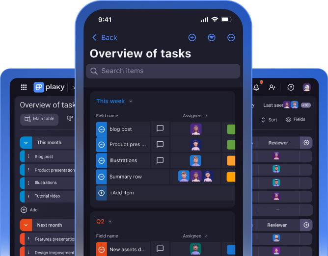
Plaky is a PM tool designed to help you plan and execute tasks flawlessly. It has various practical features, including Gantt charts, to ensure flexibility, precision, and overall project success.
Why choose Plaky?
At just $3.99, Plaky is an affordable Gantt chart software that boasts essential timeline visualization features, making project planning accessible for teams of all sizes.
| Pros | Cons |
|---|---|
| – Very user-friendly – Highly customizable – Detailed yet uncluttered Gantt charts – Affordable | – Basic Gantt functionalities |
Build effective Gantt charts with Plaky
I’m familiar with Plaky since my team uses it daily. Admittedly, I never relied on the Gantt view that much, but writing this review has opened my eyes to its practicality!
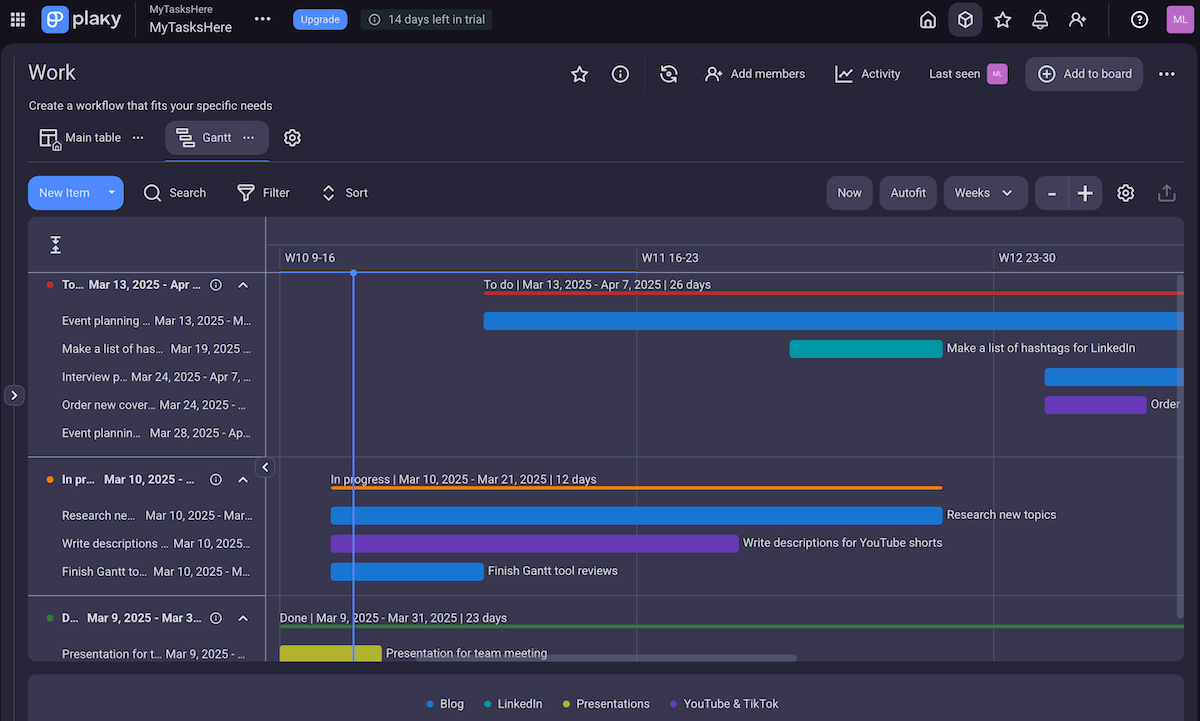
My favorite Gantt features in Plaky include:
- Drag-and-drop functionality — Grab and move items to quickly schedule tasks, adjust their durations, change categories, etc.
- Customizable time frame — Use your preferred format (daily, weekly, monthly, quarterly, or yearly) or click the Autofit button to make tasks fit neatly within the covered period.
- Personalization — Customize the grouping, coloring, and labeling criteria to adjust your focus.
- Sorting & filtering — Arrange and/or display tasks based on different criteria (priority, deadline, creator, etc.) to improve clarity.
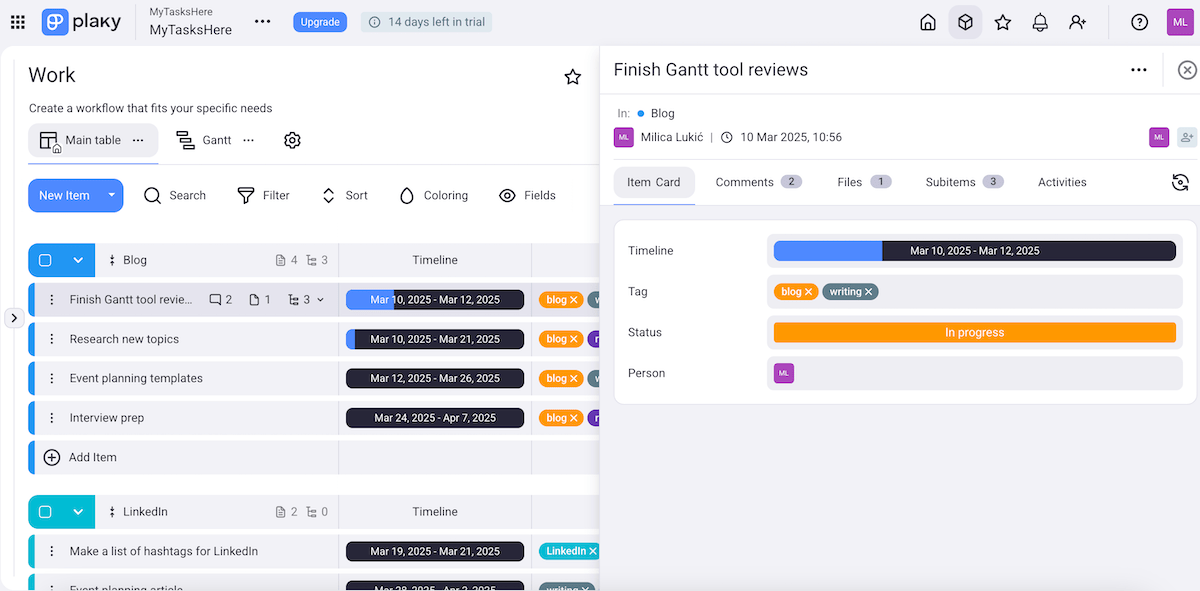
What’s extra handy is that you can click on any item in the left sidebar and get all the task details. Without switching to other available views, you see:
- Custom fields — task information in different formats (text, number, link, etc.),
- Comments — centralizing communication with teammates,
- Attachments — storing all related files in one place,
- Subitems — dividing tasks into smaller chunks for better organization, and
- Activity log — keeping a record of all changes on the platform to boost accountability.
Now, some more advanced features like task dependencies are yet to be introduced in the future as part of the platform’s commitment to continuous improvement.
You should also know the Gantt view isn’t available in the free plan, but that’s also the case with most competitors.
What’s different about Plaky compared to them is that the higher tiers are super affordable and offer so many benefits that it’s practically a bargain. Plus, you get to test paid features like Gantt charts for free for 14 days before committing to the app full-time!
What’s new in Plaky?
Apart from several useful bug fixes, Plaky’s latest updates include the so-called CAKE.com account — which lets you access 3 work management & productivity apps with a single login:
- Plaky — for effective project management,
- Clockify — for seamless time-tracking, and
- Pumble — for free business communication.
Available for: web, iOS, Android
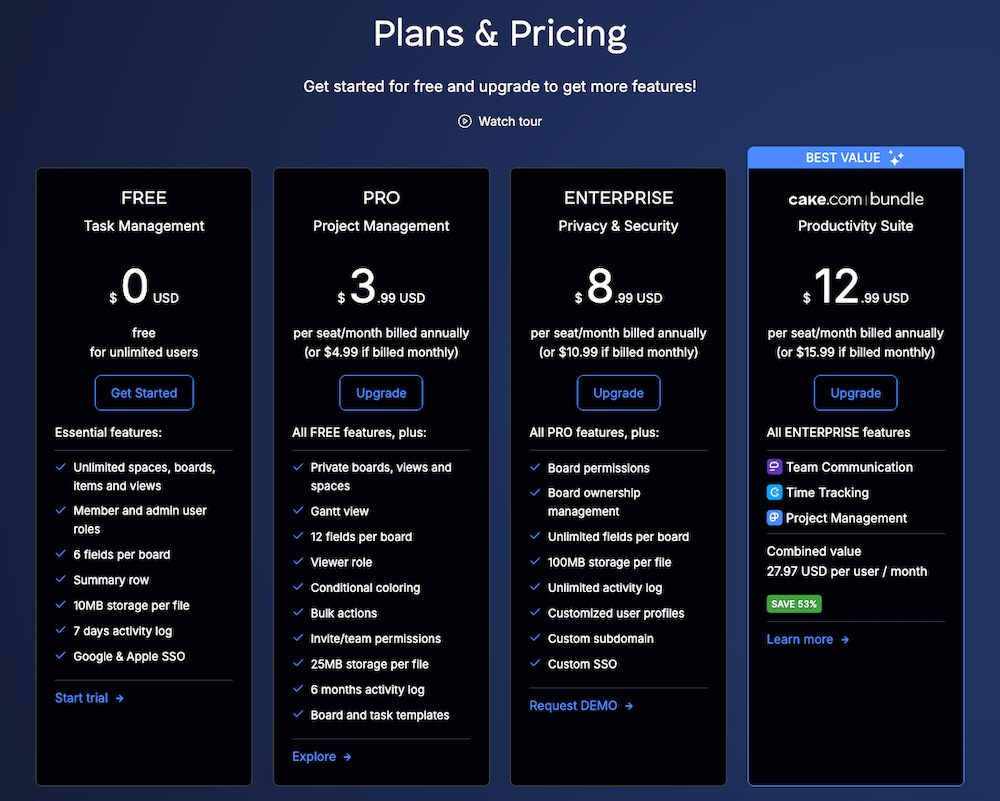
| Plaky’s plans | Plaky’s pricing |
|---|---|
| Free | $0 |
| Pro | $3.99/seat/month* |
| Enterprise | $8.99/seat/month* |
| CAKE.com Bundle (Plaky, Clockify, Pumble) | $12.99/seat/month* |
*billed annually
#2 Smartsheet — best for Excel enthusiasts
Smartsheet is a tool that blends a spreadsheet-like interface with advanced project management features. It allows teams to plan, monitor, and report on their assignments.
Why choose Smartsheet?
Smartsheet is a decent choice because it supports robust Gantt chart functionalities and flexible spreadsheets.
| Pros | Cons |
|---|---|
| – Advanced Gantt features – Automations – Excel-like formulas & functions | – Clunky navigation & limited Gantt view – Expensive for larger teams |
As someone familiar with Excel, I transitioned to Smartsheet without a steep learning curve, considering the grid interface and formulas & functions.
That said, Smartsheet can seem complex to those used to more visual tools. Also, I must say the navigation feels clunky at times — e.g., switching between different projects and dashboards isn’t as fluid as in other apps.
Back to the positives: whether you need a simple task list or advanced functionalities like automation and reporting, Smartsheet adapts to various workflows through multiple view options:
- Grid,
- Timeline,
- Board,
- Gantt,
- Card, and
- Calendar.
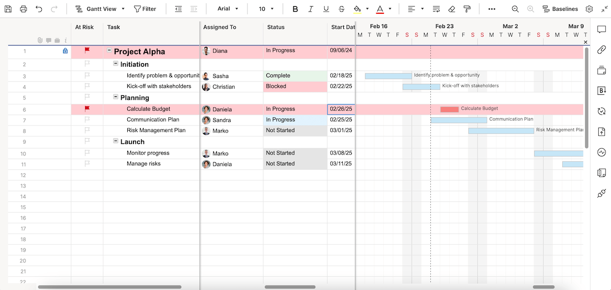
After exploring Smartsheet’s Gantt view more thoroughly, this is what I highlighted as the strongest points:
- Dependency management — Set task dependencies to ensure a logical project flow (Smartsheet will automatically update related tasks when changes occur).
- Critical path analysis — Apply the Critical Path Method, i.e., highlight the longest chain of dependent tasks to identify bottlenecks and prioritize essential activities.
- Baseline tracking — Compare planned vs. actual progress over time using a baseline.
- Reporting and dashboards — Pull data from multiple Gantt charts into reports and dashboards for a high-level view of progress.
I just wish the main task table and the Gantt view weren’t always displayed side by side. Allowing Gantt charts to take up more screen space would provide a clearer overview.
What’s good, though, is that multiple people can work on the same sheet simultaneously, which makes team collaboration easier. And if it gets a bit chaotic and you aren’t sure who changed what, don’t worry — just check the cell history!
My final remark has to do with Smartsheet’s pricing. The free plan is no longer available, only a free trial. This means the cost could likely be quite steep for larger teams (at least $90/month for a team of 10!).
What’s new in Smartsheet?
Similarly to several other platforms on this list, Smartsheet has incorporated AI to automate tasks, generate complex formulas, and provide data insights.
The platform now supports AI-powered chart creation and integrates with Amazon Q Business, AWS’s generative AI assistant.
Available for: web, macOS, Windows, iOS, Android
| Smartsheet’s plans | Smartsheet’s pricing |
|---|---|
| Free | ❌ |
| Pro | $9/member/month* (1-10 members) |
| Business | $19/member/month* (3+members) |
| Enterprise | POA (10+ members) |
| Advanced Work Management | POA |
*billed annually
💡Plaky Pro Tip
Smartsheet is also on our list of the best construction scheduling tools. See the full blog post here:
#3 monday.com — best for project planning
monday.com is an app designed for flexible task management and collaboration. It’s rather popular among teams looking to track their day-to-day workplace activities.
Why choose monday.com?
Opting for monday.com may make sense for teams that need advanced Gantt charts with multiple dependency types for precise planning.
| Pros | Cons |
|---|---|
| – Comprehensive Gantt options – Neat design – Very flexible | – Impractical pricing structure – Advanced features too complex for beginners |
The first thing I noticed is monday.com’s clean look, especially in the Gantt view. The drag-and-drop interface makes project planning and management within Gantt charts simple and interactive, even for inexperienced users.
This is particularly the case with structured project planning involving a clear, linear progression, like teams following the Waterfall methodology.
However, setting up advanced automations and dependencies in monday.com takes time to master. Plus, the interface can become overwhelming with so many view and widget options.
As for other board views, monday.com is really versatile and offers a nice range of options, including:
- Table,
- Kanban,
- File gallery,
- Form, and more.
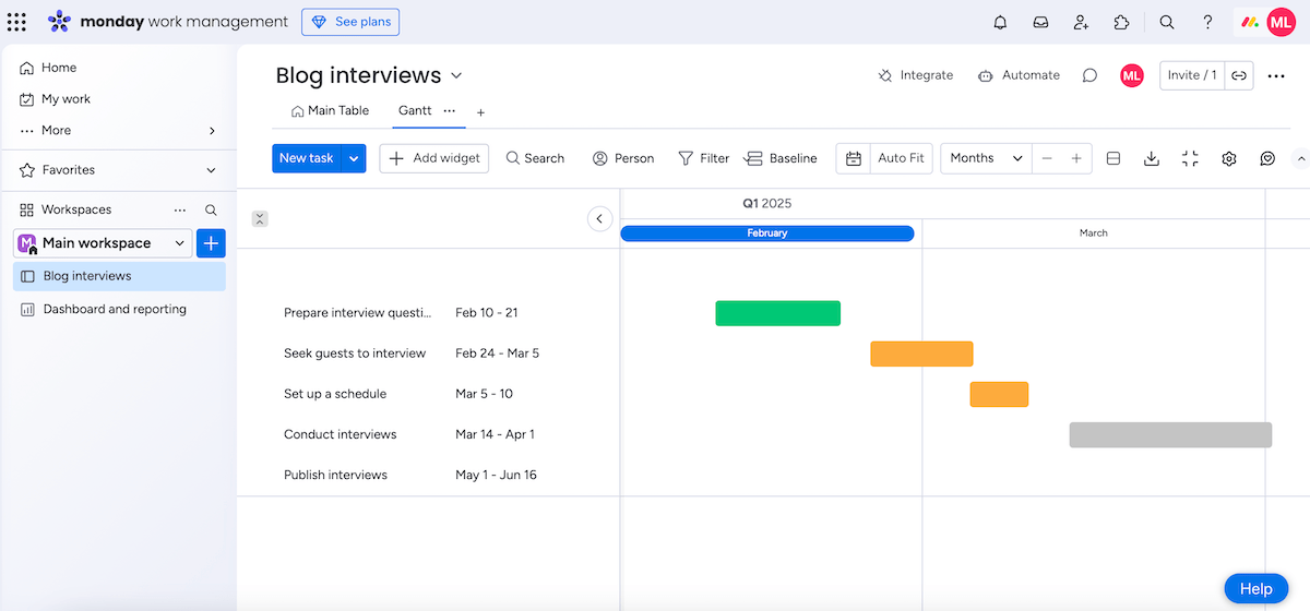
When trying this app to track a mini project of mine, I listed tasks using the table view and then switched to Gantt to visualize the project timeline better. These are the most helpful Gantt features in my opinion:
- Board filter — Focus on certain assignments by filtering items based on their status, owner, priority, etc.
- Dependencies — Choose whether you want dependent items to automatically update after changes or just display discrepancies.
- Critical path — Spot the tasks that must be completed to conclude a project on time; this lets you adjust schedules and manage project risks effectively.
- Baseline — Monitor progress throughout the project life cycle by comparing current dates on your Gantt chart to previous snapshots.
Now, if I had to suggest some improvements, I’d go with the pricing structure.
Right now, monday.com’s seat options come in fixed increments (e.g., 3, 5, 10, 15, etc.) with no in-between options. So, if your team has, let’s say, 7 or 18 users, you’ll be forced to pay for extra seats you don’t need.
What’s new in monday.com?
In the past period, monday.com implemented several AI features: AI-powered resource allocation, timeline summaries, risk identification, and more.
Additionally, monday.com now offers Sequences, an automation tool in monday CRM that streamlines customer communication by automating multi-step workflows (including emails, tasks, and reminders).
Available for: web, macOS, Windows, iOS, Android
| monday.com’s plans | monday.com’s pricing |
|---|---|
| Free | $0 (up to 2 seats) |
| Basic | $9/seat/month* |
| Standard | $12/seat/month* |
| Pro | $19/seat/month* |
| Enterprise | POA |
*billed annually
💡Plaky Pro Tip
Check out these articles to see how monday.com compares to similar PM tools:
#4 GanttPRO — best for Gantt beginners
As its name suggests, GanttPRO is a work management app designed around Gantt charts. It combines a simple design with comprehensive features for project planning and tracking.
Why choose GanttPRO?
You should go for GanttPRO if you prioritize user-friendly project visualization with good communication features.
| Pros | Cons |
|---|---|
| – Sophisticated design – Advanced Gantt features – Communication hub | – Limited Gantt view on screen – No free plan |
Unlike some Gantt tools, GanttPRO has a very sleek and elegant design. I tracked quite a few of my writing assignments using this platform and never felt my workspace was cluttered.
If you’re a beginner, you might also like the selection of pre-made Gantt templates. It’s an easy way to learn the ropes while keeping projects organized from day one.
Since I’d tried out several Gantt tools by this point, I wasn’t surprised to find these features in GanttPRO:
- Task dependencies — auto-scheduling gaps between related tasks,
- Critical path — showing what tasks directly affect your project completion date, and
- Baselines — evaluating progress based on your project’s clearly defined initial point.
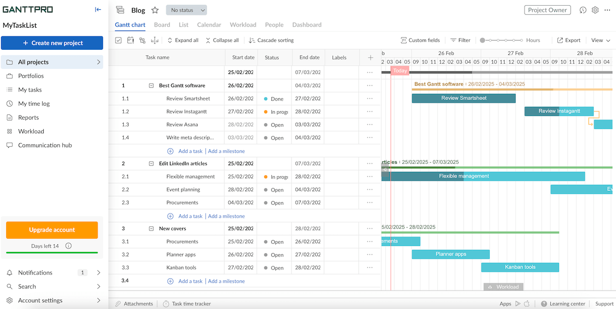
Similarly to Smartsheet, GanttPRO shows Gantt charts on the right half of the screen along with the full task table on the left, which isn’t that convenient (especially when looking at longer periods).
If you also like other project views, this platform has 6 additional ones besides Gantt:
- Board,
- List,
- Calendar,
- Workload,
- People, and
- Dashboard.
Another useful feature is GanttPRO’s communication hub — a section where users can view and write comments on tasks across all projects in their accounts. This saves time since you don’t have to search for comments in different tabs or chats.
All in all, GanttPRO offers a smooth user experience for both teams and individuals. Just remember there’s no free plan, so it’s less accessible for organizations and individuals with a limited budget.
Another complaint: the mobile experience isn’t as fully featured as the desktop version, making on-the-go project management somewhat inefficient.
What’s new in GanttPRO?
After the newly introduced Calendar view, GanttPRO redesigned the Board view to enhance the Kanban-style experience and improve task management features.
There have also been several bug fixes and improvements in GanttPRO’s mobile apps.
Available for: web, iOS, Android
| GanttPRO’s plans | GanttPRO’s pricing |
|---|---|
| Free | ❌ |
| Core | $7/user/month* |
| Advanced | $10/user/month* |
| Business | $17/user/month* |
| Enterprise | $20/user/month* |
*billed annually (for est. 20 users)
#5 ClickUp — best for feature-rich customization
ClickUp is a software solution used for task management, goal tracking, and document collaboration that functions as an all-in-1 workspace for all your project needs.
Why choose ClickUp?
ClickUp is a reasonable choice for teams that need flexibility and a wide range of features to tailor their project workflows.
| Pros | Cons |
|---|---|
| – Highly customizable – Advanced Gantt capabilities – Real-time chat | – Limit of 60 Gantt views in the free plan – Slight learning curve |
ClickUp is very customizable wherever you look — it comes with numerous custom fields, different themes and accent colors, highly configurable dashboards, etc.
Moreover, there’s a built-in timer, notepad, and whiteboard, minimizing your need for external apps (and hence reducing distractions).
As someone who prefers to switch visualization styles for different kinds of tasks, I also appreciate ClickUp’s multi-view capabilities:
- List,
- Table,
- Kanban,
- Gantt,
- Timeline,
- Form, and more.
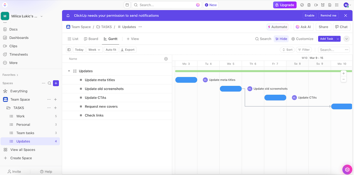
Regarding the Gantt view, these are the benefits that stood out to me while testing the app:
- Adding task dependencies — Choose between 3 dependency types to specify different relations between assignments.
- Reusing dependencies — Duplicate tasks with dependencies when you want to replicate an assignment and automatically pull its connections to other tasks.
- Critical path — Specify the sequence of tasks essential to finishing your project on time.
- Slack time — Determine which tasks can be rescheduled without affecting larger project deadlines.
- Live updates — Enable live updates to tasks within your Gantt chart from other users within the platform.
The final ClickUp pro in my book is its efficient team collaboration capability. The option to leave comments on tasks is quite standard, but real-time chat and document sharing are extra helpful.
As for the drawbacks, I believe the extensive features may seem daunting to new users. While customization can be considered a strength, it can lead to overcomplicated workflows if not managed properly.
I also noticed slower loading times, especially with large boards, which can be frustrating.
What’s worse, the free plan includes only 60 uses of the Gantt view. Budget-conscious teams managing multiple projects may quickly hit the cap, forcing them to delete old charts or upgrade sooner than planned.
What’s new in ClickUp?
Recently, ClickUp revamped the Form view, enabled Slack imports into the ClickUp chat, and introduced AI-powered recommendations for what fields to add to tasks.
In addition, managers can now submit, review, and approve timesheets within the app.
Available for: web, macOS, Windows, Linux, iOS, Android
| ClickUp’s plans | ClickUp’s pricing |
|---|---|
| Free | $0 |
| Unlimited | $7/user/month* |
| Business | $12/user/month* |
| Enterprise | POA |
*billed annually
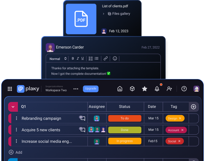
#6 Hive — best for fast-paced teams
Hive is cloud-based software that combines task management, team communication, and analytics into a single platform.
Why choose Hive?
Hive is great for users who like to suggest improvements — Hive’s creators like to emphasize that it’s a “democratic” platform, i.e., shaped by user feedback and community votes.
| Pros | Cons |
|---|---|
| – Robust Gantt functionalities – Built-in chat – AI assistants | – Limited Gantt view on screen – No custom fields & labels in the free version |
Hive’s Gantt view has several strengths:
- Task dependencies & auto-scheduling — Adjust timelines and related tasks dynamically.
- Multiple users — Enable team members to edit Gantt charts simultaneously.
- Project baseline — Compare earlier snapshots with the progress made later on.
- Percent complete — Auto-calculate or manually update how much of a task is done.
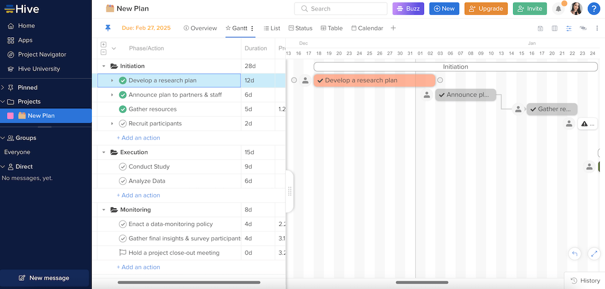
What’s more, you can make your Gantt chart more customizable by changing the color of the action card bars, as well as choosing to show/hide certain elements (actions, assignees, project milestones).
Now, there are several features that prove Hive is a solid choice for fast-paced teams:
- Built-in timer — Tracking time (automatically or manually) across any action card can improve productivity and accountability.
- Flexible workflows — Various views besides Gantt (calendar, table, timeline, etc.) enable switching between project views without disrupting the workflow.
- Built-in communication — In-task comments and Hive’s native messenger reduce the need for external communication apps.
- HiveMind — This real-time AI assistant helps respond to emails, plan projects, analyze data, and more.
Similarly to several other apps on this list, Hive splits the screen to show the Gantt chart and the full task list at the same time. Using the fullscreen mode helps you observe details better, but I’d prefer seeing Gantt charts across the entire screen.
Another downside for me is Hive’s limited free plan. I wasn’t surprised to learn that Gantt charts aren’t available in the free version, but I was disappointed because the time-tracking feature and custom fields & labels are also reserved for paid-tier users only.
I also noticed slower loading times when adding dependencies in the web version, which could cause some frustration and reduced productivity.
What’s new in Hive?
Hive has introduced another AI assistant (in addition to the previously mentioned HiveMind) — Buzz. This virtual intern can help you with document proofing, executing automations, brainstorming ideas, and more.
Also, there’s a new Hive mobile app, bringing the most requested desktop features to smartphone users.
Available for: web, macOS, Windows, iOS, Android
| Hive’s plans | Hive’s pricing |
|---|---|
| Free | $0 (up to 10 members) |
| Starter | $3/user/month* (up to 10 members) |
| Team | $6/user/month* |
| Enterprise | POA |
*billed annually
#7 TeamGantt — best for complex projects
As you may guess from its name, TeamGantt is a cloud-based PM tool specializing in Gantt chart planning and scheduling.
Why choose TeamGantt?
TeamGantt is a reasonable choice because it lets you create interactive Gantt charts, monitor progress, and collaborate in real time.
| Pros | Cons |
|---|---|
| – Several advanced Gantt features – Visually appealing interface – Easy to use | – Limited board view options in the free plan – Pricey |
These are the main TeamGantt functionalities that stood out to me:
- Quick setup — It took me only a few minutes to create a Gantt chart because the drag-and-drop interface works seamlessly.
- Effective color-coding — There’s a wide selection of vivid colors you can use to color-code tasks for better visual organization.
- Easy dependency management — Tasks can be connected by simply drawing a line between their representative circles.
- Task filtering — You can narrow your focus on certain items based on their assignee, status, deadline, or colors.
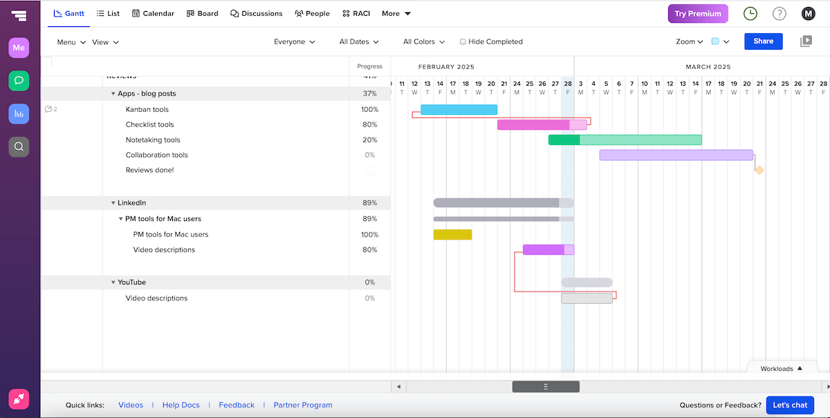
Another thing I like about TeamGantt is that it lets you adjust day and week view zoom levels, font size, and date format. This kind of personalized experience made me feel more comfortable and efficient while using the platform.
All of this makes TeamGantt practical for handling complex projects with numerous stakeholders. It easily supports overlaying multiple projects on a single Gantt chart, which is handy when managing interconnected tasks across teams and departments.
Collaboration is also supported through task commenting and file sharing, as well as a separate discussion section, but the latter requires a paid plan.
As for some concerns, the biggest one is that TeamGantt logged me out unexpectedly twice throughout the day, which disrupted my workflow.
I was also quite surprised to learn that the board and list view aren’t included in TeamGantt’s free version (while the Gantt view is) — most similar tools provide these project views for free.
And, if you decide to go on a paid plan, you should know that TeamGantt is rather pricey compared to most apps on this list — $49/month per manager!
What’s new in TeamGantt?
Recent TeamGantt updates include an overhaul of the discussions section — bug fixes and a few new features, like note templates and comment reactions.
Also, TeamGantt now integrates with Procore, a construction management software solution.
Available for: web, iOS, Android
| TeamGantt’s plans | TeamGantt’s pricing |
|---|---|
| Free | $0 (1 manager + 2 collaborators) |
| Pro | $49/month/manager* |
| Unlimited Everything | POA |
*billed annually
#8 Asana — best for task-oriented teams
Asana is a comprehensive PM solution for organizing and monitoring work efficiently. It supports a variety of project management techniques, especially for task-oriented teams that rely on structured workflows.
Why choose Asana?
The main advantage of using Asana as a Gantt platform is its ability to combine intuitive task management with timeline planning.
| Pros | Cons |
|---|---|
| – Advanced Gantt functionalities – Solid Gantt personalization – Automations | – Slight learning curve – Expensive |
Like several other apps in this article, Asana’s Gantt view supports:
- Adding a baseline — a snapshot of the project you can use later on to analyze progress,
- Setting dependencies — marking whether a task is blocking or is blocked by another one,
- Critical path tracking — identifying which dependent tasks are crucial for project completion, and
- Auto-scheduling tasks — automatically assigning dates to new tasks in the Gantt view (optional).
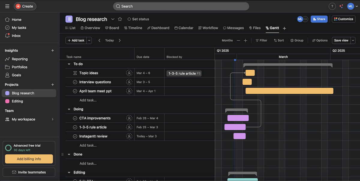
What’s more, I liked having different bar chart color options based on priority, status, or theme color. I usually go into prioritization mode in the morning, but I’d rather switch to status-based coloring later in the day.
On the whole, I’d say Asana is useful for breaking down large projects into structured, manageable tasks thanks to the following functionalities:
- Task hierarchy — Apply work breakdown structure (WBS) to create subtasks to improve organization and the accuracy of estimates.
- Multiple task views — Toggle between list, board, calendar, and timeline views to match your preferred workflow.
- Rules — Use the rule feature to automate actions based on triggers to save time.
- Collaboration features — Rely on comments and file attachments to keep discussions in one place.
In terms of disadvantages, I find it odd that Asana, as a rather popular team collaboration tool, doesn’t allow multiple task owners. You can find your way around this by adding team members as collaborators, but some teams might see this as tedious and restrictive.
Also, while experienced project managers probably wouldn’t need extensive onboarding to use Asana, it would definitely take beginners more time to master the platform.
My final remark has to do with Asana’s pricing — it’s pretty extravagant compared to some of its competitors!
What’s new in Asana?
Asana has a few novelties for each tier, such as cross-platform syncing of draft comments in iOS in the free version, triggering messages in Microsoft Teams for Starter users, AI studio updates in the Advanced plan, and more.
Available for: web, macOS, Windows, Linux, iOS, Android
| Asana’s plans | Asana’s pricing |
|---|---|
| Personal (free) | $0 |
| Starter | $10.99/user/month* |
| Advanced | $24.99/user/month* |
| Enterprise | POA |
| Enterprise+ | POA |
*billed annually
💡Plaky Pro Tip
We’ve compared Asana to several other project management tools. If you’re interested, check these out:
#9 Notion — best for free Gantt charts
Notion is a productivity and note-taking platform that you can use to create and manage various types of content. It’s highly customizable, allowing maximum creativity in organizing your projects.
Why choose Notion?
Notion is best for users who like complete freedom in structuring their pages and personalizing them with cover images, quotes, emojis, etc.
| Pros | Cons |
|---|---|
| – Essential Gantt features – Timeline view available in the free plan – Extremely customizable | – Cluttered Gantt charts – Slight learning curve |
Those on a tight budget may like what Notion has to offer in the Gantt department. More precisely, it’s the Timeline view functioning as a Gantt chart, which is free and lets you visualize project schedules and task durations.
These are some noteworthy Gantt features in Notion:
- Task dependencies — the blocking/blocked by option to specify task relationships,
- Progress tracking — the percentage of task completion within the timeline for better insight, and
- Customizable properties — properties such as priority levels, statuses, and assignees to facilitate detailed tracking.
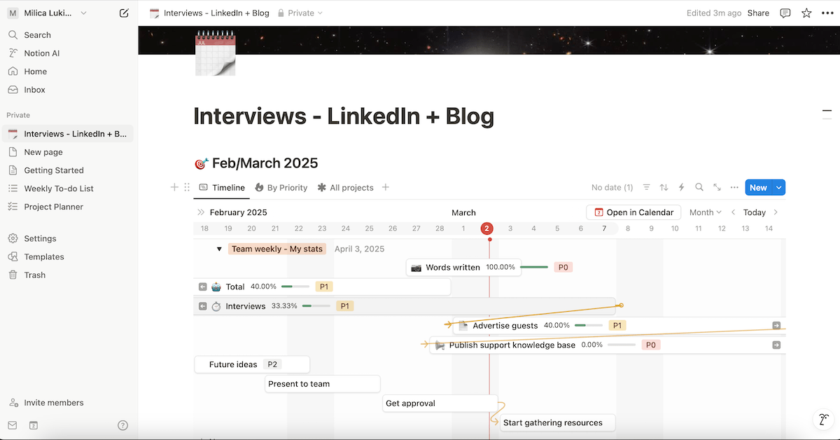
Moreover, this app lets you filter tasks in the Gantt chart based on their status, priority, progress, and so on.
Nonetheless, unlike in some Notion alternatives, I feel like Notion’s Gantt charts get cluttered quickly if you want to display more than 2 properties next to task bars.
Apart from Gantt, you can also see your projects and tasks in a few other formats, including:
- Table,
- List,
- Board,
- Gallery, and
- Calendar.
All of these options are available in the free version, so even cost-conscious teams and individuals can nurture their unique workflows and preferences.
Then again, the versatility of Notion’s building blocks and features is likely to intimidate non-technical users. Relying on templates can help, but even then, some further customization is needed.
But, once you get the hang of it, building pages can be quite fun, which is why some people also like using Notion as daily planner software.
Just know that this app is sometimes slow to load when a page contains many elements and linked databases, which may affect users’ productivity.
💡Plaky Pro Tip
Notion ranks high on our list of the best project management tools for Mac users. To see why it is so and discover other Mac-friendly PM apps, read this:
What’s new in Notion?
Some of the latest Notion updates include new pricing and plan feature sets, as well as a database makeover and a new database view (Feed view).
Available for: web, macOS, Windows, iOS, Android
| Notion’s plans | Notion’s pricing |
|---|---|
| Free | $0 |
| Plus | $10/seat/month* |
| Business | $20/seat/month* |
| Enterprise | POA |
*billed annually
💡Plaky Pro Tip
Wondering how Notion stacks against similar note-taking apps? Read these:
#10 Instagantt — best for standalone Gantt simplicity
Instagantt is a web app designed specifically for Gantt chart visualization and scheduling. It integrates with Asana but can also be used as a standalone tool.
Why choose Instagantt?
Instagantt is primarily for users who just want to track project timelines without dealing with any complex project management features.
| Pros | Cons |
|---|---|
| – Extended Gantt features – Minimal setup – Gantt exports in multiple formats | – No native mobile apps – No free plan |
Instagantt has a number of handy Gantt features:
- Baselines — to capture your Gantt chart’s current state for future reference,
- Dependencies — to determine relationships between tasks and identify the impact of potential delays,
- Drag-and-drop simplicity — to quickly adjust timelines and dependencies with an intuitive interface,
- Workload management — to track team capacity and avoid overloading individuals, and
- Export options — to save Gantt charts as PDFs, images, or Excel files for easy reporting.
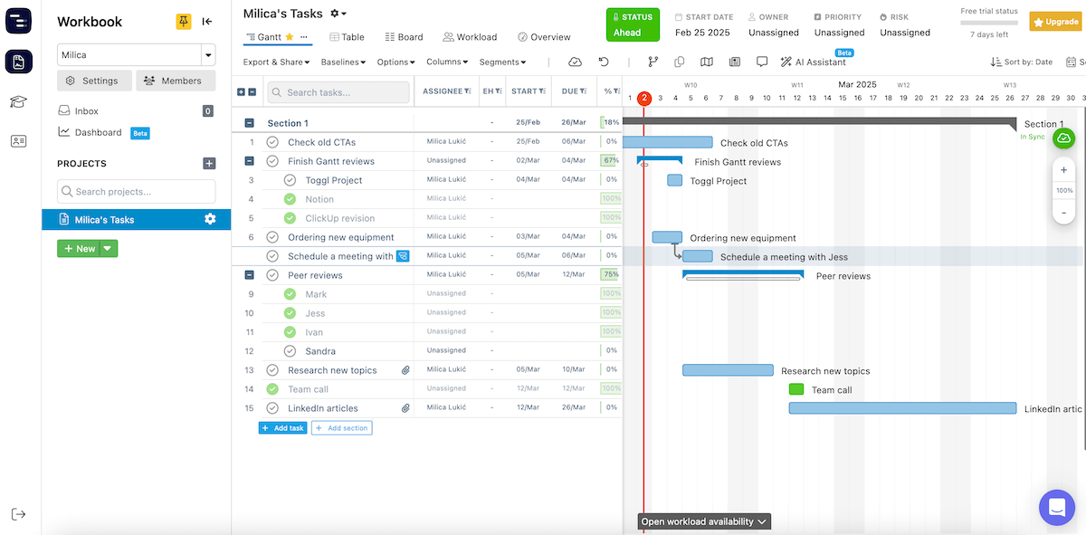
Instagantt’s best functionality is tied to Asana, but it can certainly work on its own if you don’t need a full-fledged project management platform. There’s no need to install software as it runs in a browser, and the simple design requires minimal setup.
Standalone Instagantt could, therefore, be a good match for:
- Freelancers and solopreneurs — It offers a simple way to plan projects visually without managing multiple team members.
- Small teams & startups — Dabble in lightweight scheduling without committing to a bigger PM tool.
- Researchers — Organize research phases, grant proposals, and thesis deadlines.
- Consultants and agencies — Share public Gantt chart links with clients without requiring them to use a larger PM platform.
It’s important you know there’s no free plan, so Instagantt might be too expensive for most teams since the Team plan can be used by only 3 collaborators. If you want more, you’ll have to pay $8/month per additional collaborator.
And, unlike the vast majority of its competitors, Instagantt doesn’t have a dedicated mobile app, which may be a problem for those who like on-the-go updates.
My last complaint is that the quality of PDF/image exports could be better, i.e., include sharper visuals. Poor-quality Gantt exports can appear unpolished in presentations or reports, affecting credibility.
What’s new in Instagantt?
Instagantt now has an AI-powered feature that lets you enter a prompt and get a customized Gantt chart with timelines, tasks, and dependencies without a manual setup.
There’s also a new multi-project dashboard, providing a full overview of all your projects in a single timeline.
Available for: web
| Instagantt’s plans | Instagantt’s pricing |
|---|---|
| Free plan | ❌ |
| Individual | $12/month or $120/year |
| Team | $24/month or $240/year |
#11 Toggl Plan — best for resource management
Toggl Plan is a lightweight task and project management tool. Since it integrates with Toggl Track for time tracking and billing, this app can also be used for resource management.
Why choose Toggl Plan?
Toggl Plan is a decent Gantt chart tool for those who like more refined features like swimlanes and milestone tracking without unnecessary complexity.
| Pros | Cons |
|---|---|
| – Easy to use – Segments and milestones – Analytics page | – Basic Gantt functionality – Bland design |
Toggl Plan offers several features beneficial for Gantt chart users:
- Visual timelines — The timeline view functions as a Gantt chart, providing a neat visual representation of tasks and deadlines.
- Segments — Shown on the timeline’s vertical axis, segments help you organize tasks more clearly into different swimlanes.
- Tags — You can assign small labels inside task cards to provide additional filtering options.
- Milestones — Color-coded milestones serve as clear visual indicators about upcoming events.
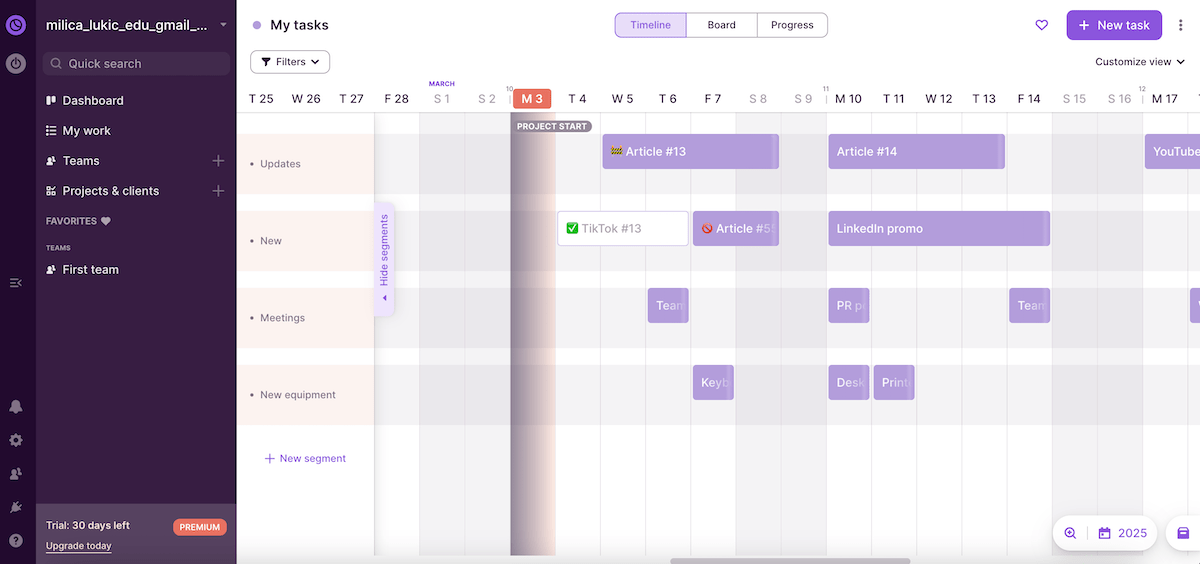
In addition to Gantt, Toggl Plan also has the board (Kanban) view, which allows you to visualize work phases in columns. Surprisingly, there’s no list/table view for users who prefer text-based overviews for quick scanning.
You might notice the progress view as well — it’s a simple analytics page showing the percentage of completed tasks and estimated vs. actual time spent on tasks.
Moreover, the Team section gives you a visual overview of who’s working on what and when, making sure nobody is overbooked or underutilized.
In fact, it’s possible to integrate Toggl Plan with Toggl Track (a separate subscription) and get more comprehensive time reports, which you can export and use to bill clients accurately. All of this makes Toggl Plan suitable for managing workloads and project resources.
When it comes to room for improvement, I’ll mention that the design feels a little dull and uninspired. This can reduce motivation to interact with the app regularly, making it harder to stay focused and productive.
Task management in Toggl Plan could be better, too. Task cards include information such as status, due date, and assignee, but PM tools that offer to-do lists and customizable fields allow for more detailed task organization.
What’s new in Toggl Plan?
The latest Togg Plan updates include several bug fixes and search improvements.
Available for: web, iOS, Android
| Toggl Plan’s plans | Toggl Plan’s pricing |
|---|---|
| Free | $0 (up to 5 users) |
| Capacity | $5/user/month* |
| Starter | $8/user/month* |
| Premium | $13.50/user/month* |
*billed annually
#12 Jira — best for Agile teams
Jira is a project management and issue-tracking tool primarily used by software development and Agile teams.
Why choose Jira?
Jira supports Scrum, Kanban, and hybrid Agile methodologies, so you should consider it if you have a project team that needs flexible, iterative management.
| Pros | Cons |
|---|---|
| – Essential Gantt features – Numerous third-party app integrations – Advanced issue tracking | – Steep learning curve – Dull design and almost no Gantt customization options |
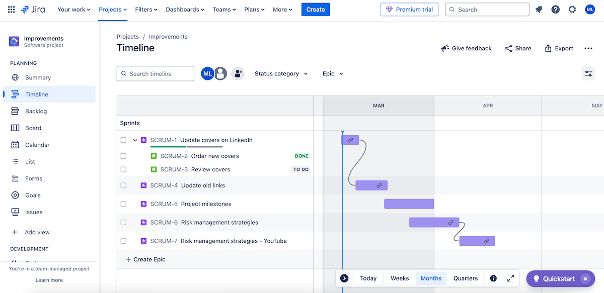
Jira doesn’t have a built-in Gantt chart feature, but teams can create them using the timeline view — a Gantt-like overview of projects or tasks with:
- Drag-and-drop functionality — for quick task creation and movement across the timeline,
- Dependencies — for specifying relations between connected tasks,
- Progress tracking — for monitoring epics, tasks, and milestones using timeline-based visuals, and
- Plugins & integrations — add-ons like BigPicture or Structure.Gantt for bringing full Gantt chart functionality to Jira.
Other features in Jira promote flexibility as well, making it ideal for Agile teams — most notably:
- Kanban & Sprint support — Jira includes Kanban boards and Sprint planning tools.
- Scrum-friendly features — Scrum teams can create Sprint backlogs, track iterations, and review finished works.
- Bug tracking — Jira specializes in issue tracking, which is ideal for software development teams.
- Burndown and velocity charts — Teams can see how fast they’re completing work during a Sprint, which helps them stay on schedule and predict future performance.
- Integration with DevOps tools — Jira connects seamlessly with GitHub, Bitbucket, and CI/CD pipelines, boosting collaboration between development and operations.
Now some downsides: Jira comes with a steep learning curve and could easily intimidate new users. This is especially the case for non-technical teams since the focus on software development and Agile workflows leans toward technical jargon and concepts.
In addition, Gantt charts in Jira aren’t as customizable compared to some other apps I’ve tried. This means restricted task representation and flexibility.
Finally, Jira has my least favorite design out of all the Gantt tools on our list. Moving between different workflows can feel particularly clunky as it requires too many clicks or doesn’t always follow a consistent structure.
What’s new in Jira?
Jira’s visual tool Program board has transitioned from Open Beta to a full feature, introducing dependency management. The platform is also preparing several security and usability updates to enhance data security and improve the overall user experience.
Available for: web, iOS, Android
| Jira’s plans | Jira’s pricing |
|---|---|
| Free | $0 (up to 10 users) |
| Standard | $7.53/user/month* |
| Premium | $13.53/user/month* |
| Enterprise | POA |
*billed monthly (team size of 300 users)
Visualize project success with the right Gantt tool
There are various ways to visualize projects (e.g., mind maps, project network diagrams, dashboards, etc.), but Gantt charts are among the most popular tools in the world of project management given that they:
- Provide neat project timelines,
- Enhance team coordination,
- Help track progress visually, and more.
Finding the ideal Gantt tool depends on your needs — whether you prioritize cost-effectiveness, advanced customization, Agile workflows, and so on.
Each tool has its strengths and trade-offs, but if you want to strike the best balance of affordability, ease of use, and customization, go for Plaky!
In addition to the benefits stated above, our platform is an excellent pick for teams across various industries since it also has:
- 2 other board views— Need a more textual, structured overview of your Plaky boards? Go for the Table view. Want a visual workflow focusing on different stages? Rely on Plaky’s Kanban view.
- Task export option — Export project data as CSV files and use them in other apps or databases for reporting, further analysis, etc.
- Ready-made templates — Use free templates available in Plaky’s PM template center to jumpstart your projects fast and introduce consistent workflows.
- Time-tracking integration — Integrate Plaky with Clockify to track time and gain a better insight into your productivity, and
- User roles — Set different user roles & permissions to guarantee the appropriate level of access and control among different team members.
Ready to simplify your Gantt charts without breaking the bank? Sign up for Plaky today and bring clarity to your workflow!
