
Have you ever realized too late that your team is overloaded? Are you bouncing between spreadsheets and project tools to answer simple questions about staffing or equipment availability? If so, this listicle is for you.
I tested a wide range of capacity planning tools to see which ones genuinely help teams plan work better.
Keep reading to find detailed reviews, standout features, limitations, and pricing info.
WHY TRUST US?
The apps we talk about are selected, tested, and written about by human reviewers who follow strict review and editorial guidelines. We pick solutions that are practical, purposeful, and can offer real value for the specific use case or business context we’re covering — while also being justified in their pricing. Our methodology is transparent, clear, and available to everyone:
10 best capacity planning tools — an overview
Here’s a brief overview of all the apps I tried out. Scroll down for my full reviews, including pros, cons, and everything in between!
| Tool | Best for | Free trial | Free plan | Lowest price |
|---|---|---|---|---|
| Plaky by CAKE.com | Capacity planning with task management | ✔ | ✔ | $3.99/user/month |
| Float | Live visual scheduling | ✔ | ❌ | $7/user/month |
| Ganttic | Equipment scheduling | ✔ | ✔ | $1.25/resource |
| Meisterplan | Scenario planning | ✔ | ❌ | $600/month |
| Wrike | Capacity planning in complex workflows | ✔ | ✔ | $10/user/month |
| Scoro | Managing capacity and profitability | ✔ | ❌ | $19.90/user/month |
| Teamwork.com | Connecting capacity to clients | ✔ | ✔ | $9.99/user/month |
| ClickUp | Cross-functional teams | ✔ | ✔ | $7/user/month |
| Forecast | Beginner-friendly planning | ✔ | ❌ | $5/user/month |
| Toggl Focus | Scheduling with time data | ✔ | ✔ | $9/user/month |
#1 Plaky by CAKE.com — best for capacity planning with task management
Plaky is a professional tool designed for teams that want a simple, visual way to organize their work without breaking the bank.
Why choose Plaky?
Capacity and tasks are closely linked components of resource management, and Plaky is perfect for teams who don’t want separate systems for all that.
| Pros | Cons |
|---|---|
| – Intuitive UI – Highly customizable – Multiple views – Part of CAKE.com’s Productivity Suite | – Lack of integrations |
Plaky is one of the best lightweight capacity planning apps primarily thanks to these features:
- Fields — use versatile custom fields (text, number, person, status, etc.) to specify estimated effort, priority, departments, project stages, or whatever else you need.
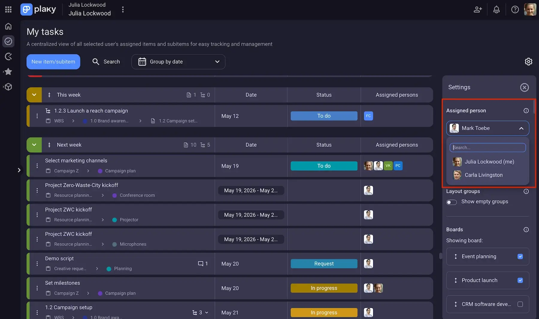
- My tasks — see all the tasks assigned to you or a specific teammate in one place, group them by date, status, or board, and use the insights to prevent hidden capacity issues across multiple projects.
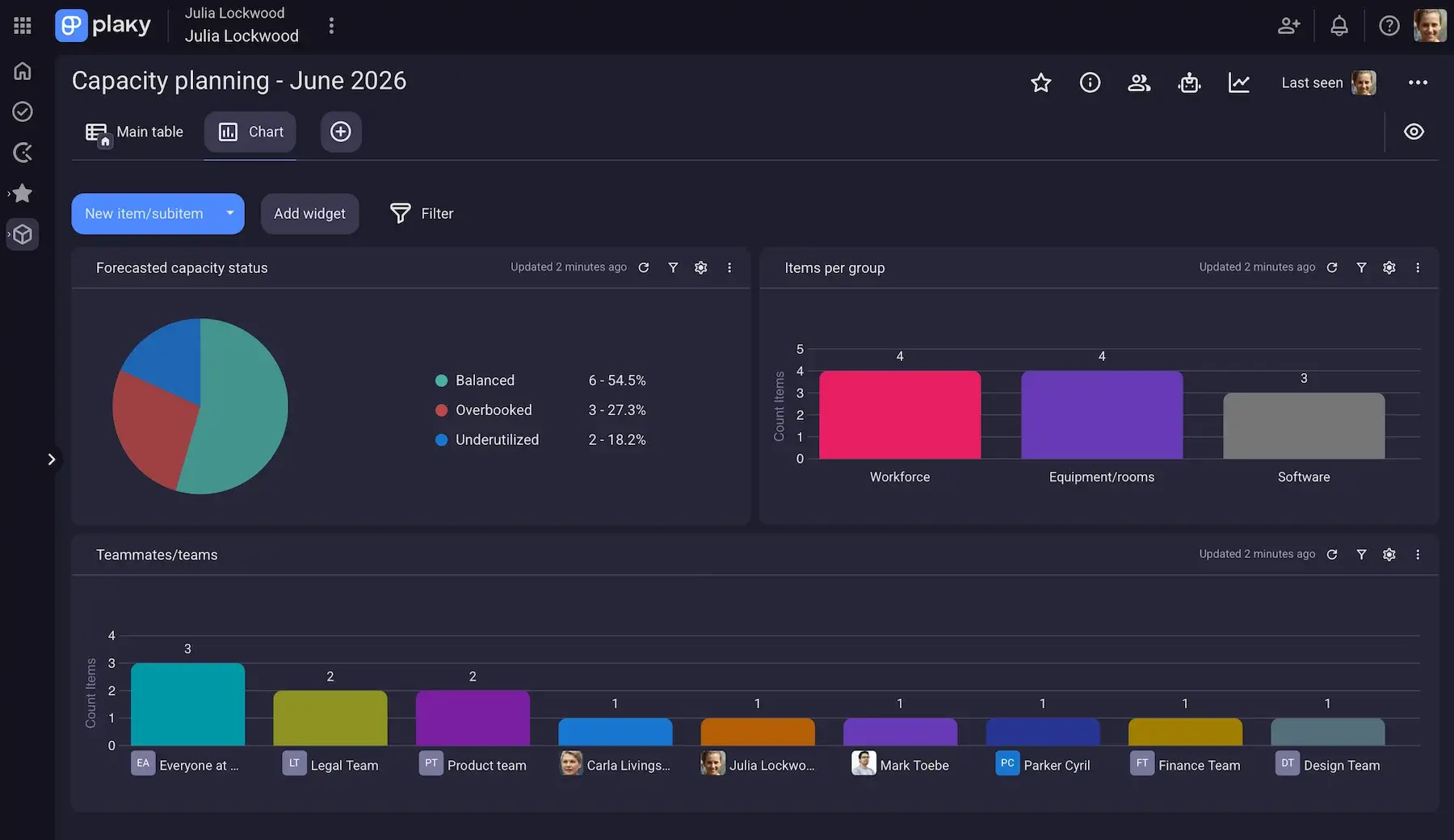
- Chart view — turn data into pie and bar charts to visualize task distribution by assignee, project status breakdowns, and more, essentially creating simplified reporting dashboards.
- Gantt chart view — look at project timelines and task durations to identify resource overlaps or unrealistic scheduling.
There are also 2 other board views — Table and Kanban — for extra flexibility in monitoring workloads and projects.
Try capacity planning in Plaky
While capacity planning focuses on the long-term view of hours and skills, it can’t really be separated from specific day-to-day work if you wish to predict future demand accurately. Plaky shines here, offering:
- Boundary setting vs. detailed action — besides noting down what your team can take on, you can actually assign those hours and tasks to specific employees (manually, or with automations on paid plans).
- Easy communication — if there are any remarks or outstanding questions, you can simply add comments and @mentions within relevant items.
- Built-in time tracking — Plaky’s native integration with Clockify allows you to track time spent on tasks, and you can then head over to Clockify for detailed time and cost reporting/forecasting.
As for room for improvement, the only thing that comes to mind is integrations. Besides the one with Clockify, the only other integration is Plaky-Pumble (a team communication app). But, if you want all 3, the good news is that CAKE.com lets you save over 50% — so, you get a fully upgraded business suite at just $12.99/user/month. And, to make things easier, all 3 apps are accessible through a single CAKE.com account.
It’s also worth noting that Plaky’s API enables you to connect it with other apps to create/update/delete (sub)tasks and comments automatically.
💡 Plaky Pro Tip
To learn more about capacity planning types and strategies, read this guide:
What’s new in Plaky by CAKE.com?
Plaky now lets you create up to 30 widgets in the Chart view for enhanced data representation. A custom color picker for tags and labels is also new, as well as dynamic date values in automations involving date and timeline field types.
If you’re curious to see what’s coming to our platform soon, check out Plaky’s Roadmap.
Available for: web, iOS, Android
| Plan | Price |
|---|---|
| Free | $0 |
| Pro | $3.99/seat/month* |
| Enterprise | $8.99/seat/month* |
| CAKE.com Bundle (Plaky + Clockify + Pumble) | $12.99/seat/month* |
*billed annually

#2 Float — best for live visual scheduling
Float is a professional tool built specifically for capacity management and scheduling. It allows you to assign work, adjust timelines, and instantly see how those changes impact your team’s availability.
Why choose Float?
This platform keeps capacity planning visual and surprisingly intuitive with drag-and-drop scheduling that even non-technical users can master.
| Pros | Cons |
|---|---|
| – Fast and intuitive – Real-time capacity visibility – Baseline vs. logged hours | – No free plan – Limited PM features |
Quickly after launching Float, I could tell it was sleek and responsive. The most noteworthy features include:
- Flexible scheduling — Float supports teams working in both fixed hours and split allocations across projects, flagging workload imbalances without manual calculations.
- Time off management — scheduling vacation, sick leave, public holidays, etc. is seamless thanks to precise time off request/approval settings.
- Planned vs. actual tracking — when you log hours, you can compare planned allocations against real work done to make future planning more accurate (not on the Starter plan, though — only Pro and Enterprise).
Unfortunately, there’s no free plan, but there is a 30-day trial, which is more time than most similar apps offer for trial periods.
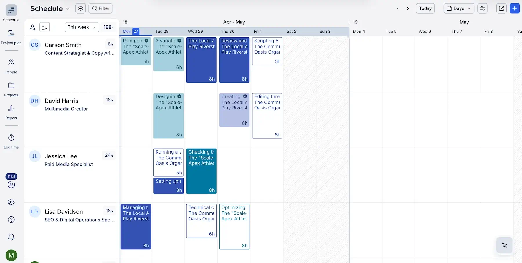
Now, this is where Float earns its reputation — live visual scheduling. Here’s what I jotted down as the main advantages:
- Drag-and-drop simplicity — moving tasks across project timelines or between teammates is effortless, with zero lag.
- Readable timeline view — Float keeps things clean and scalable in all 3 density view options (Compact, Comfortable, or Spacious).
- Different zoom levels — switching between daily, weekly, or monthly views doesn’t distort the schedule, but I will say the monthly view is slightly less readable and therefore better for high-level overviews rather than day-to-day planning.
- Color-coded clarity — projects, phases, roles, and allocations are visually distinct, making it easy to scan without overthinking.
As for the Report section, it’s neat and can help you improve utilization, but there’s no advanced analytics or highly customizable reports.
Float primarily focuses on scheduling, so its project management features are very limited (no detailed task cards, dependencies, or workflow automations). To match all-in-1 tools, you’d need to integrate Float with a PM tool.
Speaking of integrations, there are only around 20 native options, but Zapier (a no-code automation platform) is one of them — meaning you can integrate Float into your broader automated workflows if needed.
What’s new in Float?
Float has introduced Smart Assign, a feature that relies on machine learning to suggest the right person for any unassigned role. Also, the new People Operations dashboard provides a clearer real-time view of team capacity and potential staffing risks.
Available for: web, iOS, Android
| Plan | Price |
|---|---|
| Starter | $7/scheduled person/month* |
| Pro | $12/scheduled person/month* |
| Enterprise | POA |
*billed annually
#3 Ganttic — best for equipment scheduling
Ganttic is a resource planning and scheduling platform that shows availability, assignments, and capacity in one place.
Why choose Ganttic?
This tool is designed to manage both people and equipment on a shared timeline, making it handy for industries like construction, manufacturing, or event planning, to name a few.
| Pros | Cons |
|---|---|
| – Custom fields – Task manager – Unified view of people and equipment | – Limited integrations – Outdated UI |
Ganttic offers a clear, data-backed overview of your resources thanks to:
- Custom resource fields — attributing different fields (dates, links, users, numbers, and more) to a resource enables deeper and more precise planning.
- Filtering and grouping — when dealing with extensive resource allocation, being able to slice capacity views by team, type, or project becomes essential.
- Projects tab — you can see all your projects in one place and expand them to look at tasks and add dependencies, but the lack of subtasks can lead to missing details or unclear ownership.
Where Ganttic falls short is integrations. It only supports a two-way sync with Google Calendar and MS outlook, but you can incorporate the app in wider workflows via Zapier and Ganttic API.
Also, reporting is functional, but not impressive. I do like the ability to automate sending reports, though (for example, weekly/monthly reports sent automatically to teammates and stakeholders).
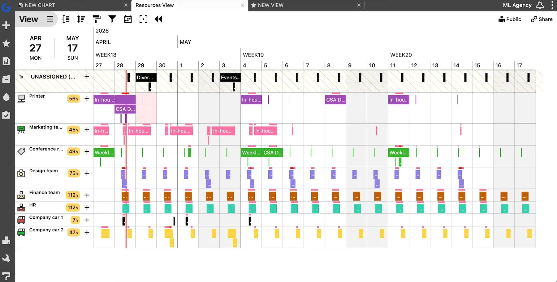
On a more positive note, Ganttic is really useful for equipment scheduling. These are my main reasons for believing so:
- Equipment as a core resource — machines, tools, or spaces can be scheduled just like team members — no hacks or workarounds needed.
- Maintenance and downtime planning — you can block out time for repairs or servicing, which directly impacts availability and prevents overbooking.
- Clear conflict visibility — people can speak up when overlapping bookings happen, but equipment can’t, so Ganttic flags that for you.
I got the hang of all these features in Ganttic very quickly, although it isn’t the most modern-looking app. I’m not the biggest fan of the sharp, boxy UI.
Let me also comment on Ganttic’s pricing model. It feels aligned with how the tool is built, but it’s also something you should understand before committing.
Basically, Ganttic has no tiers or per-user pricing — it’s resource-based. So, you can manage up to 10 resources for free, while bigger resource pools (20, 50, 150, 250, etc.) involve different costs shown on Ganttic’s pricing page.
What’s new in Ganttic?
Ganttic has redesigned its mobile app (e.g., easier navigation, task coloring for visual hierarchy). Also, the web’s History Log has been expanded to include all changes made to reports.
Available for: web, iOS, Android
| Plan | Price |
|---|---|
| Free (up 10 resources) | $0 |
| 20-1,500 resources | from $1.25–$0.53/resource/month; from $12.50–$5.27/resource/year* |
| 1,500+ resources | POA |
*Resource cost decreases with volume.
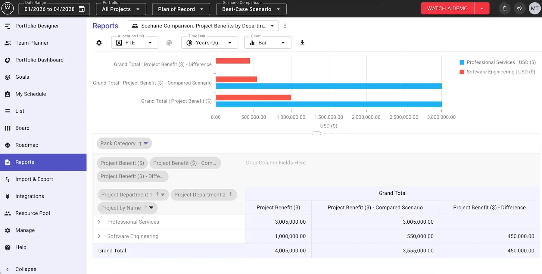
#4 Meisterplan — best for scenario planning
Meisterplan is a platform that combines resource management, capacity planning, and portfolio prioritization to help you reach strategic goals.
Why choose Meisterplan?
Thanks to strong scenario modeling features, Meisterplan turns static plans into something you can actively explore in order to make better decisions.
| Pros | Cons |
|---|---|
| – Individual and role-based planning – Cost and effort alignment – Robust scenario planning | – Learning curve – No free plan & pricey |
If you manage multiple projects and need clarity at a strategic level, this tool offers:
- Flexible capacity planning — you can allocate a resource to an individual, a specific role, or a project, so you aren’t forced into one approach.
- Multi-project visibility — seeing how resources are distributed across all active and planned projects makes it easier to predict and prevent scheduling conflicts.
- Financial and effort alignment — planning accuracy improves over time when you link project plans with the actual budgets and effort worked.
I must admit it took me a while to fully understand how all the features connect. Meisterplan comes with a learning curve, so it could take some time to onboard less tech-savvy teammates.
That said, Meisterplan is one of the most useful solutions out there when it comes to what-if scenario planning. If you’re on the Pro tier or higher, you can have multiple versions of the same plan to reflect several plausible futures. Meisterplan then helps with:
- Side-by-side comparison — you can directly compare 2 plans (e.g., best-case vs. worst-case scenario) to see differences in effort, expenses, and overall benefit.
- Instant impact on capacity — every change made (like delaying a project or reallocating roles) reflects immediately in capacity views.
- Future-proofing your strategies — by modeling different scenarios, you anticipate future capacity gaps and adjust plans before they turn into problems.
For all this to work well, though, you need consistency in project data, role definitions, and processes. Otherwise, the outputs lose accuracy.
I’d like this app more if it also supported daily task tracking. However, Meisterplan does integrate with some task management apps (e.g., Asana, Wrike), as well as thousands of other tools via Zapier for automations.
And my biggest complaint: Meisterplan is expensive. It has 3 tiers, but similarly to Ganttic, the price depends on the number of resources tracked. If we compare the price for 50 resources, let’s say, Meisterplan is 10 times more expensive than Ganttic — and that’s on the lowest (Basic) tier.
What’s new in Meisterplan?
The most notable addition to Meisterplan is AI Summaries (beta), helping users generate quick project summaries. There have also been ongoing improvements to integrations (like Microsoft Planner Premium and Wrike connectors).
Available for: web
| Plan | Price |
|---|---|
| Basic (est. 50 resources) | $600/month* |
| Pro (est. 50 resources) | $800/month* |
| Premium (est. 150 resources) | $3,200/month* |
*billed annually
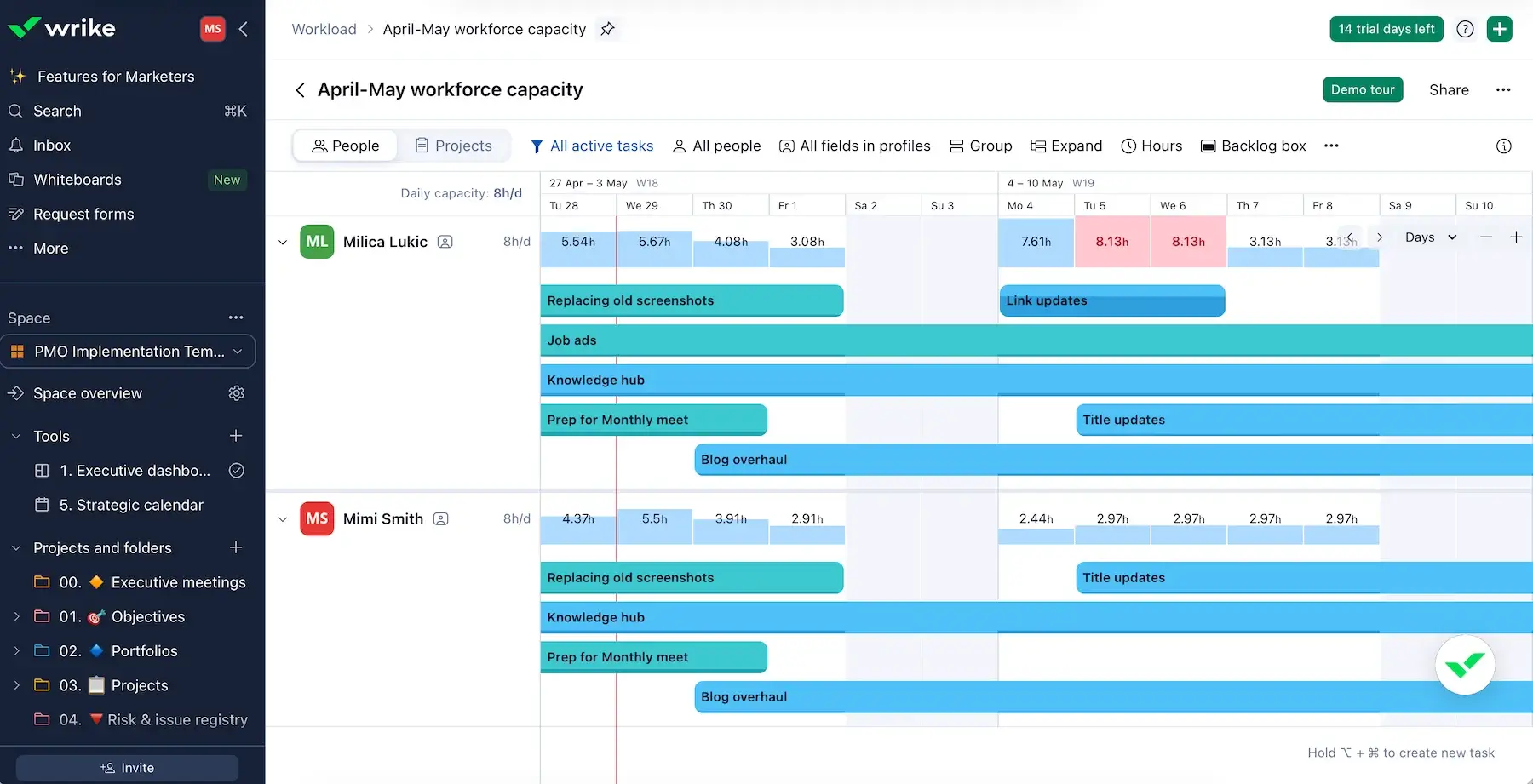
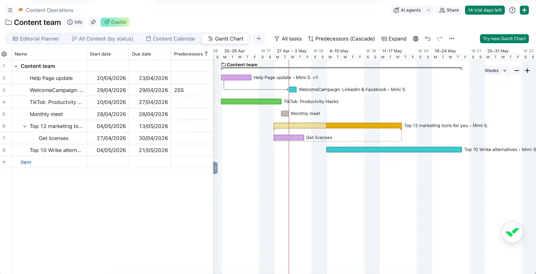
#5 Wrike — best for capacity planning in complex workflows
Wrike is a platform that blends project management, collaboration, and resource planning in one system.
Why choose Wrike?
This app supports structure, customization, and automation well, so it pays off if you work with lots of moving parts.
| Pros | Cons |
|---|---|
| – Workload charts – 9 project views – 400+ integrations | – Overkill for simpler use cases – Inflexible pricing |
Since Wrike is primarily a PM tool, capacity planning feels integrated with tasks and timelines. The standout features include:
- Team workload visibility — Workload is one of the view types (besides Table, Kanban, Calendar, and 5 others), letting you notice who’s overbooked or underutilized at a glance.
- Effort-based planning — you can assign effort measured in hours and track how it accumulates across projects, making capacity planning more realistic than simple task counts.
- Robust reporting — Wrike is known for solid reporting features, and analyzing reports can help you refine future capacity planning instead of relying on guesswork.
Unfortunately, workload charts and effort allocation aren’t available in the free plan or even the first paid plan — only Business and higher. This means at least $25/user each month, which is far from cheap.
That said, Wrike might still be worth it if your team operates in complex workflows thanks to:
- Advanced workflow customization — users can specify stages, approvals, and statuses mirroring how real progress works.
- Dependencies and Gantt charts — it’s important to map task dependencies in the timeline-style view, as task sequencing can impact capacity plans.
- Cross-tagging — tasks in Wrike can live in multiple projects at once, which is useful when work overlaps across teams or initiatives.
- 400+ integrations — native integrations with other tools your team uses (e.g., for CRM, team chat, emails, etc.) ensure seamless data flows.
- Automations — automating routine work reduces admin overhead — a lifesaver in complex environments.
If you tend to work on a handful of straightforward projects, though, this app would likely feel unnecessarily complex.
I must also say I find Wrike’s pricing policy impractical. This is how subscription sizes work:
- <30 users — blocks of 5 seats
- 30–100 users — blocks of 10 seats
- 100+ users — blocks of 25 seats
So, for example, with 102 users in your company, you’d have to purchase 125 seats. In other words, you’d be paying for 23 unused ones, which just seems overly wasteful to me.
💡 Plaky Pro Tip
Already using Wrike and looking for a more accessible alternative? We have several recommendations:
What’s new in Wrike?
Lately, Wrike has focused heavily on AI-driven automation and deeper reporting. There have also been some smaller but important improvements like better filtering across search and calendars, refinements in dashboards, and UX upgrades across tools like Whiteboards and request forms.
Available for: web, macOS, Windows, iOS, Android
| Plan | Price |
|---|---|
| Free | $0 |
| Team (2–15 users) | $10/user/month |
| Business (5–200 users) | $25/user/month |
| Pinnacle | POA |
| Apex | POA |
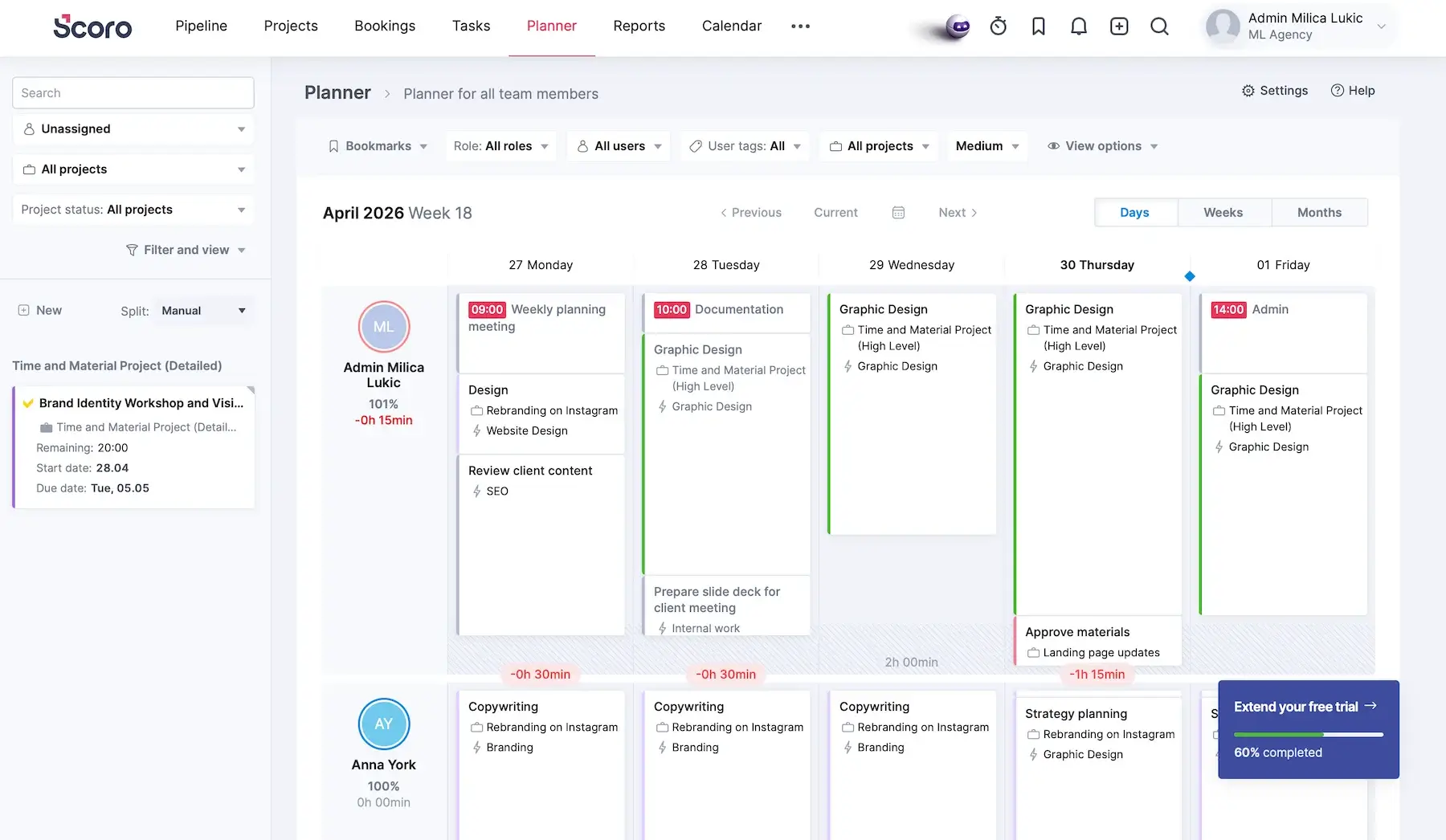
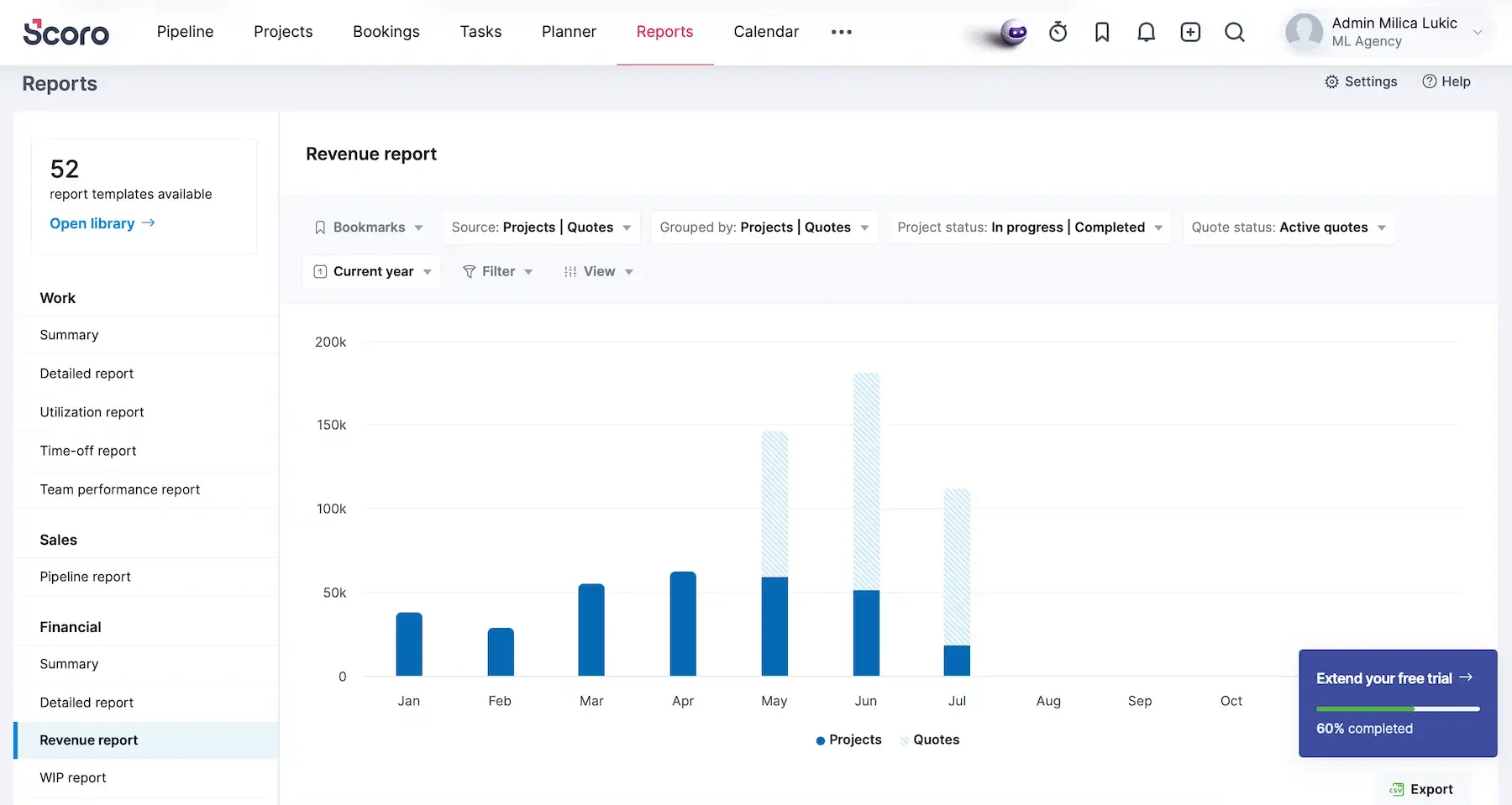
#6 Scoro — best for managing capacity and profitability
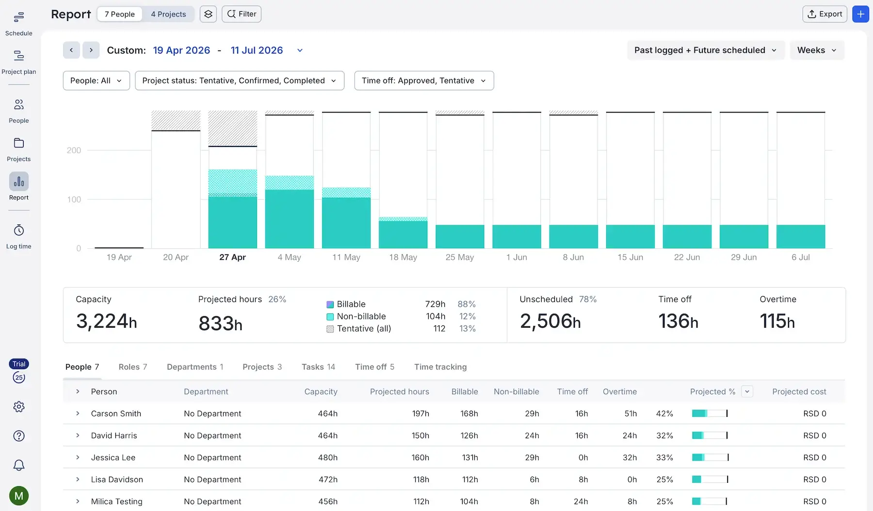
Scoro is an all-in-1 professional services automation (PSA) platform. Service-based businesses use it for PM, time tracking, budgeting, billing, and more.
Why choose Scoro?
In addition to availability, Scoro connects planning decisions to finances, helping you determine whether your capacity is profitable.
| Pros | Cons |
|---|---|
| – Rich with features – Versatile reports – Forecasting capabilities | – Learning curve is real – No free plan & expensive |
When I first opened Scoro, I was quite overwhelmed by the number of menus and features. However, demo data — mock projects, users, and clients — helped me understand the platform better. When I didn’t need this pre-populated info anymore, I just deleted it with one click.
And here’s why Scoro works for capacity planning:
- Live visibility into team capacity — the Planner tab shows who’s available, overloaded, or underutilized, with time off and holidays built into capacity calculations.
- Shared resource management — you can add resources like equipment and meeting rooms and connect them with calendar events to prevent overlapping bookings.
- Robust reporting — there are lots of report types that help with planning in general (customizable dashboards, summaries, utilization report, etc.).
Speaking of reports, I noticed they sometimes lag with lots of data. It didn’t happen a lot, but having to refresh the browser from time to time isn’t my favorite.
So, what is Scoro’s forte? I’d say seeing capacity, cost, and delivery in one place thanks to:
- Capacity planning tied to margins — every scheduled hour connects to project budgets and billable rates, so you can evaluate if certain work is worth taking on.
- Forecasting capabilities — besides forecasting workload, this app also forecasts the financial outcome of that workload, which boosts financial planning.
- Integrations with financial tools — Scoro integrates with a number of accounting, billing, and payment processing apps to streamline financial workflows (like QuickBooks, Xero, and Stripe, plus many others via Zapier).
- Detailed financial reports — you can analyze profitability by project, client, service, or employee, which simplifies capacity decisions.
Many report types (e.g., Revenue, Supplier management) aren’t available on the first or even the second paid tier, though, so be prepared to set aside a notable monthly budget if you really need Scoro’s full functionality.
Besides the steep pricing, I must also point out that Scoro has no free plan, which raises the barrier to entry and makes adoption riskier for cost-conscious teams.
What’s new in Scoro?
Scoro has improved the Bookings feature, making it more usable for high-level capacity planning (for instance, better handling of tentative vs. fixed bookings across projects and roles). Another notable addition is the ELI AI assistant, which helps users find data, summarize project info, and so on.
Available for: web, iOS, Android
| Plan | Price |
|---|---|
| Core | $19.90/user/month* |
| Growth | $32.90/user/month* |
| Performance | $49.90/user/month* |
| Enterprise | POA |
*billed annually
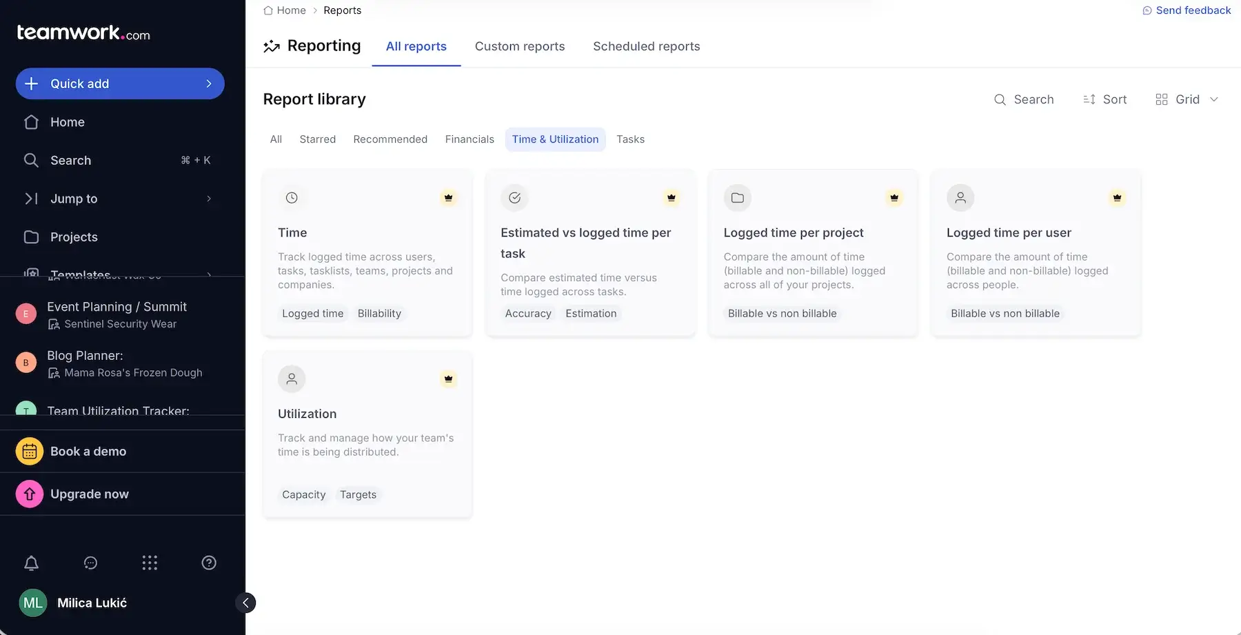
#7 Teamwork.com — best for connecting capacity to clients
Teamwork.com is a project and resource management tool focusing on client delivery, billable work, resource scheduling, and team utilization.
Why choose Teamwork.com?
This platform doesn’t separate capacity planning from client management, which makes it valuable for agencies and service businesses.
| Pros | Cons |
|---|---|
| – Visibility into team workloads – Tentative projects – Unlimited free client users | – Pricey – Less useful for internal/back-office teams |
Teamwork.com has several handy capacity planning features:
- Workload view — look at the Workload Planner to see all users in a scrollable timeline view of scheduled work compared against available capacity.
- Split capacity — customize the distribution of estimated time for a task across multiple users or days for full precision.
- Tentative projects — reserve team capacity early, before projects are active, to prevent surprise overbooking.
- Placeholders — identify staffing gaps early by using unnamed resources when you know you’ll need capacity but not who will do the work.
These are advanced features, though, i.e., they’re locked behind the two highest tiers, and this app isn’t exactly cheap (there are quite a few more affordable Teamwork.com alternatives out there).
However, if you’re willing to invest in a tool that ties capacity planning with billable time and client relationships, Teamwork.com can support you. The standout features include:
- Unlimited client users for free — you can bring clients directly into planning and projects without expensive extra seats.
- Centralized client communication and project delivery — tasks, files, and approvals live in one place, helping you manage workloads around real client activity instead of fragmented updates across emails.
- Custom billable and cost rates — by assigning different billable or cost rates by employee, role, or project, you make capacity planning more strategic.
- Custom reports — you can build and share reports on utilization, profitability, planned vs. actual work, and more with clients through dashboards, exports, or scheduled updates.
That said, product teams or companies without billable client work may not benefit from many of Teamwork.com’s strongest features (e.g., client collaboration, billable time tracking, forecasting). If that’s you, I wouldn’t recommend paying for operational depth you simply won’t use.
What’s new in Teamwork.com?
Tentative projects for better demand forecasting are new. Teamwork.com has also expanded its concept of AI teammates, positioning them as “role-based assistants” that act more like coworkers than simple automation tools.
Available for: web, macOS, Windows, iOS, Android
| Plan | Price |
|---|---|
| Free (up to 5 users) | $0 |
| Basics (3+ users) | $9.99/user/month* |
| Accelerate (5+ users) | $24.99/user/month* |
| Optimize | POA |
| Enterprise | POA |
*billed annually
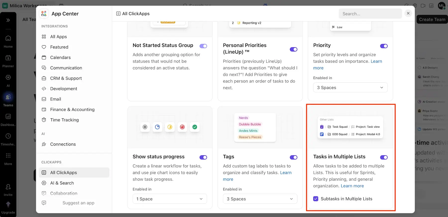
#8 ClickUp — best for cross-functional teams
ClickUp is a platform that supports tasks, docs, collaboration, time tracking, and resource management in a single workspace.
Why choose ClickUp?
Modern work rarely stays inside one department, and ClickUp balances flexibility with centralized visibility — crucial for cross-functional collaboration.
| Pros | Cons |
|---|---|
| – All-in-1 PM app – Strong workload view – Multi-list tasks | – Limited free plan – Slowdown in large workspaces |
To make planning more operational and less theoretical, ClickUp connects workloads, priorities, timelines, and more with features like:
- Workload view — there are 15+ views, one of which is Workload, allowing you to see your team capacity over time, choose workload units, set capacity limits, etc.
- AI features — ClickUp Brain can analyze tasks, timelines, and historical patterns to surface workload risks earlier or even evaluate multiple what-if situations, but this AI feature is a paid add-on ($9/user/month).
- Whiteboards — Whiteboards can also help with scenario modeling if you design multiple possible paths side by side, but this is definitely not advanced simulation software like Meisterplan.
Since there are many views, settings, automations, permissions, etc., it takes some time to establish consistency in ClickUp. Frankly speaking, at times, it feels like the product prioritizes feature exposure over interface quality.
While testing ClickUp, I got the impression it could be useful for cross-functional teams, considering:
- Tasks in multiple lists — a task can appear in several projects simultaneously, so different departments can all follow it from their own workflows while still sharing one source of truth for workload and progress.
- Centralized communication — files, docs, comments, and built-in chat reduce communication friction — an often underrated benefit for capacity planning.
- Dependency management — cross-functional planning is often blocked by information silos rather than workload volume, and dependencies in ClickUp let teams see how delays in one department affect the capacity and scheduling of another.
If you’re eyeing ClickUp’s free plan, I must underline some limitations, e.g., a maximum of 5 spaces and 3 whiteboards, only a Workload view trial, and very limited reporting.
One of the most common criticisms of ClickUp among user reviews online is that the app slows down in large workspaces. After my testing, I think the concern is legitimate. The app didn’t freeze completely for me, but it was sluggish at times when I didn’t even work with that much data, which can definitely be frustrating.
What’s new in ClickUp?
ClickUp has been expanding its AI features (Super Agents and Brain). In fact, Brain has been revamped and has become available in the mobile app. Moreover, ClickUp now supports baselines in the Gantt view to improve plan vs. reality comparisons.
Available for: web, macOS, Windows, Linux, iOS, Android
| Plan | Price |
|---|---|
| Free | $0 |
| Unlimited | $7/user/month* |
| Business | $12/user/month* |
| Enterprise | POA |
*billed annually

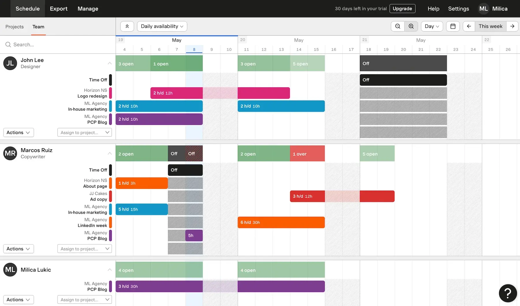
#9 Forecast — best for beginner-friendly planning
Forecast is a resource and capacity planning platform closely connected with Harvest, a popular time-tracking and invoicing tool.
Why choose Forecast?
This app promotes simplicity rather than all-in-1 philosophy, ideal for teams transitioning from spreadsheets to more intentional work planning software for the first time.
| Pros | Cons |
|---|---|
| – Intuitive UI – Tentative planning – Minimal setup required | – No free plan – Full potential locked behind the Harvest integration |
Forecast lets you understand team capacity without needing extensive setup or customization. The app has 3 tabs:
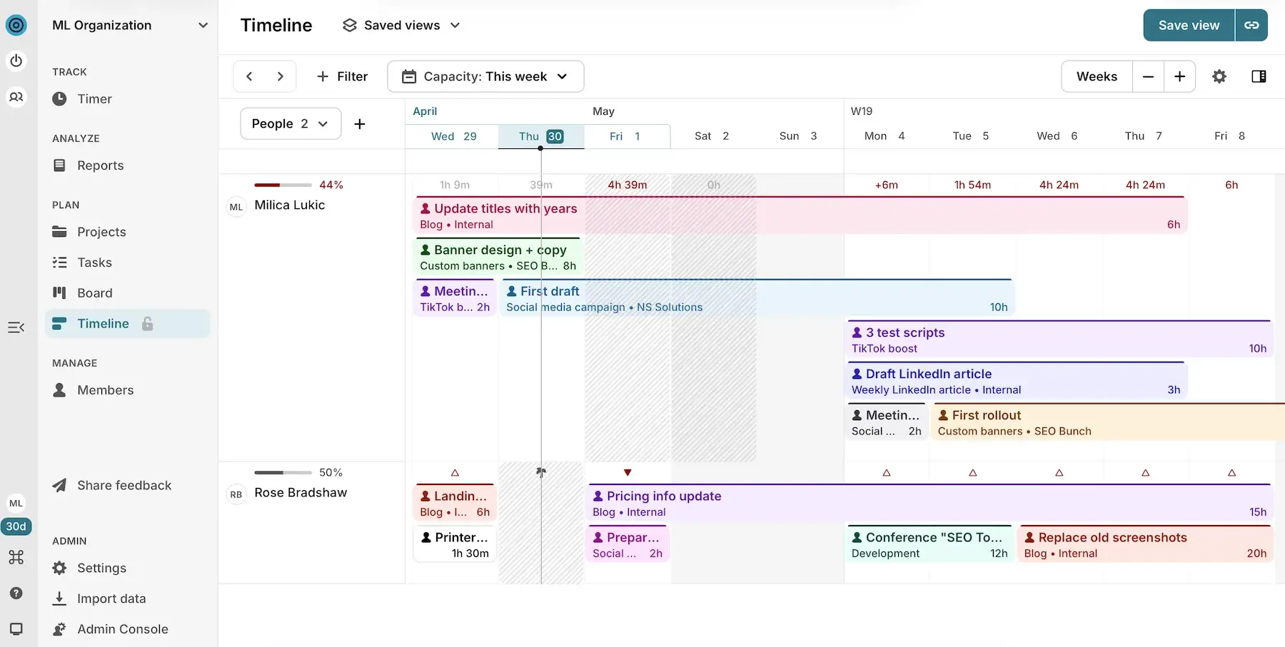
- Schedule — viewing project or team schedules on a timeline helps you understand staffing demands and everyone’s availability, overbookings, and time off.
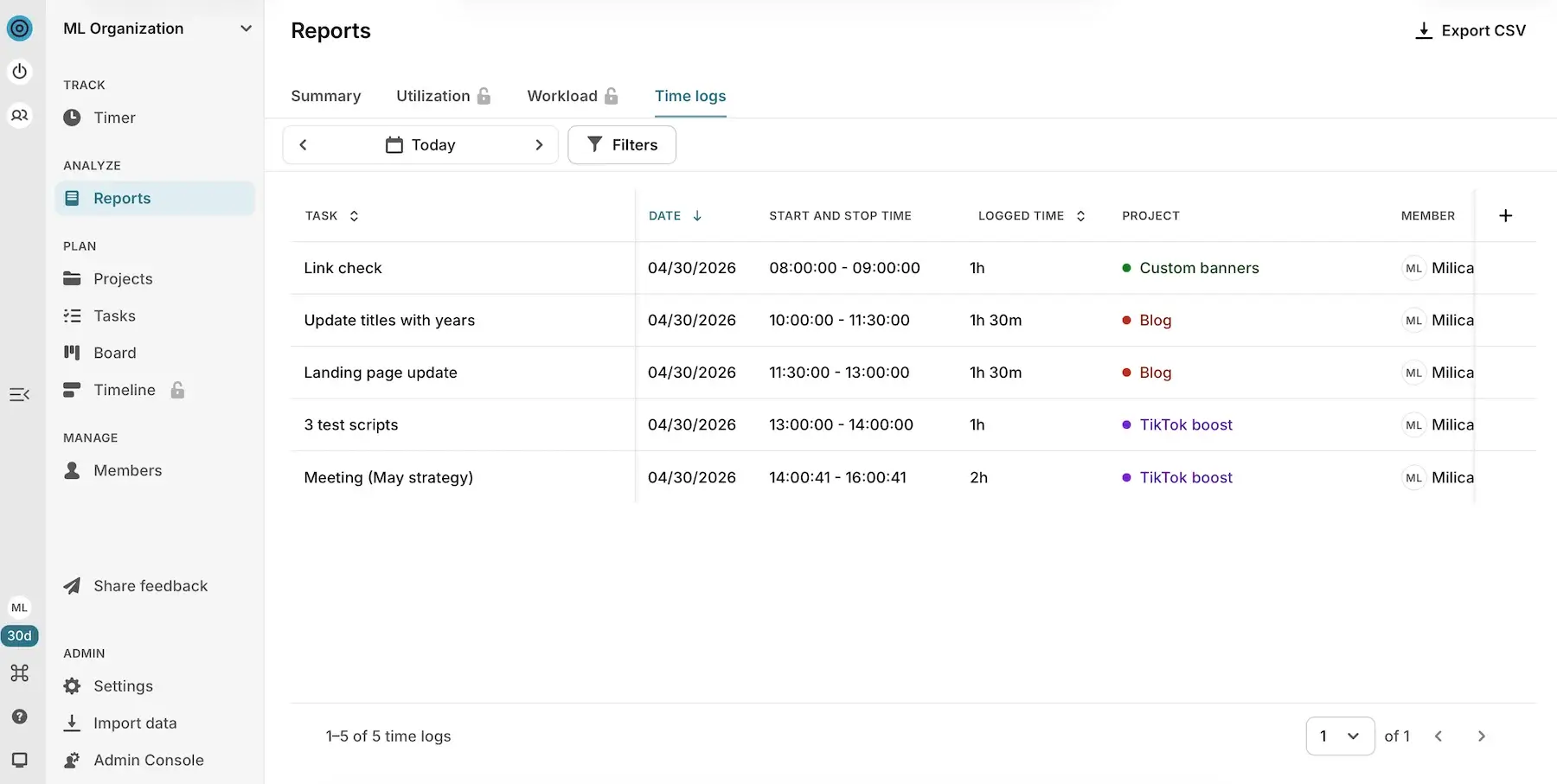
- Export — you can export weekly or monthly summaries of your project or team schedule to a CSV file, then share it with stakeholders or merge it with other data sources.
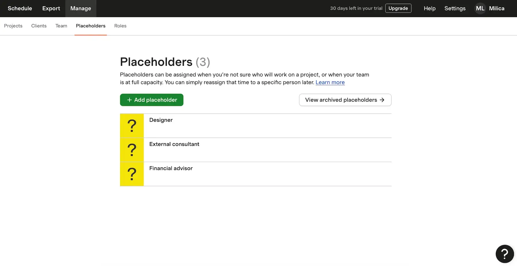
- Manage — this serves as your administrative hub, showing lists of Projects, Clients, Teams, Placeholders, and Roles — with some but not many descriptive fields for each of them.
As you can probably tell, compared to tools like ClickUp or Plaky, Forecast offers less workflow flexibility. So, teams with highly specialized processes may eventually feel constrained.
On the other hand, if you need beginner-friendly capacity planning, Forecast might be the way to go — here’s why:
- Simple interface — there’s no excessive feature clutter, which lowers the learning curve significantly.
- Immediate capacity visibility — Forecast does a good job highlighting who is swamped (excess hours in red), who can take on more (available hours in green), and who has time off (marked in black).
- Tentative planning — beginners often hesitate to make scheduling decisions too early, and this app helps with Placeholders — temporary slots for when you know you’ll need someone for a project but aren’t sure who specifically.
The good news is that, while Forecast charges per scheduled person, placeholders and archived users don’t count. But, the number of placeholders available only grows with your paid users total. And, unfortunately, there’s no free plan, but there is a 30-day trial.
Forecast works on its own, but during testing, I felt like a part of the product’s real value is locked behind its integration with Harvest. The platform becomes much more complete once it connects with tracked time, invoicing, and actual utilization data from Harvest (paid separately!).
What’s new in Forecast?
The biggest update in Forecast recently is task-level scheduling, enabling users to allocate time and resources to specific tasks within projects. There’s also been work on making financial reporting more standardized and easier to understand.
Available for: web
| Plan | Price |
|---|---|
| Annual billing | $5/person/month |
| Monthly billing | $6.25/person/month |
#10 Toggl Focus — best for scheduling with time data
Toggl Focus is a tool for optimizing productivity and time management. It combines elements of time tracking, focus sessions, and lightweight planning.
Why choose Toggl Focus?
This app integrates planning and time tracking naturally, ensuring your schedule reflects reality.
| Pros | Cons |
|---|---|
| – Real-time capacity awareness – Utilization and workload reports – Flexible time logging | – No capacity planning features in the free plan – Limited PM features |
After researching Toggl Focus, I didn’t expect it to compete with heavy-duty tools, but I found it could be useful for personal and small-team capacity visibility. Here’s what works well:
- Natural limit on overbooking — once the day is filled with tasks, there’s nowhere to hide extra work, which creates a built-in resistance to overcommitting.
- Board, Calendar, and Timeline views — you can look at work in 3 different ways depending on your needs and preferences.
- Utilization reports — once you know your typical utilization levels (what percentage of time goes toward billable work), it’s easier to predict how much real capacity exists in future weeks.
While there are some task management features (like deadlines, assignees, and priority labels), Toggl Focus doesn’t support deep task dependency tracking, advanced workflows, or robust collaboration functionality.
Where Toggl Focus stands out is scheduling based on time tracking. The best features include:
- Flexible time entry — you can use a running timer for live work, manual entries for when you forget to track, calendar sync for pre-planned days, or even Pomodoro-style focus sessions.
- Planned vs. tracked time — by using this feature consistently, you start noticing the type of work you systematically underestimate and get better at predicting how much you can realistically fit into a day.
- Marking non-working days — public holidays, vacation time, or days blocked for any other reason can be excluded from availability to reflect real working capacity instead of theoretical time.
Obviously, this entire system works only if you consistently track time. Otherwise, your data (and planning) becomes unreliable.
All in all, if your needs are simple and execution-oriented, Toggl Focus does the job. But, if you need something more complex and organizational, you’ll outgrow it very quickly.
I must also emphasize that, while there is a free plan, it offers nothing for capacity planning — flexible working hours, PTO, and individual-level capacity are all locked behind a paywall.
What’s new in Toggl Focus?
Toggl Focus hasn’t had any major updates lately — the past period was less about new features and more about making the app more stable through internal fixes and improvements.
Available for: web, macOS, Windows, iOS, Android
| Plan | Price |
|---|---|
| Free (up to 5 users) | $0 |
| Starter | $9/user/month* |
| Premium | $20/user/month* |
| Enterprise | POA |
*billed annually
What to look for in tools for capacity planning
It’s important to understand that not all capacity planning apps solve the same problems. Some are built for simple scheduling, while others focus on forecasting and high-level strategies.
In other words, the best choice depends on your team size and workflow complexity.
That said, I recommend paying attention to these factors:
- Resource visibility — workload and Gantt views with real-time availability updates
- Ease of use — a simpler and more intuitive interface rather than endless customization options
- Reporting and analytics — profitability insights, workload breakdowns, planned vs. actual time comparisons, etc.
- Pricing and hidden costs — cost-effectiveness, user limits, and feature restrictions
When testing platforms, I usually check whether there’s a native mobile app, but I didn’t see the lack of one as a major con in this case. Careful capacity planning isn’t something most people do on the go, and it’s much easier on a larger screen that accommodates multiple timelines and workloads.
In any case, I’d say it’s rare for all these aspects to be 100% ideal in a single tool. Luckily, most capacity planning solutions have free versions or at least free trials, so you can try them before officially subscribing.
💡 Plaky Pro Tip
Not ready to commit to capacity planning software? Check out these free spreadsheet-style templates:
Make capacity planning simple with Plaky by CAKE.com
Ultimately, any best-tool definition depends on what your team needs. After testing 10 tools used for capacity planning side by side, I kept coming back to one recurring idea: for many teams, the most effective solution is not necessarily the most advanced one, but the one people will actually use consistently.
And that’s exactly where Plaky stands out. Its balance of usability, task management, and workload visibility makes it a practical choice for teams that want structured capacity planning without overwhelming complexity.
And, in case you do need help with anything, our customer support team is available 24/7 for all users.
Keep projects balanced and workloads visible — get Plaky by CAKE.com for free!
How we reviewed this post: Our writers & editors monitor the posts and update them when new information becomes available, to keep them fresh and relevant.