Struggling to choose between ClickUp and monday.com? When it comes to picking a project management tool, making the right decision requires research and a detailed comparison.
Luckily, I’ve done the hard work for you and analyzed these 2 apps in terms of their main features and who they’re best for.
So, stop wondering, and find out how monday.com compares to ClickUp.

WHY TRUST US?
Human reviewers try out each app and follow strict guidelines while writing about the comparisons. We follow a transparent, clear, and systematic methodology, so that every review is objective and accurate.
What are the main differences between ClickUp and monday.com?
The main difference between ClickUp and monday.com is that ClickUp is more complex but, pricewise, flexible and affordable, while monday.com has a more user-friendly interface and a rigid pricing structure.
We’ll go into detail for every single feature, but here’s a quick side-by-side rundown of how they compare:
| Feature | ClickUp | monday.com |
|---|---|---|
| Pricing | Free plan Paid plans start at $7/member/month | Free plan Paid plans start at $9/seat/month |
| User interface | Cluttered | User-friendly |
| Task management | Advanced | Advanced |
| Project management | Multiple project views Whiteboards Dashboards Workload | Multiple project views Dashboards Workload |
| Team collaboration | Assigned comments Integrated chat | Updates section |
| AI | Add-on | Credits available |
| Integrations | 50+ native | 200+ native |
| Support | 24/7 support Chatbot Live chat Help center Knowledge base | 24/7 support Chatbot Live chat Help center Knowledge base |
| Security | Advanced | Advanced |
What’s new in ClickUp?
Recently, ClickUp introduced the following features:
- Slack automations — Notify channels or teammates when tasks are created, updated, or completed in ClickUp.
- AI-powered Dashboards — Automate project updates and summaries.
- Custom emojis — Personalize reactions and make your workspace a fun place.
- Scheduled dashboard reports — Configure to whom and how often you’d like to show your progress.
What’s new in monday.com?
New releases from monday.com include:
- GitLab integration — Keep track of merge requests and approvals without switching apps.
- Capacity planner — Get an overview of your team’s workload and availability.
- WorkCanvas data layers — Customize how you visualize board data.
💡 Plaky Pro Tip
If you’re looking for more comparisons of monday.com against its competitors, we already made a thorough research and review:
ClickUp vs monday.com: main features comparison
I’ll compare ClickUp and monday.com based on my personal experience with both apps and review the features they offer.
ClickUp’s pricing is more flexible
One of the first things anyone looks at when choosing between 2 products is their price. Here’s a side-by-side comparison of all the pricing plans of ClickUp and monday.com:
| Subscription plan | Paid annually | Paid monthly | ||
|---|---|---|---|---|
| ClickUp | monday.com | ClickUp | monday.com | |
| Free | $0 | $0 | $0 | $0 |
| Unlimited/Basic | $7/user/month | $9/user/month | $10/user/month | $12/user/month |
| Business/Standard | $12/user/month | $12/user/month | $19/user/month | $14/user/month |
| Pro | / | $19/user/month | / | $24/user/month |
| Enterprise | POA | POA | POA | POA |
Even though the prices are fairly similar, there are some crucial differences between the pricing models of ClickUp and monday.com. Generally speaking, monday.com offers an additional pricing tier when compared to ClickUp. In total, that gives us 5 monday.com’s pricing plans, while ClickUp offers 4.
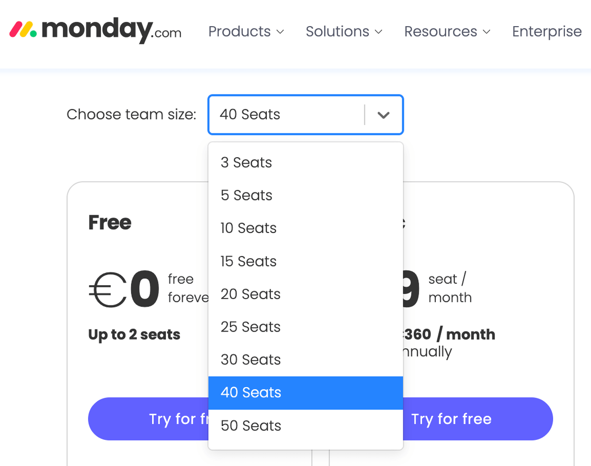
ClickUp doesn’t define team sizes, and you’ll pay for as many paid users as you invite. However, you can’t use monday.com’s paid plans for less than 3 users, and you pay in increments of 5 or 10 users, regardless of how many team members you have on your account. For instance, if you have 33 people on your team, you’ll still have to pay for 40. The pricing isn’t disclosed beyond this number, meaning you’d have to contact sales to find out how much the app would cost you.
When it comes to discounts for nonprofits, monday.com is more transparent with this information. It offers charities, nonprofits, and nongovernmental or social change organizations 10 free seats on its Pro plan and a 70% discount on extra seats. On the other hand, ClickUp does offer discounts to nonprofits and students, but you have to contact sales for details.
💡Plaky Pro Tip
Looking for the best project management tool for nonprofits? Read our article:
ClickUp’s free plan offers more task management features
If you don’t want to spend money on a PM app, you’ll be interested in what the free plans of ClickUp and monday.com have to offer beyond their free trials. Here’s a quick overview of the task management features and limitations of both:
| Feature | ClickUp | monday.com |
|---|---|---|
| Number of members | Unlimited | 2 |
| Storage | 60 MB | 500 MB |
| Activity log | 1 day | 1 week |
| Project views | List, Table, Kanban, Calendar | Table, Kanban |
| Tasks/items | Unlimited | 200 (up to 1,000 with referrals) |
| Automations | Limited | ❌ |
| Time tracking | ✔︎ | ❌ |
| Dependencies | ✔︎ | ❌ |
Obviously, ClickUp is more generous with their free plan and can be used for smaller projects or personal use. The only feature where monday.com beats ClickUp is the storage space, as it offers 500 MB compared to ClickUp’s modest 60 MB.
As for task management options in general, both ClickUp and monday.com offer basic and advanced features such as:
- Multiple project views,
- Custom task fields,
- Assigning tasks and setting a due date, and
- Creating recurring tasks.
Recurring tasks are a vital part of task management for any project manager as they cut manual work and often serve as reminders for some activities. These 2 apps let you create recurring tasks in different ways.
In ClickUp, all you have to do is open the date picker and add a recurrence if necessary. This feature is available on all ClickUp plans, including the free plan.
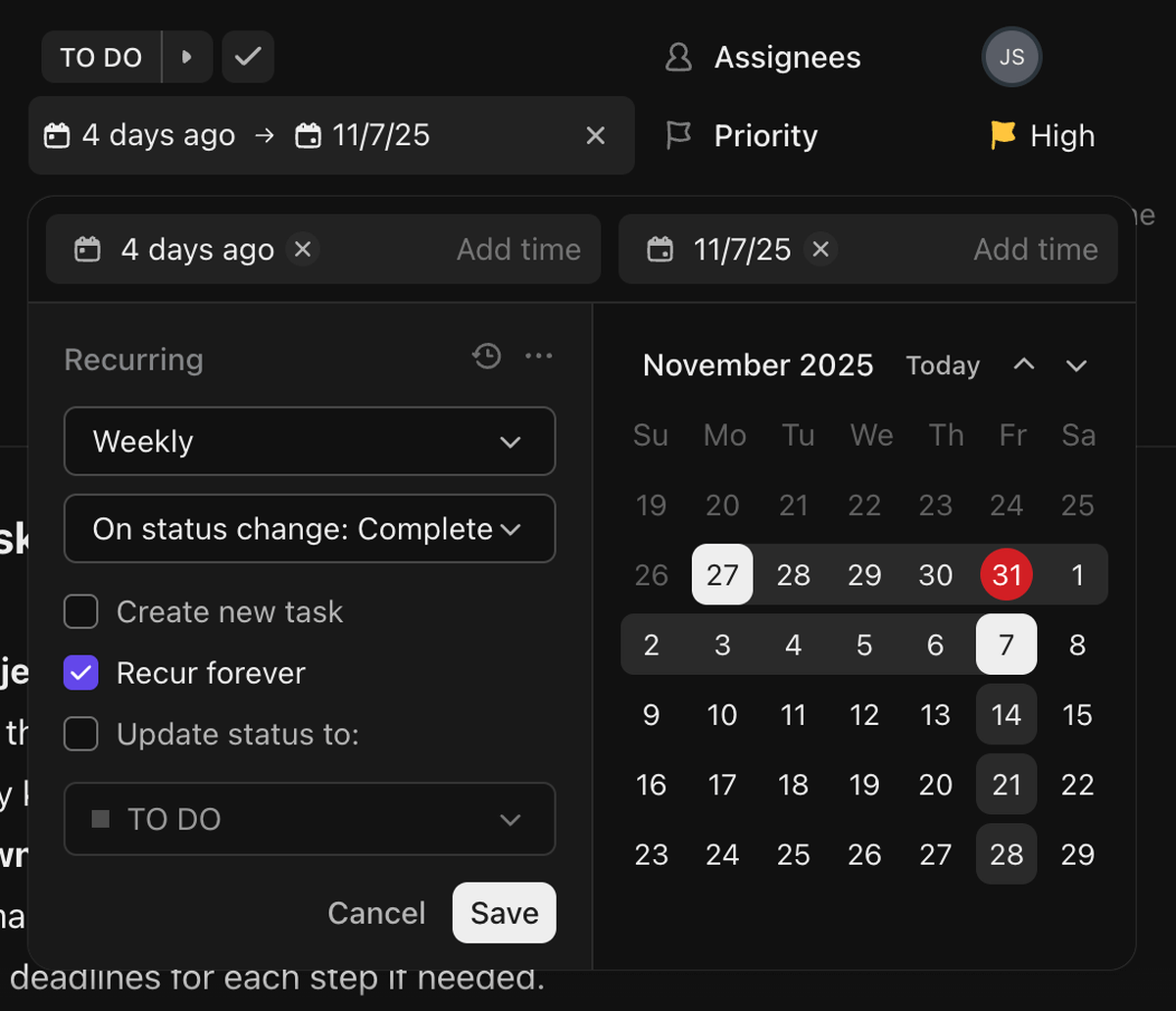
Monday.com, on the other hand, solves this through automations. You can create an automation that will repeat a task as needed. Automations, however, are not available on monday.com’s free plan.
Monday.com is easier to set up
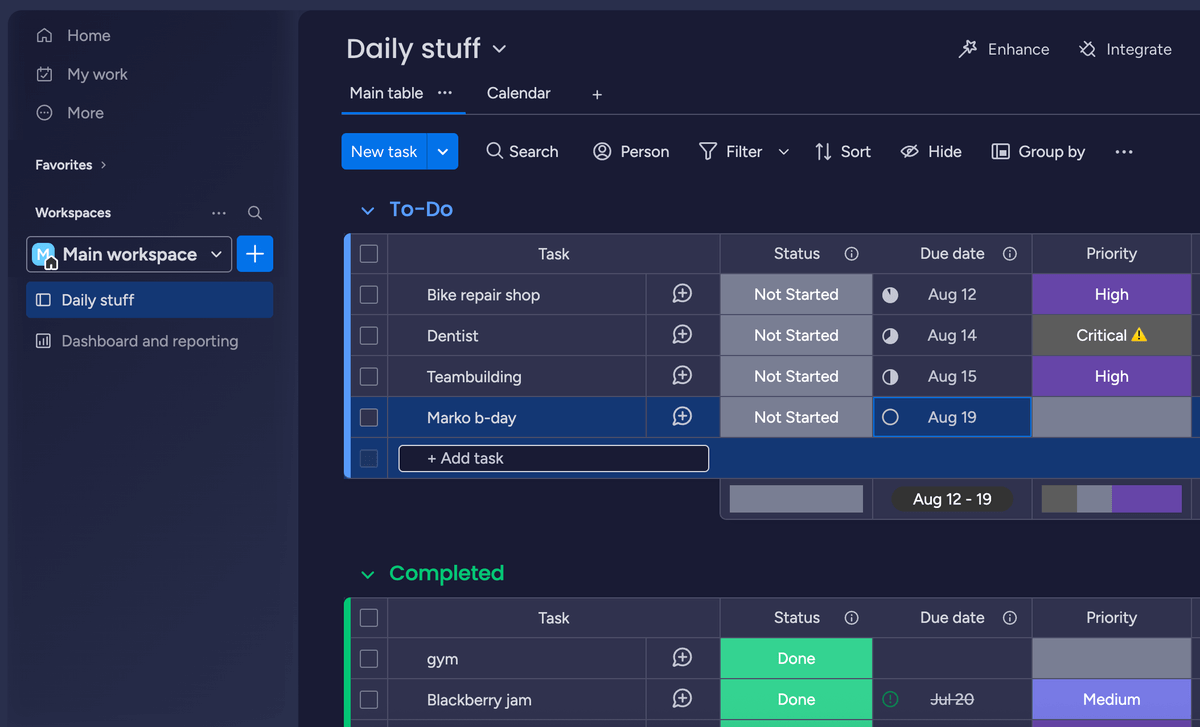
From the moment I opened these 2 apps, it was clear that monday.com’s interface is much more user-friendly than ClickUp’s. Even though the main focus of both tools is on task management and the feature set is similar, monday.com offers a much simpler interface, and it’s less intimidating to get a project started.
Monday.com displays only the essential options, which makes it much easier to set up.
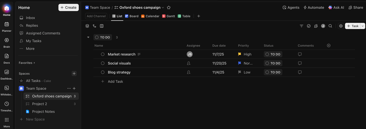
To compare, ClickUp’s workspace is not as pleasing to the eye. The cluttered look may be partially my fault as I checked almost all the feature boxes when I was onboarding the app. I had no idea they would all end up pinned on the menu on the left. This menu can be modified, though, and you can unpin features as you like, but I can’t shake the overwhelming feeling this interface is giving me.
Both ClickUp and monday.com offer advanced PM features
The list of options ClickUp and monday.com offer to view your projects is surprisingly long. Here are all the views they both provide:
- Table,
- Kanban,
- Gantt,
- Calendar,
- Doc,
- Form,
- Map,
- Timeline, and
- Dashboard.
ClickUp also includes a list view, mindmap, and whiteboards, while monday.com has a chart view as well. I have to add that ClickUp also offers more board views on their free plan. Specifically, unlike monday.com, ClickUp lets you use the Calendar view on their free plan.
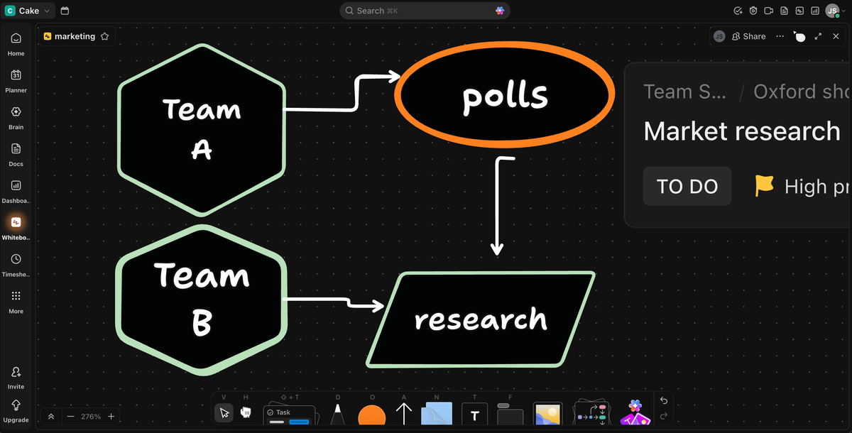
One of the great additions to ClickUp I found very useful is the Whiteboard feature that lets you draw on a virtual board, connect it with existing tasks, and illustrate your thoughts. This is a wonderful tool for remote teams and for brainstorming that eliminates the need to use other apps for the same purpose.
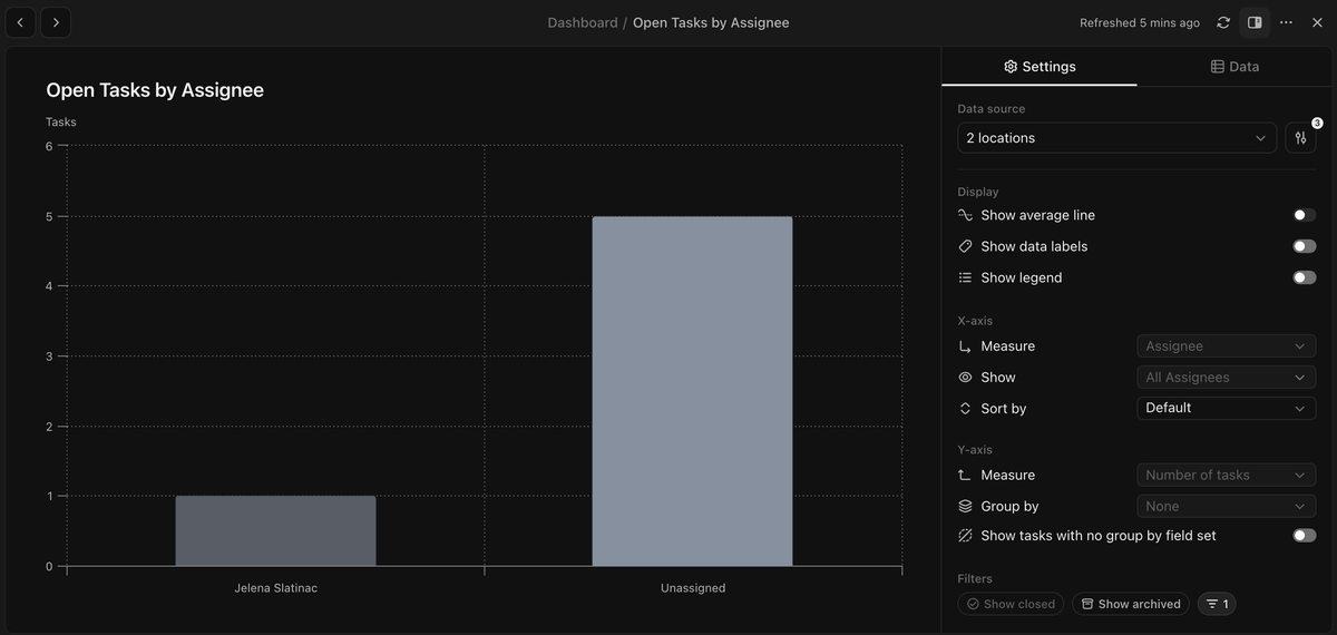
Both monday.com and ClickUp enable their users to closely track project and team progress through customizable dashboards that feature summarized results using pie and column charts.
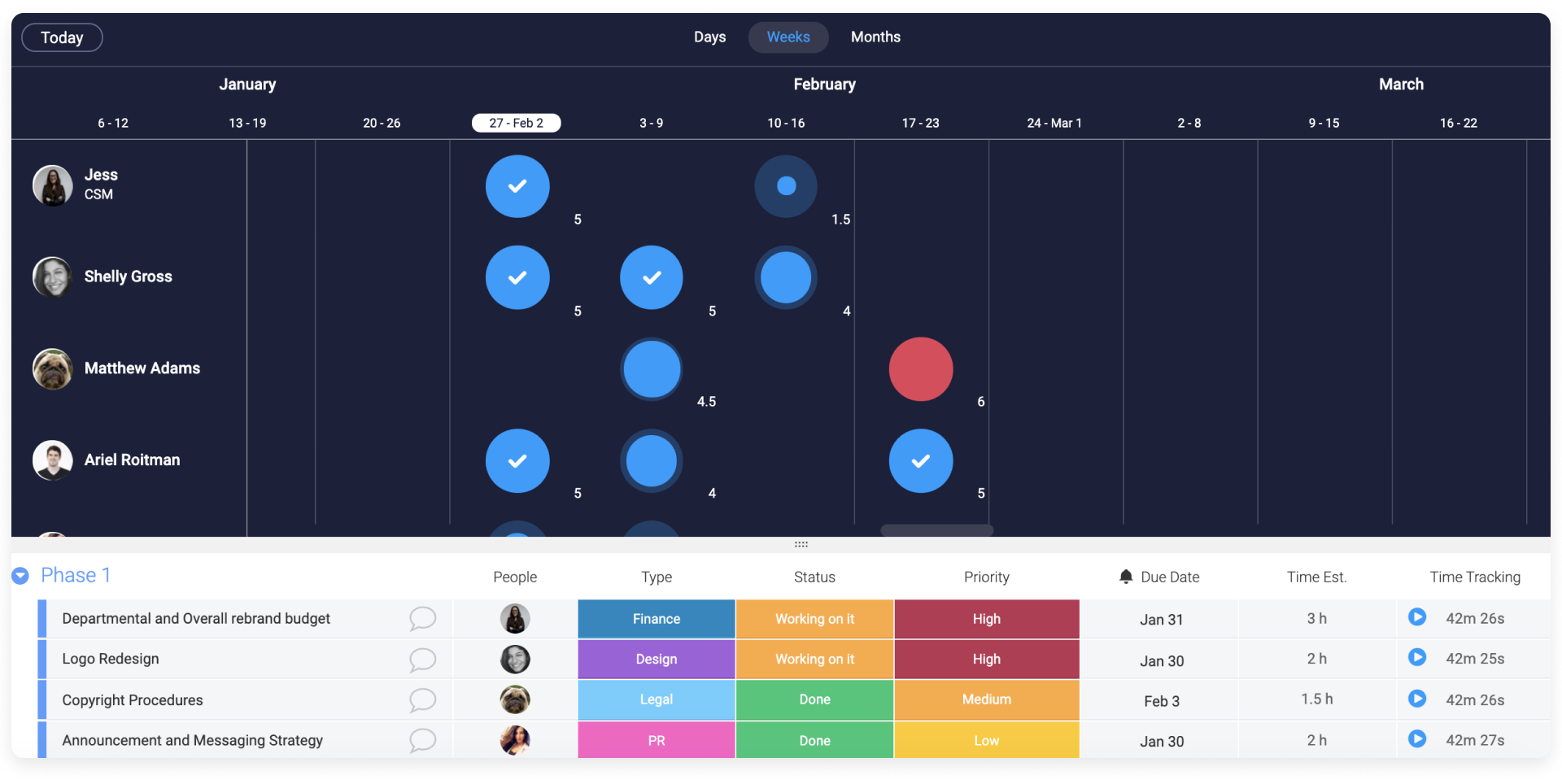
Another feature offered by these 2 apps that is very useful for managing resources and projects is the Workload view. It lets you see who’s available and who’s overwhelmed with tasks. With this overview, it’s easier to schedule assignments and plan ahead better.
💡 Plaky Pro Tip
Curious about how ClickUp compares to other apps? You’ll find detailed comparisons in these articles:
ClickUp is more transparent with its AI prices
Almost every task management tool has started adding AI features to their offer, and ClickUp and monday.com are no exception.
Monday.com includes AI on its Standard pricing plan and above, but sets the limit to 500 AI credits per month. You can purchase additional credits, but their price is not listed anywhere on monday.com’s website. After a little digging around, I found that additional 2,500 credits cost $200/month.
ClickUp manages its AI features differently. All paid plans are AI compatible, meaning you can purchase the AI add-on and expand your feature set. To compare, monday.com doesn’t include AI on its cheapest paid plan.
Here’s the overview of ClickUp’s AI pricing plans:
| Pricing plan | Yearly subscription | Monthly subscription |
|---|---|---|
| Free forever | $0 | $0 |
| AI Standard | $9/user/month | $14/user/month |
| AI Autopilot | $28/user/month | $33/user/month |
You can also purchase:
- The Talk to Text add-on for an extra $9/user/month — for voice dictation,
- The AI Notetaker for $12/user/month — for smart summaries and searchable transcripts, and
- AI Credits — $10 for 10k credits.
ClickUp offers integrations to all pricing plans
Both ClickUp and monday.com offer a high number of integrations with other apps that allow you to connect all the information you need.
Once again, we can see that monday.com excludes its free and Basic pricing plans from using integrations, while ClickUp offers its 50+ native integrations to all its plans, free or paid.

Monday.com has 200+ native integrations, but limits them across its more expensive paid plans in the following way:
- Standard plan — 250 actions/month,
- Pro plan — 25,000 actions/month, and
- Enterprise plan — 250,000 actions/month.

ClickUp has an integrated native Chat app
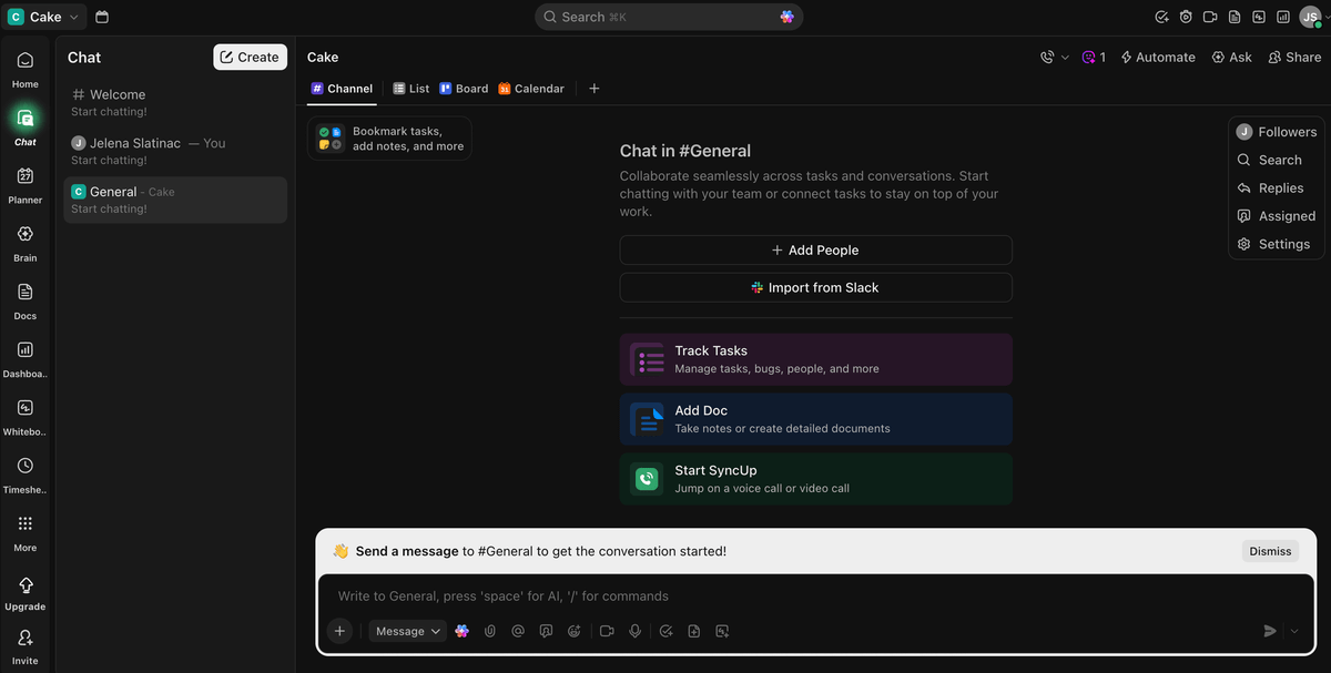
ClickUp integrates a Chat app where you can exchange messages with your colleagues without leaving the app and keeping all communication within one tool. On the free plan, you get a limited number of messages to try out the feature, but even on the cheapest paid plan available you get an unlimited number of messages.
Monday.com, on the other hand, offers integrations and third-party solutions for chatting with your team members. As already mentioned, these integrations are not available to users on the free or Basic plans.
Monday.com offers more educational materials for free
Both ClickUp and monday.com offer extensive documentation that helps its users learn how to use the app. This includes:
- Help centers,
- Lessons,
- Articles, and
- Guides.
As for customer support, both apps have chatbots that you can talk to and get answers to simple questions 24/7. To gain access to actual people, you need to be subscribed to one of the paid plans.
Monday.com also presents daily live webinars to all their paid plans, but only Enterprise users can get a dedicated customer success manager. ClickUp’s live webinars cost $249, and technical support is available to paid plans via email.
Both ClickUp and monday.com offer similar security features
ClickUp and monday.com both offer 2-factor authentication and SOC 2 certification on all plans. All other security features are available only to higher paid tiers. Starting from cheaper plans, let’s break down ClickUp’s option first and then do the same for monday.com.
ClickUp’s Business users get:
- Required 2-factor authentication, and
- Google single sign-on (SSO).
ClickUp’s Enterprise accounts get all the available security features:
- US, EU & APAC Data Residency,
- Microsoft, custom SAML, and Okta SSO,
- HIPAA compliance, and
- SCIM provisioning.
Enterprise users also get more control over their data with:
- Custom roles and permissions,
- Private spaces,
- Session Management,
- Guest restrictions, and
- Restricted public sharing.
Now, let’s explore monday.com and their offer. The free, Basic, and Standard plans are excluded from any additional features apart from the ones mentioned above. So, let’s take a look at the 2 top paid plans.
Those who are subscribed to the Pro plan get:
- Private boards and docs,
- Board administrators, and
- Google authentication.
Enterprise users, however, get many more features:
- Okta, One login, Azure AD, Custom SAML SSO,
- HIPAA compliance,
- IP restrictions,
- SCIM provisioning, and
- Panic mode.
As for data control, monday.com’s Enterprise accounts also get:
- Advanced account permissions,
- Private workspaces,
- Session Management, and
- Audit log.

What’s better: ClickUp or monday.com?
It’s hard to reach the final verdict in the ClickUp vs monday.com battle without making a distinction between different use cases. No app is perfect for everyone, so I broke down the benefits for these 3 groups of users:
- Developers,
- Marketing teams, and
- Small businesses.
ClickUp vs monday.com for developers
When looking for a tool to organize their work, software development teams concentrate on those apps that offer a way to sort their ticketing system and track sprints.
ClickUp solves all these demands with pre-designed templates and detailed instructions on how to use them. It also offers burndown and burnup, cumulative flow, and velocity charts to track your team’s progress.
Monday.com proposes development teams use their product monday dev. It relies on AI for categorizing bugs and summarizing documentation. Monday dev also includes sprint boards, roadmap tracking, and capacity planning. The pricing starts at $9/user/month when paid annually, but just as monday.com’s pricing, it requires a minimum of 3 seats.
ClickUp vs monday.com for marketing teams
Marketing teams depend on timely communication and coordination. This means they need many ways to communicate and a space to organize different roles clearly.
Following that thought, here’s what monday.com offers:
- Simple UI — Overview project activities and progress at a glance.
- Mirror columns — Check the status of connected tasks without switching boards.
- Capacity planner — Make sure no one on the team is overloaded with tasks.
On the other hand, ClickUp is no loser in this category as it offers:
- Integrated Chat — Communicate with your team in the same space you manage your work.
- Whiteboards — Brainstorm ideas and take visual notes.
- Task dependencies — Keep your project workflow coordinated even on the free plan.
- Unlimited storage on all paid plans — Feel free to upload as many files as you need.
ClickUp vs monday.com for small businesses
Small businesses are mostly focused on satisfying project stakeholders and being as cost efficient as possible.
Both apps offer project management features that I already talked about, which provide a great space for small businesses to organize their workflow and accomplish goals on time.
Now, the smaller the business, the more important the price of the tool they’re choosing is. So, let’s compare the lowest possible prices of ClickUp and monday.com for teams of 10, 20, and 30 people in total:
| Team size | ClickUp Unlimited (annually) | monday.com Basic (annually) | ClickUp Unlimited (monthly) | monday.com Basic (monthly) |
|---|---|---|---|---|
| 10 | $70/month | $90/month | $100/month | $120/month |
| 20 | $140/month | $180/month | $200/month | $240/month |
| 30 | $210/month | $270/month | $300/month | $360/month |
It’s obvious that ClickUp is the more affordable option, and considering that it’s also not as rigid with team sizes as monday.com, it could be a better option for teams that are just starting out.
Looking for an easy-to-use alternative to ClickUp and monday.com? Try Plaky by CAKE.com
Plaky is a project management tool that helps businesses stay on track with their work and increase their productivity. If you find ClickUp too complicated and monday.com too expensive, Plaky could be a great alternative to both.
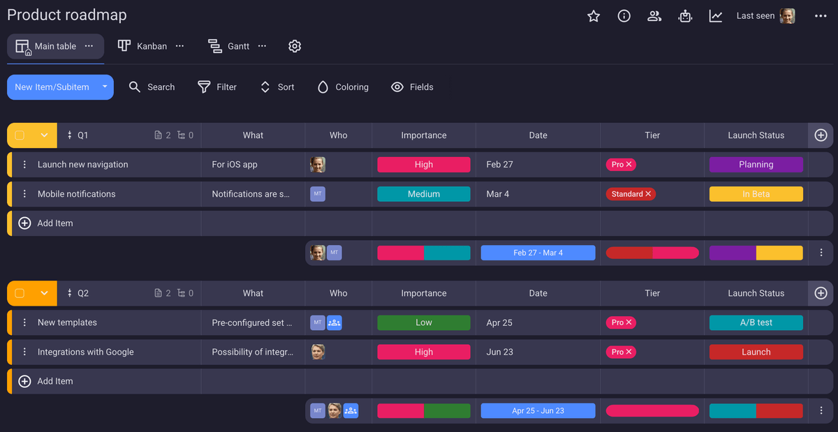
Plaky also offers a simple and user-friendly interface, making it a great monday.com alternative. In Plaky, you can:
- Track projects on boards,
- Invite an unlimited number of team members,
- Automate your processes, and
- Overview your upcoming tasks.
All this at a fraction of monday.com’s price. Plaky’s paid plans start at only $3.99 per user per month and — unlike in monday.com — you don’t have to pay for more users than you actually invite.
If you prefer visual comparisons, we made a video that puts Plaky side-by-side with monday.com:
Plaky is also an easy-to-use ClickUp alternative, especially if you need a clean interface, an unlimited number of spaces, and unlimited storage. You can also:
- View your projects on a Gantt chart,
- Create custom fields to adapt a board to your needs, and
- Give appropriate permissions to different user roles.
Transfer your ClickUp data to Plaky
You don’t even have to make your boards from scratch as you can kick off with one of the project management templates available in Plaky’s template center.
Still not sure? Here’s a quick comparison of the monthly total you’d spend for 3 members if you choose the least expensive option of each app:
| Team size | ClickUp (Unlimited) | monday.com (Basic) | Plaky (Pro) |
|---|---|---|---|
| 3 users | $21/month* | $27/month* | $12/month* |
*billed annually
Quit waiting and start organizing! Plaky’s 7-day free trial is one click away!

