A Gantt chart is an indispensable tool for any project manager who needs to have a simple and intuitive overview of their project. It’s extremely useful when it comes to providing insight into the project schedule and task dependencies.
In this article, I’ll provide a step-by-step guide that will help you create a Gantt chart in Microsoft Excel. You’ll also find a comprehensive free template you can use to set up a Gantt chart faster.

Making a Gantt chart in Excel
There are several ways you can make a Gantt chart in Microsoft Excel, and you will find a step-by-step guide for each method below.
Method #1: How to make a basic Gantt chart in Excel
A basic Gantt chart in Excel is easy to make, and it can be used for tracking project tasks and project milestones without being cluttered with any but the most important information.
Step #1: Create a table
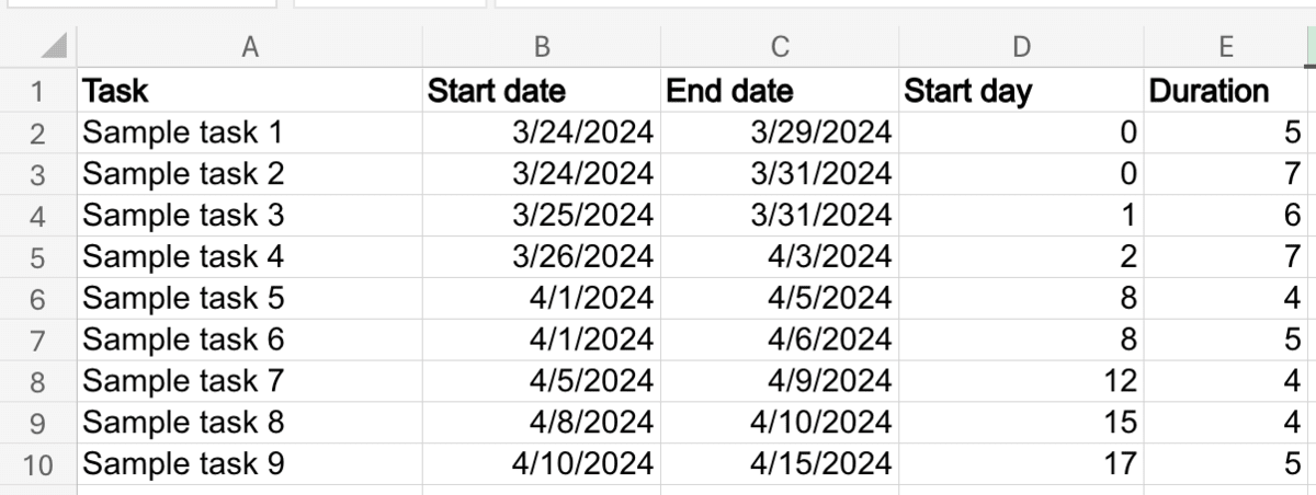
First, you need to create a table with the following data:
- Task,
- Start date,
- End date,
- Start day, and
- Duration.
Column A should be formatted as Text, and columns B and C should be formatted to show dates.
Now, you can add tasks and specify start and end dates for each task.
Step #2: Calculate task start days and duration
Excel can’t generate a Gantt chart based on dates alone, so the next step is to determine the start day of each task relative to the start of the project, as well as the duration of each task.
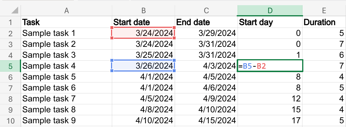
To calculate the Start day of a task, use a formula to subtract the start date of the project from the start date of the task. To start, double-click D2 (the first cell in the Start day column) and type in the following formula:
=B2-B2
Repeat this process for each row in the D column, as pictured below.
Once you’ve added the formula several times, you can use AutoFill to complete the column. If this feature isn’t working or is not available in your version of Excel, you’ll have to do it manually.
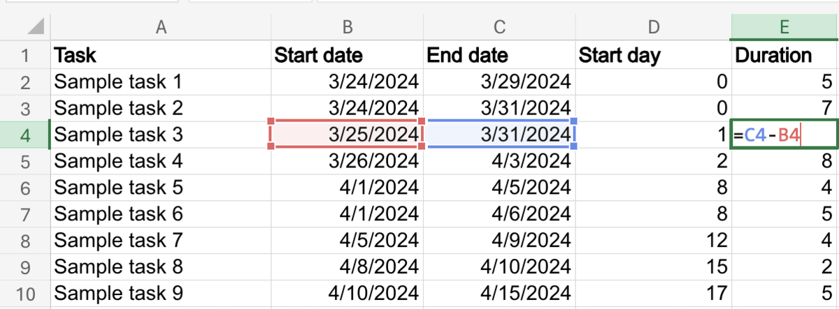
Next, calculating the duration of each task is just as simple, as you need to subtract the task’s end date from its start date.
To start, double-click E2 and type in the following formula:
=C2-B2
Repeat this for each task, as seen in the image below.
Step #3: Insert a stacked bar chart
Next, it’s time to insert the actual chart.
First, select columns A, D, and E.
Then, go to the Insert tab, click the Bar button in the Charts section, and choose the stacked bar chart.
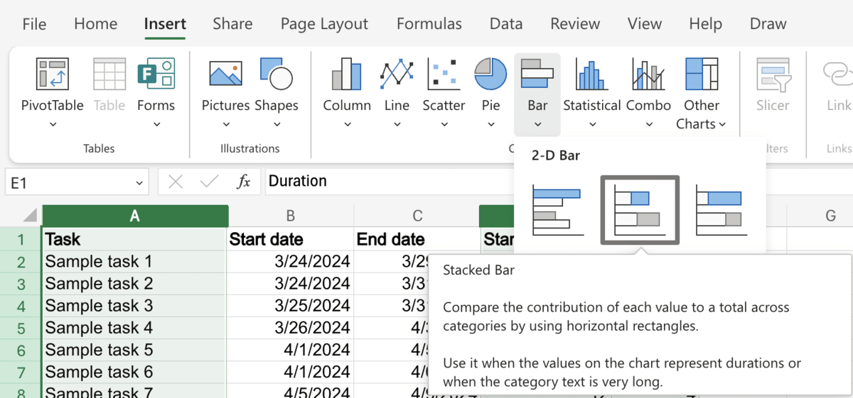

Step #4: Format the bar chart
Now, all you need to do is format the bar chart to make it look like a Gantt chart.
To do this, simply click the Start day bar in the chart (which should be dark blue by default), click the Fill Color button in the Home tab or by right-clicking the bar, and choose the No Fill option.
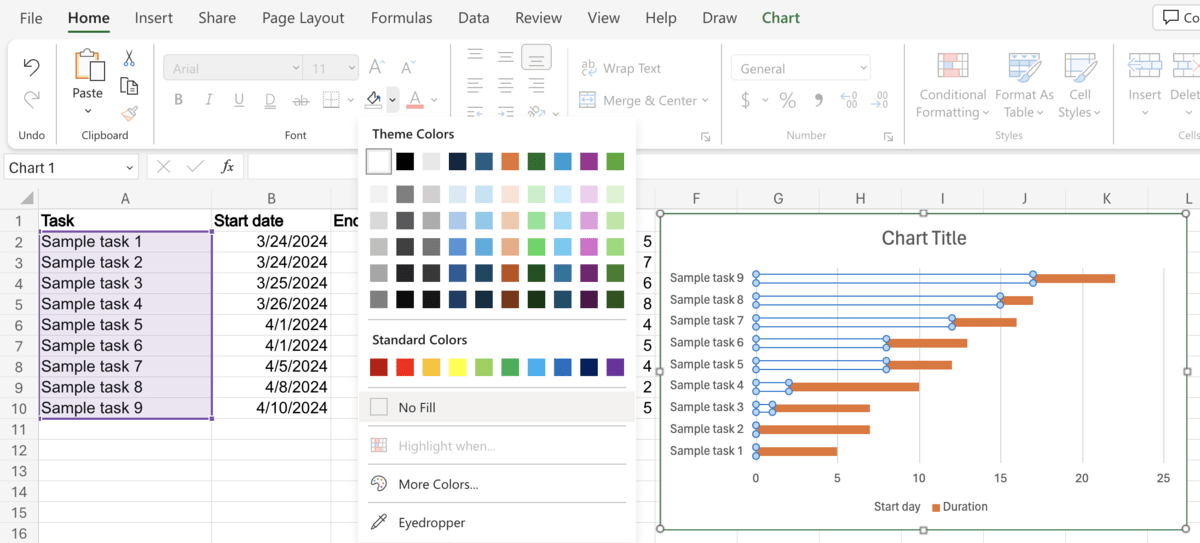
Finally, right-click the chart, select Format, and click the Vertical Axis category in the menu that opens up. Tick the checkbox next to Categories in reverse order to reverse the order the tasks are listed in.
With that, you have successfully created a basic Gantt chart in Excel.
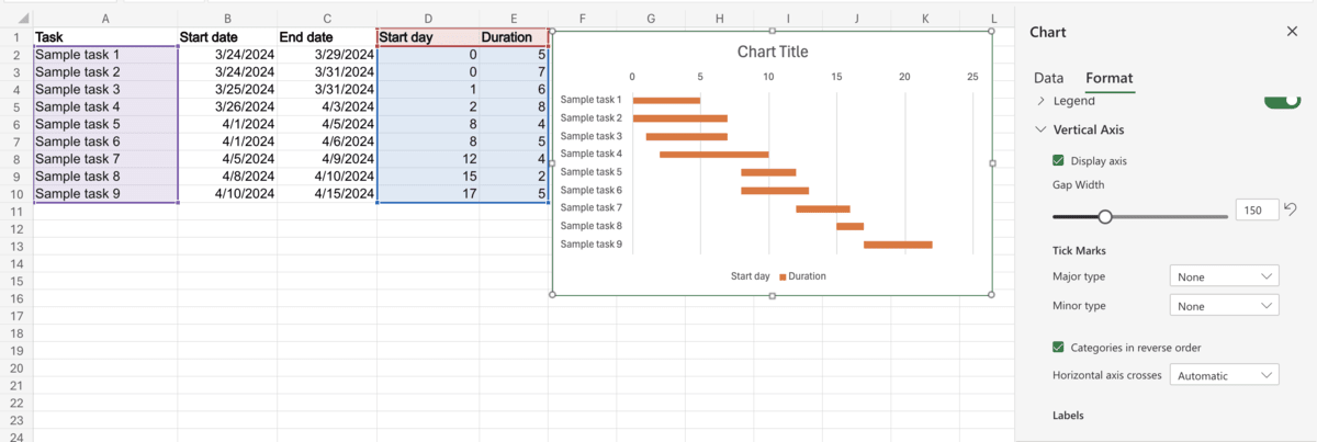
You are also free to customize the chart further in the Format menu and tweak it until it suits your needs and preferences.
💡Plaky Pro Tip
If you’re currently looking for a tool to help you track tasks more accurately, you should take a look at the article below:
Method #2: How to make an advanced Gantt chart in Excel
If you need a Gantt chart with more options for more precise project management, here’s how to make a chart that includes progress tracking.
Step #1: Create a table
Similar to the simple chart, the first step is to create a table that includes the following information:
- Task,
- Start date,
- End date,
- Duration,
- Start day, and
- Progress.
The first 5 points are set up the same way as with the basic chart above.
Next, create the Progress column.
Left-click column F to select all cells, then right-click it and select Format cells. In the new menu that opens up, select Number, and then select Percentage from the drop-down menu.
After this, the Decimal places box will appear underneath, and you can specify how many decimal places the cell should show.
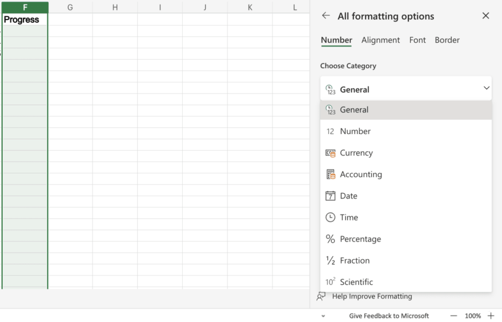
Step #2: Calculate completed days and remaining days
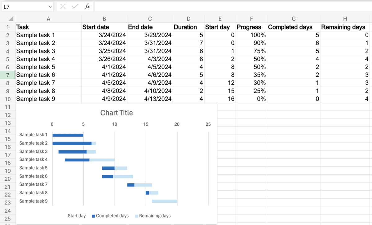
Now, it’s time to add the Completed days and Remaining days columns so that the chart can reflect task progress.
To track completed days, start by adding the following formula to column G:
=IF((C2)=””,””,(D2*F2))
The first value is the end date, the second is the duration, and the third is the task progress.

Next, in column H, add the following formula:
=IF(G2=””,””,(D2-G2))

Step #3: Insert the stacked bar chart
When creating the stacked bar chart, select the following columns:
- Task,
- Start day,
- Completed days, and
- Remaining days.
With the columns selected, simply go to the Insert tab > Bar > Stacked Bar.
Step #4: Format the chart
To format the bar chart to look like a Gantt chart, first right-click the chart, select Format, and under Vertical Axis, tick the box next to Categories in reverse order.
Then, right-click the bar showing data from the Start day column, click the arrow next to the Fill button, and choose No Fill.
Do the same for the Completed days and Remaining days bars, and choose colors that fit your preference.
I prefer dark blue for completed days and light blue for the remaining days, as it’s easy on the eyes and creates the impression of a bar filling up.
💡Plaky Pro Tip
Looking for some additional advanced templates for Excel? One of the following articles might pique your interest:
Method #3: How to create a manual Gantt chart in Excel
If you want a simpler, more direct, and more intuitive way to manage your project, you can create a manual Gantt chart. With this chart, there aren’t many formulas to worry about, and it’s all quite straightforward.
Step #1: Create a table
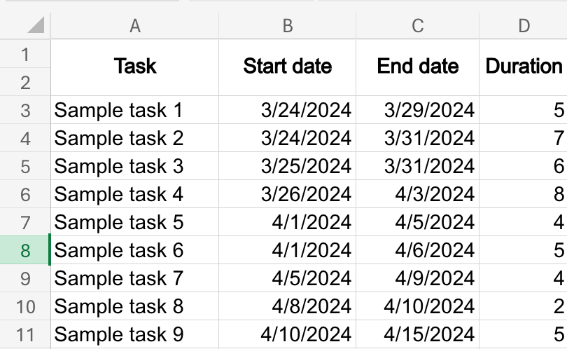
As before, the first thing you need to do is create a table with the following data:
- Task,
- Start date,
- End date, and
- Duration.
This time, merge cells A to D vertically in rows 1 and 2, as seen below, as we’ll need 2 rows to create the calendar.
Step #2: Create the calendar
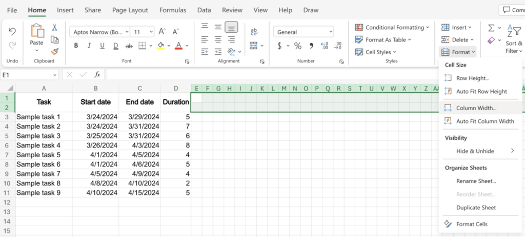
To create the calendar, start by formatting columns E and onward. To do this, simply select the entirety of row 1 and then deselect columns A-D.
Click the Format button in the Home tab and select Column Width from the dropdown menu, and type in 2.5 as the new width.
Starting in E2, begin entering dates from the start date of the first task. However, only enter the day in the unformatted cell, not the month and year.
This can be done quickly with AutoFill, but if you’re using a version of Excel that doesn’t support AutoFill, you can manually insert numbers 1 through 31, then copy-paste the selection for each month and delete the extra days for shorter months.
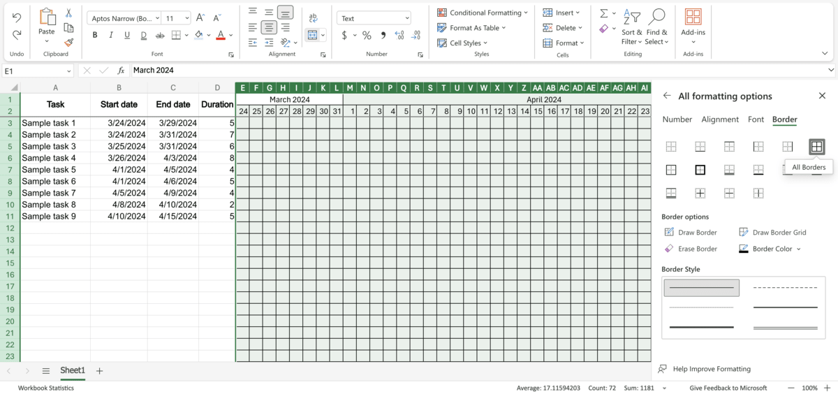
Finally, merge the row 1 cells corresponding to each month, and specify the month and year as pictured below.

Step #3: Add borders to the table
To give the table a clearer outline, select all columns from E and onward, just like before. Right-click the selection and click Format Cells.
From here, select Border, and pick the All Borders option.
Finally, to make sure the title bar and the days/months are always visible — select row 2, go to the View tab, click the Freeze Panes button, and then click Up to row 2.
Step #4: Add tasks to the chart
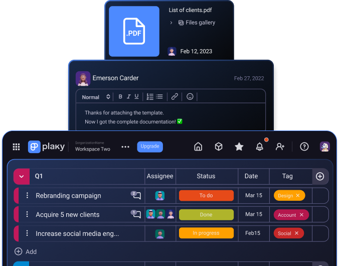
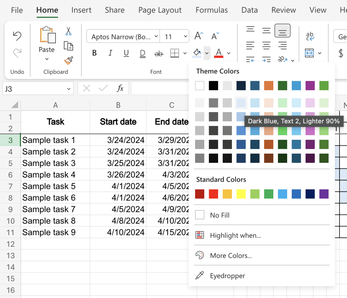
To add tasks to the chart, simply select cells corresponding to the task’s specified start and end dates.
Then, click the downward arrow next to the Fill Color button on the ribbon and choose whichever color you wish to use.
💡Plaky Pro Tip
Looking for an Excel alternative? Check out our selection of the best tools to consider in 2025:
Plaky Gantt template in Excel
If you’d prefer to get started quickly and skip the hassle of setting a Gantt chart up in Excel yourself, you can try out the template below:
Plaky Gantt Chart Excel Template
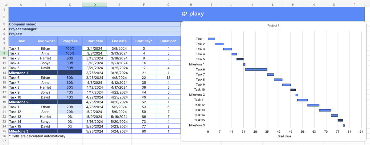
This template includes multiple sheets with all 3 types of Gantt charts we’ve mentioned here:
- Basic,
- Advanced, and
- Manual.
Moreover, the basic and advanced templates come in both single-project and multi-project variants.
💡Plaky Pro Tip
Need a more user-friendly alternative to Excel? Here’s a comprehensive guide on making a Gantt chart in Google Sheets, too:
Pros of using Excel for Gantt charts
If you’re wondering whether Excel is the best software for Gantt charts, here are the main benefits it brings to the table.
Benefit #1: Flexibility
Spreadsheets provide a great deal of flexibility, and it’s precisely why spreadsheet apps such as Microsoft Excel and Google Sheets are so widespread and used for a wide variety of tasks across different industries.
Benefit #2: Free web app
A web-based version of Microsoft Excel is available for free as part of the Microsoft 365 suite. While it doesn’t have the full feature set of the desktop version, it has all the features necessary to set up a Gantt chart.
Cons of using Excel for Gantt charts
On the other hand, here are some notable drawbacks when it comes to using Excel for Gantt charts.
Drawback #1: Steep learning curve
Getting used to Excel’s functions and advanced features can take time, and this can make the program particularly unappealing for those who aren’t quite tech-savvy.
Drawback #2: Not optimized for Gantt charts
As you can tell from this guide, Excel doesn’t actually have native support for Gantt charts. As such, it’s simply not as efficient nor as intuitive as specialized software that comes with Gantt functionality built in.
Drawback #3: Increased risk of error
A lot of formulas need to be set up manually in Excel. This, combined with limited automation, means there’s a significantly higher risk of error. This can lead to setbacks, and identifying the error can take a lot of time on its own.
Drawback #4: Limited collaboration
Many versions of Microsoft Excel have been released over the years, and this creates lots of potential compatibility issues that make project collaboration more difficult.
For example, a Gantt chart made in Excel 2021 might not show up properly in Excel 2016 or Excel 2013. Moreover, document sharing and real-time collaboration can also be complicated for those using the desktop version of the app.
Plaky by CAKE.com — the better way to use Gantt charts
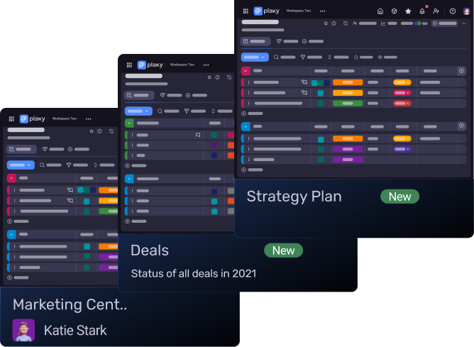
Plaky offers a much simpler and more straightforward way to generate and manage Gantt charts. Here’s a quick guide on how to set up a Gantt chart in Plaky.
Step #1: Create a project board
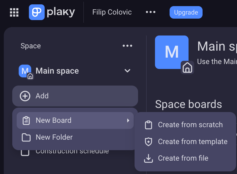
After creating a Plaky account, the app will take you to your main Space. Here, click the Add button to create a new board.
Boards can be created from scratch, or you can use one of Plaky’s many project management templates.
Step #2: Set up your project
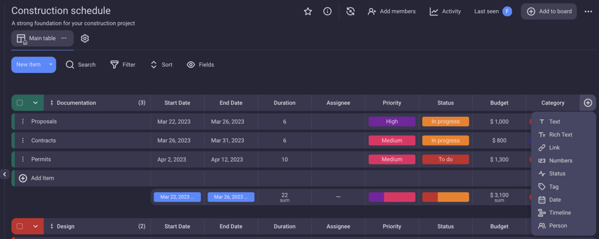
Once the board is created, you can add all relevant project data, including:
- Tasks,
- Start dates,
- End dates,
- Task duration,
- Assignee,
- Priority,
- Budget, and more.
You can add new fields to the board, much like you can add new columns in Excel. Doing this is as simple as clicking the plus icon at the end of the row, as seen below.
Moreover, you can easily filter your project view, sort tasks by whatever parameters you need, and even hide certain fields to create a clearer overview of the project.
Step #3: Add a Gantt view
The table view is the default view in Plaky, but creating a Gantt chart is much simpler than in Excel.
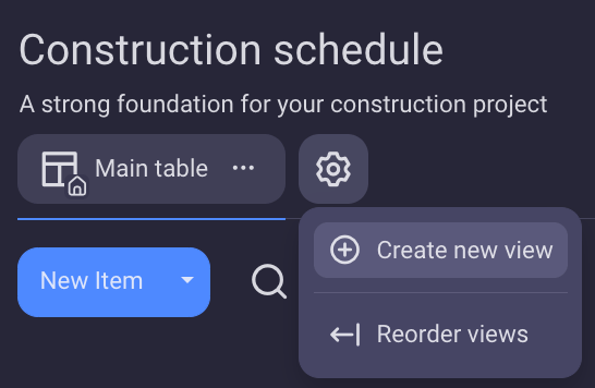
To do it, click the cog icon next to the Main table button, and select Create new view.
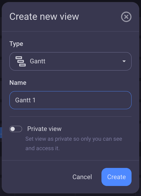
In the new menu that opens up, click Choose view type, and select Gantt. Here, you can give the view a custom name, and choose whether to make it private.
The app will then automatically generate a fully interactive Gantt chart with no additional input required on your part.
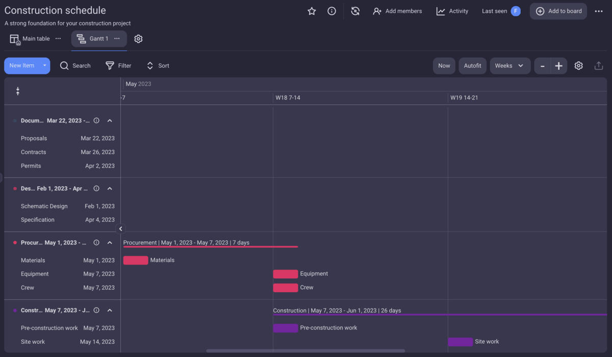
Step #4: Customize the Gantt chart
With the Gantt view set up, you’re free to customize it.
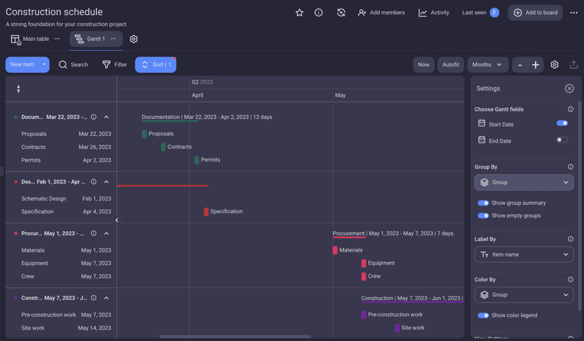
Like with all other view modes, you can search the board, as well as filter and sort items in ascending or descending order based on data in the fields.
Moreover, you can compress the chart to only show item groups, which is quite useful when managing multiple projects.

More importantly, you can easily adjust the project timeline based on the length of your project. The view modes you can select here include:
- Days,
- Weeks,
- Months,
- Quarters, and
- Years.
For added convenience, you can click the Autofit button and the app will select the optimal option based on the length of your project automatically. Meanwhile, the Now button will take you to the current date.
You can see a brief overview of all other customization options in the image below:
💡Plaky Pro Tip
If you’re unsure whether you should use a project management tool or Excel for organizing your workflow, read the following article:
FAQ
How do you make a Gantt chart for beginners?
To create a simple Gantt chart in Excel, you need to create a task table, determine start and end dates for each task, calculate each task’s start day relative to the start of the project, as well as project duration. Then, you need to insert a bar chart, remove the color for the start day bar, and flip the vertical axis.
Is there a free Gantt chart template in Excel?
Yes, Microsoft offers a basic free Gantt chart template for Excel. You can also use a more advanced free template provided by Plaky.
How do I make a Gantt chart in Excel without dates?
If you’re wondering how to make a Gantt chart in Excel without dates, you can simply exclude start and end dates from the table and set up the start day and duration for each task manually.
Say goodbye to errors and say hello to automation — try Plaky by CAKE.com for free
There’s no denying that Excel is a powerful and versatile tool that we just couldn’t do without. However, as it usually goes, a jack of all trades is a master of none. So, while Excel can be used to create Gantt charts, it’s simply not the best tool for the job.
Plaky by CAKE.com was designed to be a comprehensive project management tool with a strong feature set, intuitive interface, and maximum ease of use. There’s very little manual setup required, and you can rest assured you won’t be hunting for errors in your formulas or having trouble sharing the chart with coworkers.
Do you think Plaky by CAKE.com is the right choice for you? There’s only one way to find out. Sign up for a 14-day free trial and try Plaky today.
