If you need a high-level overview of your project activities and schedule, there’s hardly a better tool to opt for than a Gantt chart.
In case PowerPoint presentations are a staple in your day-to-day work too, read on to learn how to build a Gantt chart in PowerPoint — or just use one of our free Gantt chart PowerPoint templates.
How to make a Gantt chart in PowerPoint
There are 2 types of Gantt charts you can make in Microsoft Office’s PowerPoint:
- A manual Gantt chart, and
- A stacked bar Gantt chart.
Let’s go through the steps for each method in detail.
Method #1: A manual Gantt chart
One of the easiest ways to make a Gantt chart in PowerPoint is to use the app’s table functions.
To make a manual Gantt chart in PowerPoint, you should:
- Insert a blank table,
- Make the timeline,
- Add project tasks,
- Map the project activity, and
- Add milestones, dependencies, and a time indicator.
Step#1: Insert a blank table
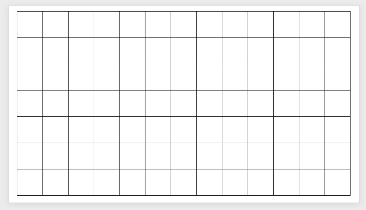
In a blank slide, go to the top left corner of the app and select Insert > Table > Insert Table. Insert a table with 13 columns and 7 rows.
The table will come pre-styled by default in PowerPoint, but we need a blank canvas.
To get a blank table, highlight it and select Table Design > Borders. Choose All borders so that the table looks like a grid.
To remove the fill color, highlight the table again, select Home > Shape fill, and choose No Fill.
Resize the table to fit the slide.
Step #2: Make the timeline
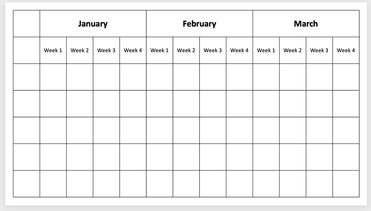
For this example, we will create a timeline that shows both weeks and months.
To label the weeks, type Week 1 in the 2nd row’s 2nd cell. Continue the sequence (Week 1–4) until the end of the row.
To label the months, select cells 2–5 in the 1st row and then go to Layout > Merge Cells.
Type the month in the newly merged cell, and repeat the process for the remaining 8 cells in the 1st row. This Gantt chart should show 3 months’ worth of project activity.
In case the font color is white by default, select those 3 newly merged cells, go to Home > Font Color, and choose another shade.
Otherwise, format as you wish, making sure the text is clearly visible and centered. If you want, you can also color-code the table.
The same table format can be used for quarters and months. If you go for weeks and months, remember to adjust the number of weeks in the table for each specific month.
💡 Plaky Pro Tip
You can also use a project timeline instead of a Gantt chart to visualize your project. Learn how to create one and get access to free project timeline templates in the post below:
Step #3: Add project tasks
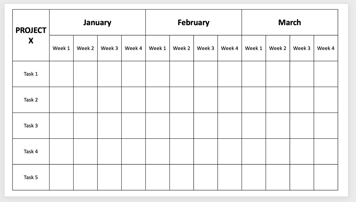
Add the project tasks in the 1st column, starting in the 3rd row.
Resize the column if necessary by highlighting it, navigating to Layout, and changing the column width. In case this takes the table beyond the slide, resize it to fit again.
While here, you can also merge the first 2 cells of the 1st column and use that space for the project name.
Format the cells as you wish.
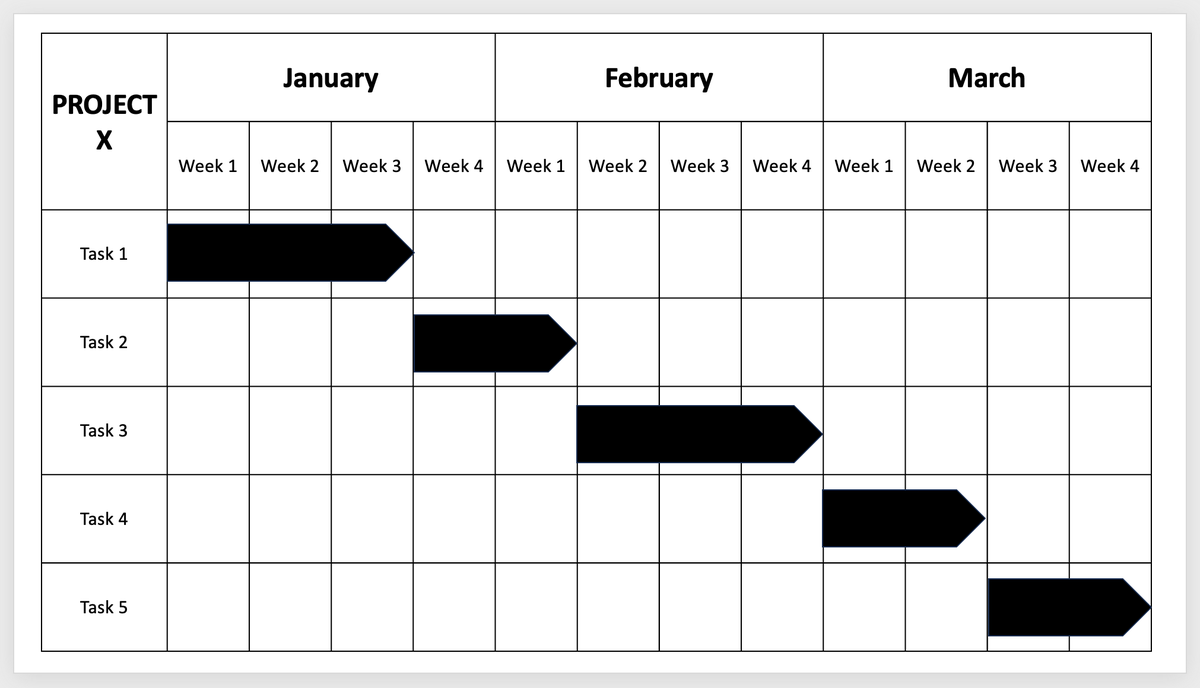
Step #4: Map the project activity
To map the activities on the chart, go to the Insert tab and select Shapes. Pick a shape that could resemble a task bar, such as the pentagon.
Drag the cursor to draw the shape and resize it so that it accurately shows the task’s duration.
Fill the shape with a color of your choice. Repeat for all tasks.
You can also double-click on the shapes and type the dates or task owners for each task.
Step #5: Add milestones, dependencies, and a time indicator
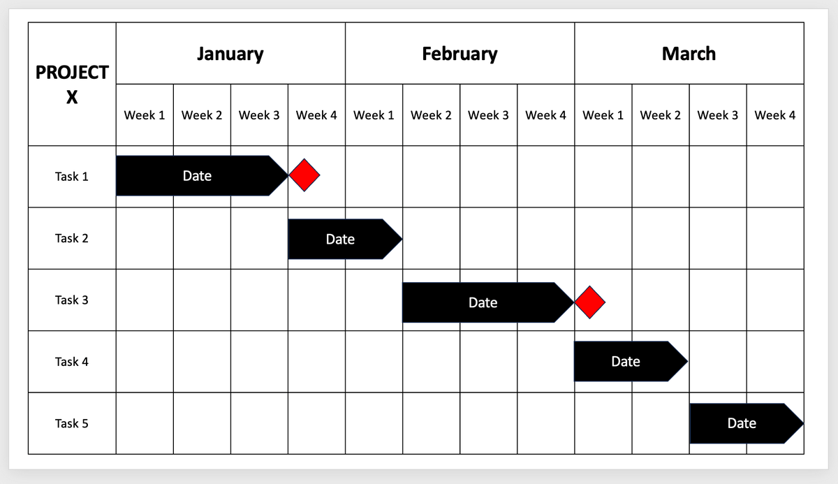
To add project milestones, go to Insert > Shapes and pick the diamond shape.
Drag the cursor to draw the shape, and resize and color as you wish.
Once done, place the shape wherever you want to indicate a milestone.
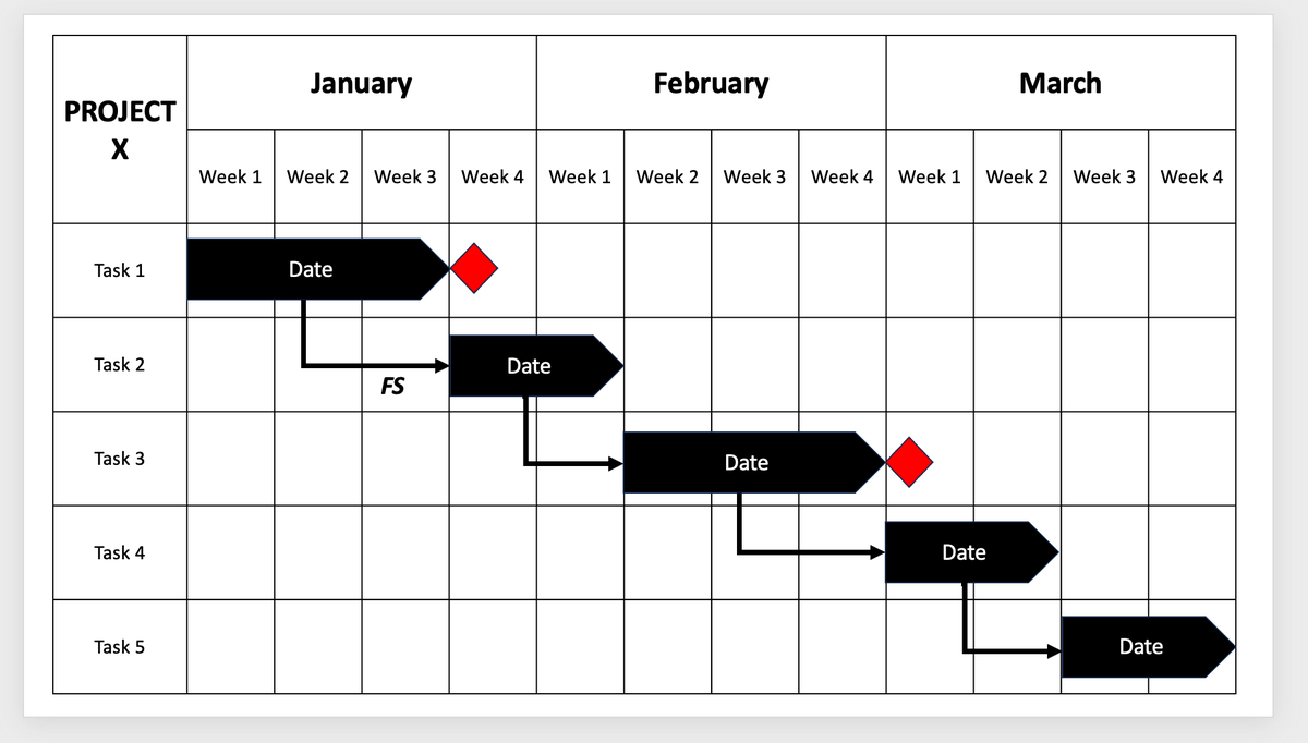
To add dependencies, go to Insert > Shapes > Lines and pick the elbow arrow connector.
Use the shape to link 2 dependent tasks together. Then, double-click on the shape to bring up the Format Shape options. Format as you wish.
You can also indicate types of task dependencies by inserting a text box (Insert > Text Box) beneath the connector and writing the appropriate abbreviation — FS, SS, SF, or FF.
Finally, to create a functional time indicator, go to Insert > Shapes > Rectangles and choose:
- 1 regular or rounded rectangle to serve as the base for the time indicator, and
- 1 regular rectangle to serve as the indicator line.
Draw both shapes and make sure they’re both the same color. Then, place the 2nd rectangle in the middle of the 1st one to finalize the shape of the time indicator.
Once you’re happy with the shapes, select both of them and right-click to bring up a menu. Select Group > Group.
Now you can move the whole indicator across the Gantt chart whenever necessary.
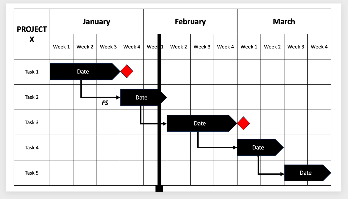
And that’s it — your manual chart is all done.

Method #2: Automated Gantt chart
Another way you could make a Gantt chart in PowerPoint is by using a stacked bar chart.
To create an automated Gantt chart, you should:
- Insert a stacked bar chart,
- Add your project data to an Excel table,
- Hide the End date column,
- Turn the stacked bar chart into a Gantt chart, and
- Customize the Gantt chart.
Step #1: Insert a stacked bar chart
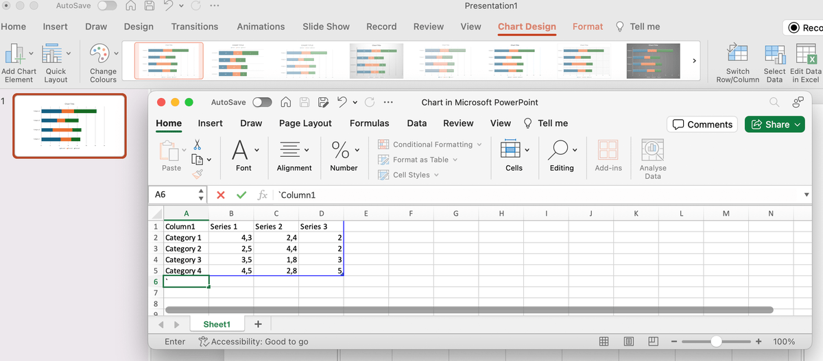
In a blank slide, go to Insert > Chart > Column and choose the stacked bar chart type from the 2-D bar category.
PowerPoint will then automatically insert a chart and open an Excel sheet where you can add your project data.
Step #2: Add your project data to the Excel table
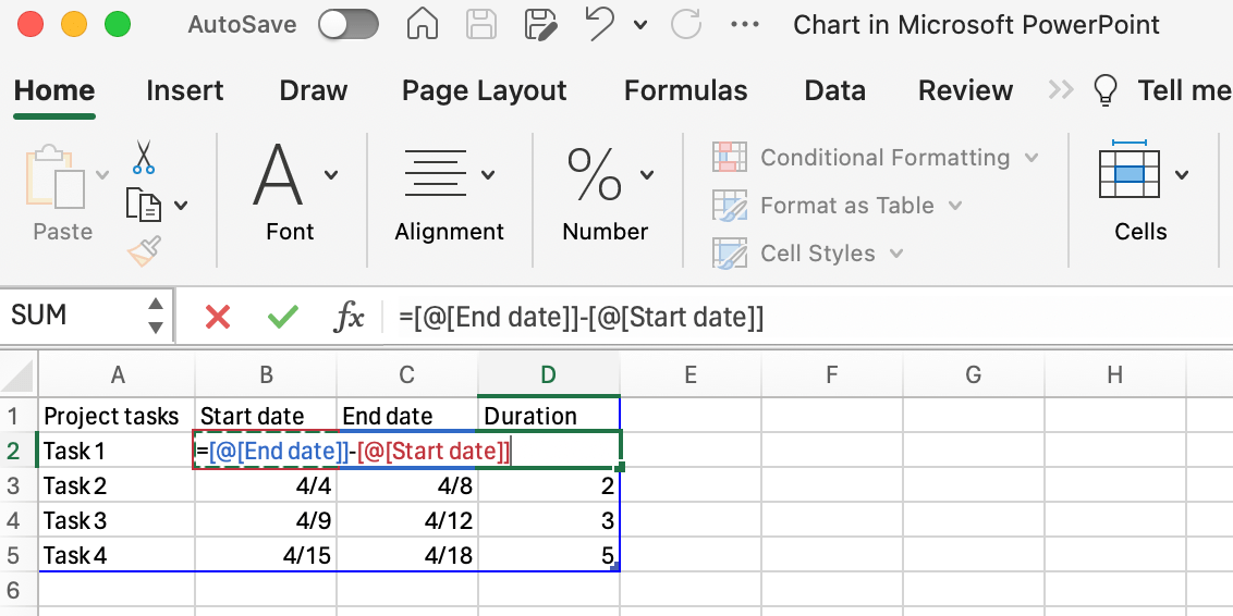
In the automatically generated Excel sheet, add your project tasks in column A.
Then, rename the other 3 columns to:
- Start date (column B),
- End date (column C), and
- Duration (column D).
Since columns B and C should show dates, highlight them and right-click to bring up a menu.
Choose Format Cells > Number and select Date from the Category selection to pick the desired date format before adding the values. Alternatively, create a custom date format.
To calculate task duration, use the following formula in cell D2:
=C2-B2.
Afterward, drag the fill handle from cell D2 to apply the formula to the whole column.
Step #3: Hide the End date column
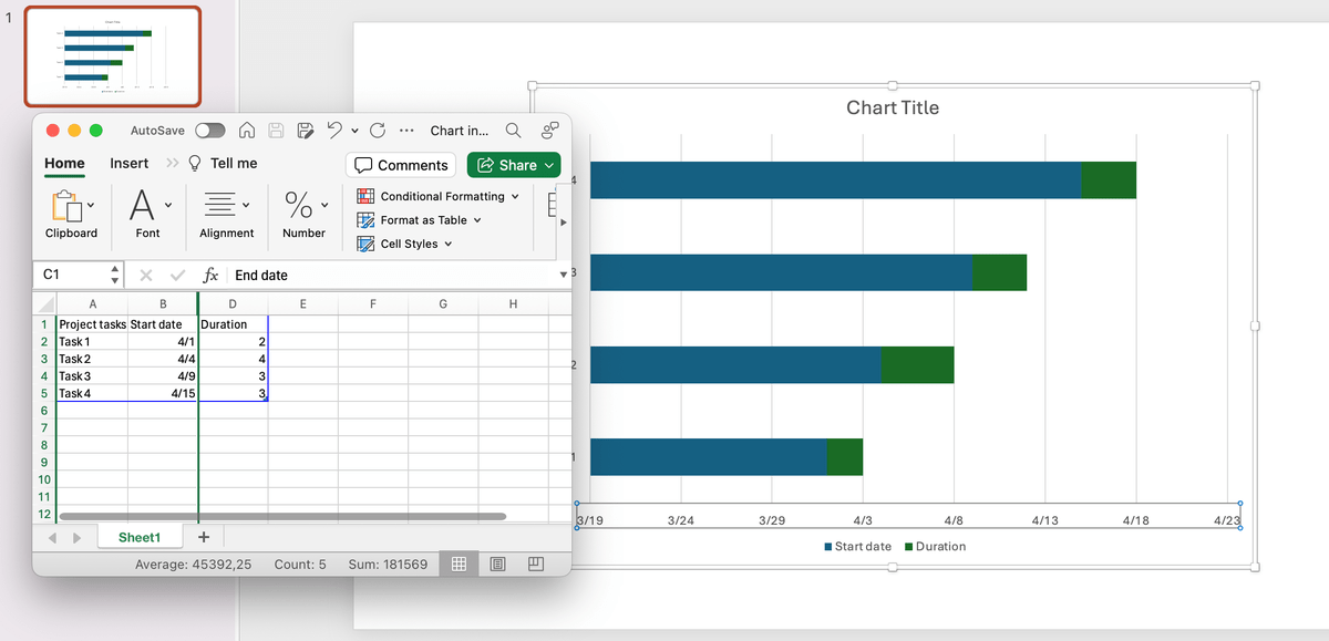
Back in the Excel sheet, select the End date column and right-click on it to bring up the menu. Choose Hide to remove it from the chart.
Step #4: Turn the stacked bar chart into a Gantt chart
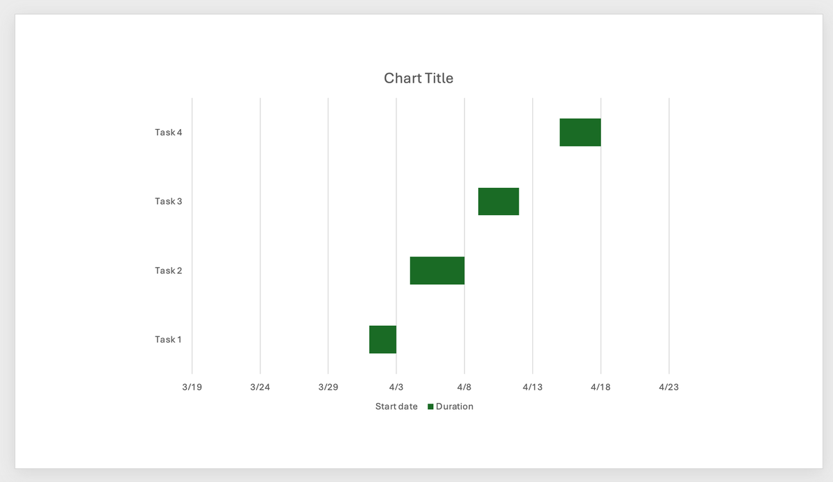
To turn the stacked bar chart into a Gantt chart, select any of the Start date bars and right-click to bring up a menu.
Choose Format Data Series and go to the 1st tab in the panel with the color bucket icon.
In the Fill category, choose No Fill.
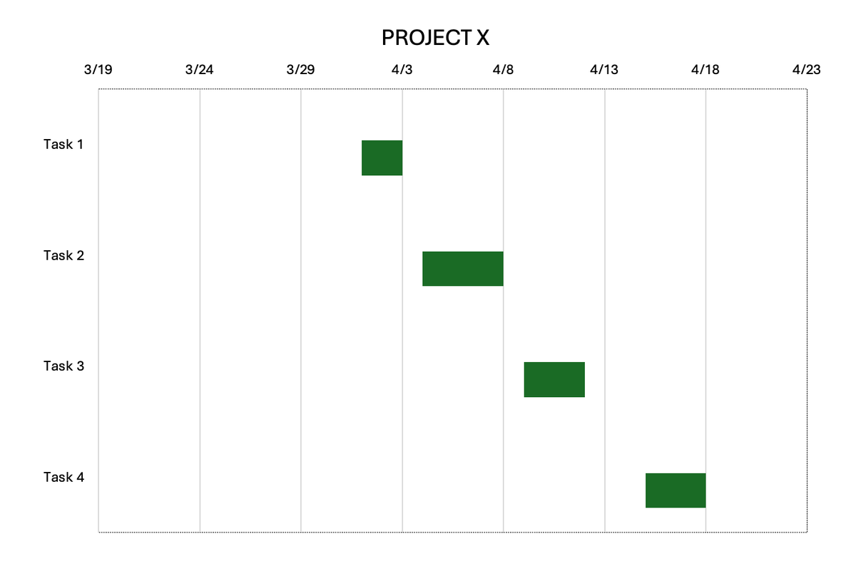
Now, the chart should look like this.
Step #5: Customize your Gantt chart
A few ways you could customize your automated Gantt chart is to:
- Change the default Chart Title,
- Reverse the task order, and
- Remove the chart legend.
Change the Chart Title to your project’s title by double-clicking on the title text box and typing the project name.
To reverse the order in which the tasks appear in the chart, double-click the task text box to open the Format Axis panel. Then, navigate to Axis Options, open the 4th tab, choose Axis Options, and check the Categories in reverse order option.
Finally, you can select the chart legend and delete it with the Backspace key. Alternatively, you can select legend components individually to delete them.
PowerPoint Gantt chart templates
If using PowerPoint to make your Gantt charts seems too complicated, we’ve created a few editable PowerPoint Gantt chart templates:
Plaky Manual PowerPoint Gantt Chart Templates
Plaky Automated PowerPoint Gantt Chart Template
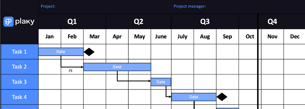
You get access to 4 different PowerPoint Gantt chart templates in total:
- Yearly manual Gantt chart,
- Monthly manual Gantt chart,
- Weekly manual Gantt chart, and
- Automated Gantt chart.
Now let’s see how you could customize these templates.
How to customize your Gantt chart templates
Once you download the templates, you can customize them by:
- Adding details about your projects and tasks,
- Changing the chart’s color scheme and formatting,
- Adding extra columns or rows,
- Making a chart legend, and
- Adding dependencies to the automated Gantt chart.
Tip #1: Add project and task details
In the manual Gantt chart templates, fill in the table with your own project and task details, including:
- Task names,
- Dates or timelines,
- Task owners,
- Project name,
- Project manager’s name, etc.
Move the task bars around to make a better project schedule. Once you’re happy with it, add milestones and dependencies.
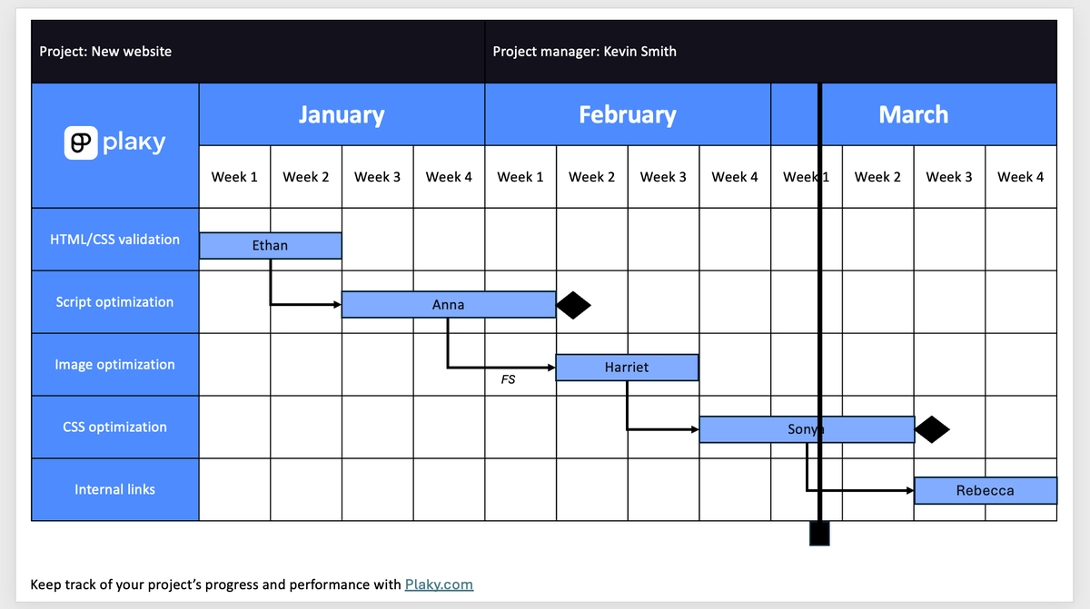
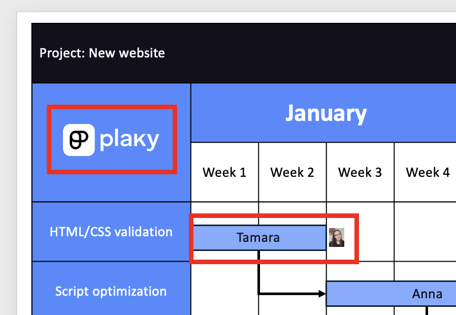
The task bars can indicate the task owner’s name or the task’s timeline.
If you go for the timeline, you can write your project team members’ names next to their tasks in separate text boxes.
Alternatively, you can insert the task owner’s image, use the Picture Format tab to edit it, and place it next to the task bar.
While here, you can also replace the default Plaky logo with your company’s logo.
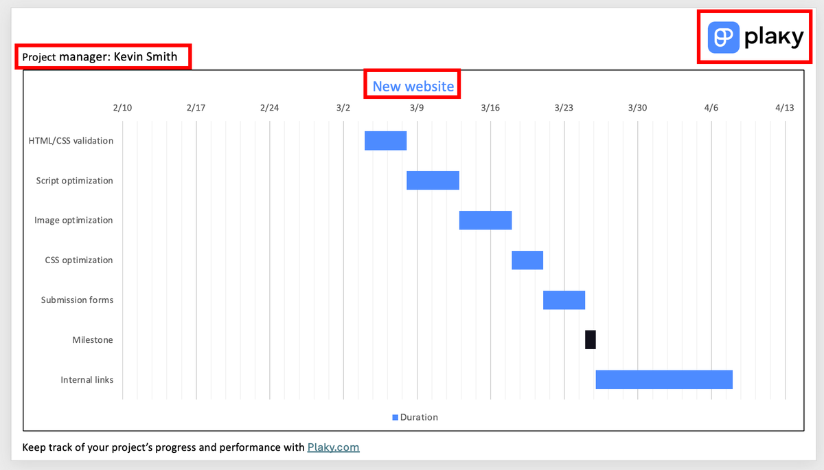
To add project data to the automated Gantt chart PowerPoint template, select the chart and navigate to Chart Design > Edit Data in Excel.
Any changes you make there will be automatically reflected in the Gantt chart.
If you want to change any other element in the chart, e.g., project title or logo, select those elements and replace them with your own.
Tip #2: Change the chart’s color scheme and formatting
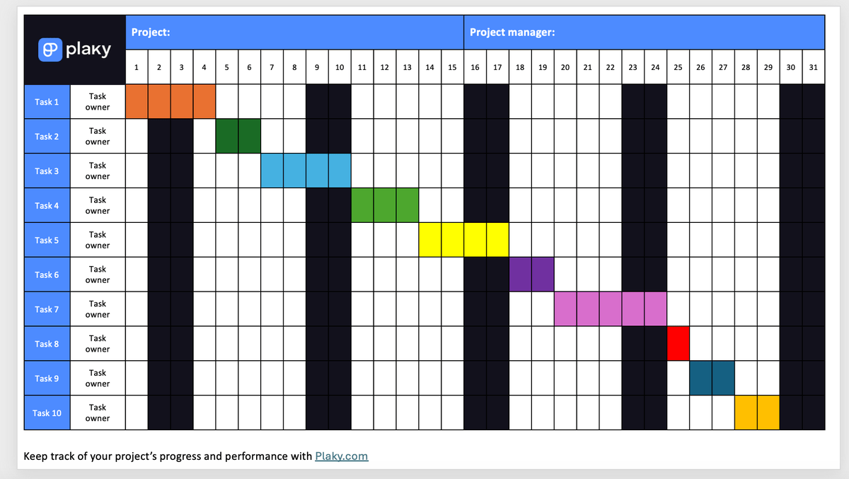
In the manual Gantt chart templates, change the color of the task bars by selecting each individually and choosing another Shape Fill shade. You can do the same for every cell you select in the monthly template.
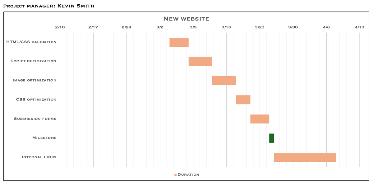
However, in the automated Gantt chart template, select only one of the task bars and choose another Shape Fill color if you want to automatically change them all.
If you need more variety, double-click on each task bar individually and choose another shade from the Shape Fill menu again.
These templates also comprise various text boxes that can be reformatted by selecting and editing the text boxes individually.
But if you want to automatically change the font size, style, color, etc., of the whole chart (manual or automated), you only need to select the whole chart to make your changes.
Tip #3: Add extra rows and columns
If you need more rows for your tasks in the manual Gantt chart templates, right-click on a cell in the last row in the table and go to Insert > Insert Rows Below.
In case you want to add multiple rows at once, select exactly the number of rows you want to add and then go to Insert > Insert Rows Below.
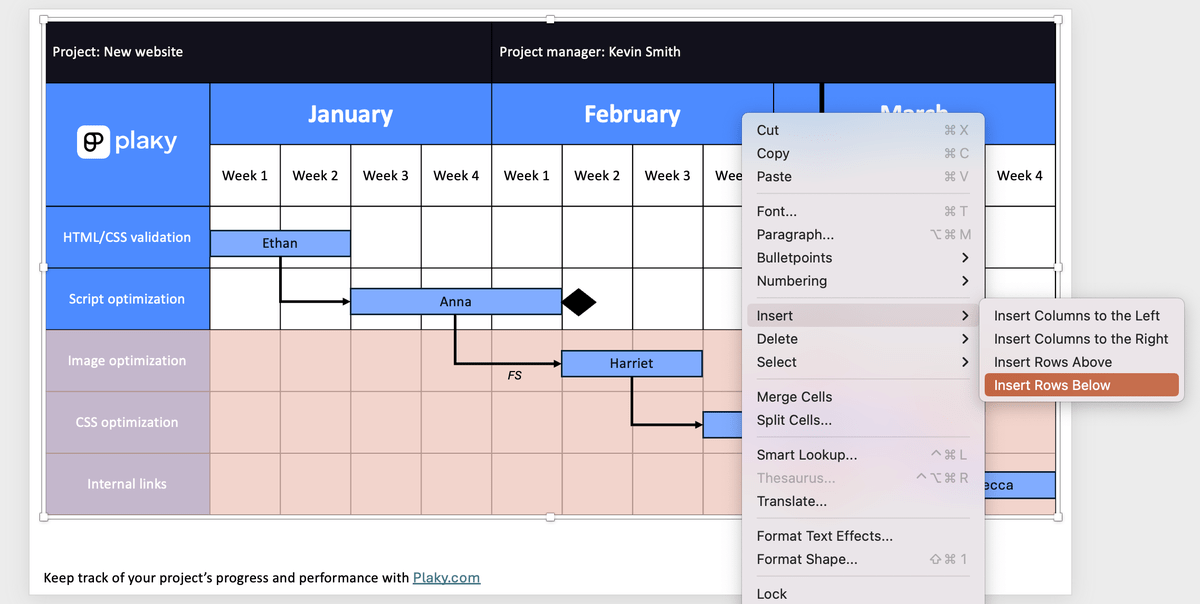
You will likely have to add more columns in the weekly manual Gantt chart template, depending on the year and months you want to track.
If necessary, you can also add extra columns to make your Gantt charts more detailed, such as a Task Owner and a Duration column.
Keep in mind, though, that you are limited in space in PowerPoint. Adding new columns or rows will require resizing the manually drawn Gantt charts and their elements.
Tip #4: Add a chart legend
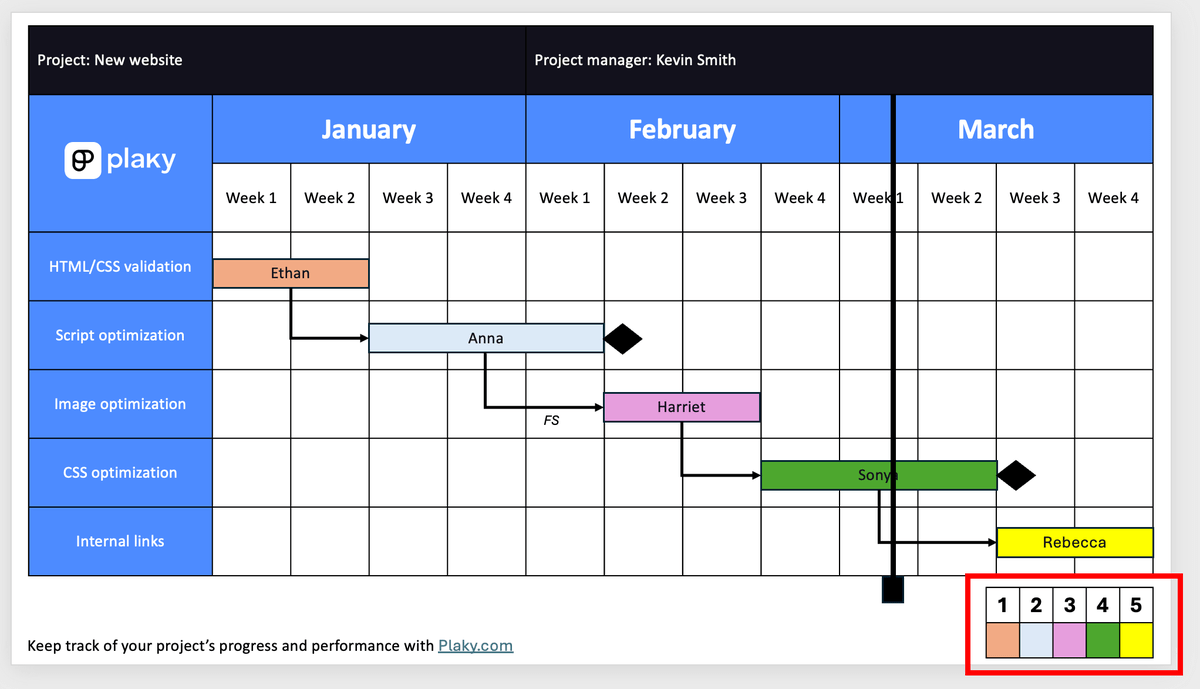
If you decide to color-code your tasks by any criteria (e.g., status), create a color legend beneath your manual Gantt chart.
To make the legend, go to Insert > Insert Table. You only need 2 rows, but insert as many columns as you have tasks.
Once inserted, remove the default table style to ensure it’s completely blank. Then, add the tasks in the 1st row and color in the cells in the 2nd row with the same shades you used for your task bars.
Tip #5: Add dependencies to the automated Gantt chart template
Though it’s impossible to add task dependencies automatically in the automated Gantt chart template, you can add them manually.
The process is the same as for the manual Gantt charts:
- Go to Insert > Shapes > Lines and pick the elbow line connector,
- Draw the shape to connect 2 tasks, and
- Add a text box beneath the connector where you’ll write the dependency type.
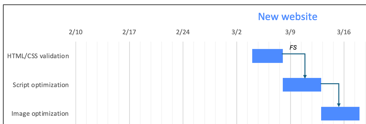
You might need to reshape the connector using the yellow rectangle in the middle and the 2 green circles at its ends to make it fit better between tasks.
Remember, though, that these connectors won’t be a real part of your chart. So, if you move, resize, or otherwise edit the chart, you’ll have to do the same with the connectors.
How to make a Gantt chart in Plaky by CAKE.com
As you can see, making Gantt charts in PowerPoint isn’t for the faint of heart – so why not make it easier on yourself?
In Gantt chart software like Plaky, you can create customizable Gantt charts in 3 easy steps:
- Make a project board,
- Create a new Gantt view, and
- Customize the chart to your needs.
Step #1: Make a project board in Plaky by CAKE.com
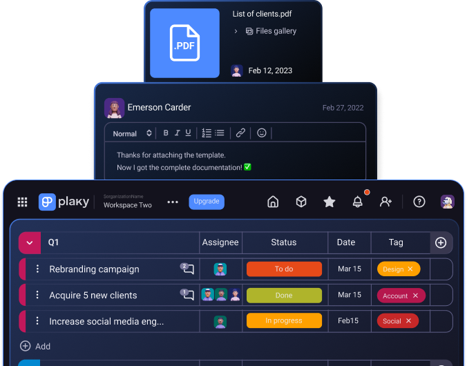
Plaky allows its users to create project boards from scratch. However, you can also speed up the whole process by relying on one of Plaky’s premade project management templates or uploading a CSV file.
To use Gantt charts in Plaky, make sure that your board has a Date or a Timeline field.
Once it’s all set up, add your project data to the main table.
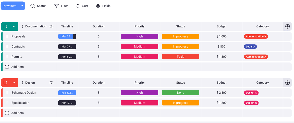
Step #2: Create a new Gantt view
To make a Gantt chart in Plaky by CAKE.com, all you need to do is create a new Gantt view. The chart will automatically pull all the information it needs from the main table.
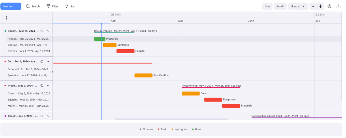
Step #3: Customize your Gantt chart in Plaky by CAKE.com
Now all that’s left is to customize your Gantt chart to your preferences.
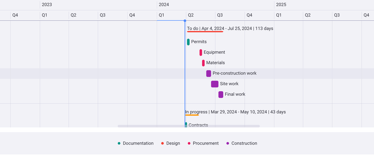
For starters, you can pick the time period you want the chart to show, e.g., weeks, days, or months.
In Gantt settings, you can also choose the criteria you want to use to group, label, and color your tasks.
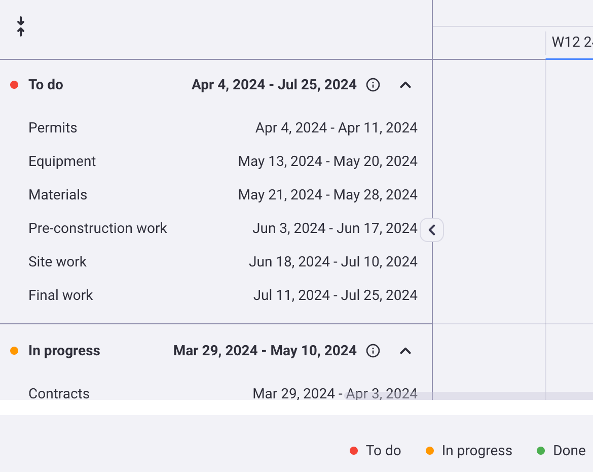
You can always remove the current time indicator and the color legend too.
And in case you need to rethink the schedule — just use the cursor to drag tasks around and extend or shorten their duration.
FAQ
Can you make a Gantt chart in PowerPoint?
Yes, you can. The best way to make a Gantt chart in PowerPoint is to either draw it manually or build it using a stacked bar chart.
Does PowerPoint have a Gantt chart template?
Yes, PowerPoint has 5 different Gantt chart templates:
- 2-month Gantt chart,
- Multi-month Gantt chart,
- 2-year Gantt chart,
- Blue 2-year Gantt chart, and
- 5-year Gantt chart.
You can find them all by going to Home > New and typing “Gantt” in the search bar.
How do I edit a Gantt chart in PowerPoint?
If you need to edit the project data in your automated PowerPoint Gantt chart, select the chart, navigate to Chart Design, and pick Edit Data in Excel.
To customize your manual Gantt charts in PowerPoint, use the Format Chart Area, Format Data Series, and Format Axis panels to change fill colors, outline colors, category order, and more.
Does Microsoft have a Gantt chart tool?
Yes, Microsoft has a Timeline (Gantt) view available with its project management tool — Microsoft Project. Project users can also rely on the Gantt Chart Wizard if they need some help coming up with functional Gantt charts.
Can I make a Gantt chart in Excel?
Yes, you can use Excel to make Gantt charts. Check out our guide on how to create a Gantt chart in Excel to learn more about the methods and download our free Gantt chart Excel templates.
Can I make a Gantt chart in Google Sheets?
Yes, you can use Google Sheets to design functional Gantt charts for your projects. Read our post on how to make a Gantt chart in Google Sheets and get access to our free Gantt chart Google Sheets templates.
Rely on Plaky by CAKE.com for efficient project monitoring
If you’ve ever needed to create a Gantt chart in PowerPoint for an upcoming presentation at work, you’re now well-equipped to do so successfully.
That said, it’s evident that PowerPoint is not the ideal tool for making elaborate Gantt charts that are both easy to read and edit whenever necessary.
If you’re eager to create detailed Gantt charts that will make managing your projects more efficient — Plaky is the tool for you.
As a comprehensive project management tool with an exquisite array of task management, collaboration, and progress-tracking features, Plaky is ready to help you tackle any project you have in mind.
Is creating and editing Gantt charts in PowerPoint too much of a hassle? Choose Plaky by CAKE.com if you need a user-friendly, detailed, high-level overview of your project tasks.
