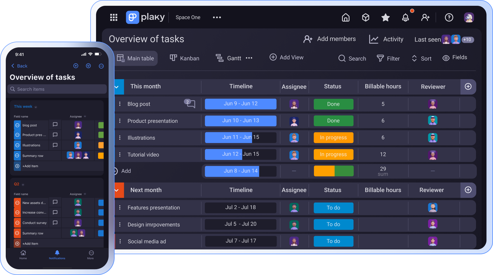
Do you use Google Sheets to track your monthly sales, team tasks, or top-performing marketing channels, but want to turn that raw data into an easy-to-understand visual?
This is exactly where Google Sheets dashboards come into play — to help you get a complete overview of your projects’ progress in a clear visual format.
Wanna know how to create a dashboard in Google Sheets? Read on to learn all the steps.
- A Google Sheets dashboard provides a clear overview of your project progress by summarizing key metrics and KPIs in the form of charts, graphs, and tables in one place.
- A good dashboard follows the F-pattern and a 5-second rule.
- There are 4 types of dashboards: operational, strategic, tactical, and analytical.
- To create a dashboard in Google Sheets, you need to set up and import your data, summarize data with formulas and pivot tables, build the charts and the dashboard tab, and make a dashboard dynamic.
- There are 3 ways to use AI in Google Sheets: built-in Gemini in your Google Workspace, third-party add-ons, and Google Apps Script + API.
- Some of the free Google Sheets dashboard templates are: project timeline template, project tracking template, Gantt chart template, and event marketing timeline template.
- Performance issues, cell limits, and poor audit trails are some of the challenges users have with Google Sheet dashboards.
What a Google Sheets dashboard is (and when you need one)
A Google Sheets dashboard provides a visual summary of the selected raw data from your spreadsheet(s).
This comes in handy if you’re using Sheets to collaborate with your team, since chances are, you’ll often need to pull out important information to share it with your stakeholders.
With the use of different charts, graphs, and scorecards, you can present specific KPIs and metrics and provide a bird’s-eye overview of your project performance right in your Google dashboard.
For example, a project manager might include a task status chart, a table listing overdue tasks, and a scorecard for task completion rates. Having important data in one place makes it easier to spot trends, track progress, and share updates at a glance.
What makes a good dashboard (before you build)
A good dashboard helps you make quick data-based decisions, while a bad one results in cognitive overload and lacks clear direction.
So, before you build your Google Sheets dashboard, make sure you stick to:
- The F-pattern — According to the eyetracking study, people read in an “F” shape, starting from the top-left. Place your KPIs in the top left corner, so that your team sees critical updates instantly.
- The 5-second rule — This design principle implies that a good dashboard lets you understand whether your project is on course within 5 seconds of opening a dashboard. When numerical data is easily found, you can discuss future actions straightaway.
Another important thing is to choose the right dashboard type. You can opt for one of these 4 options:
- Operational — used on a daily basis to present real-time data and give insights into most recent performance (order fulfillment, daily active users, etc.)
- Strategic — created for senior management for monthly, quarterly, or yearly reviews with a focus on overall business performance (market position, annual revenue, etc.)
- Tactical — built on a weekly, monthly, or quarterly basis to obtain data about short-term performance metrics and check whether daily operations follow the long-term strategy (milestones, sales targets, etc.)
- Analytical — used when needed by business specialists to track and analyze a large volume of historical data resulting in finding and understanding root causes of certain business trends (system health, conversion data, etc.)
How to create a dashboard in Google Sheets
Here are the steps to create a dashboard in your Google Sheets:
#1: Set up and import your data
You need to have some raw data to work with before you create your dashboard. You can enter data into a dedicated spreadsheet manually or use one of these options:
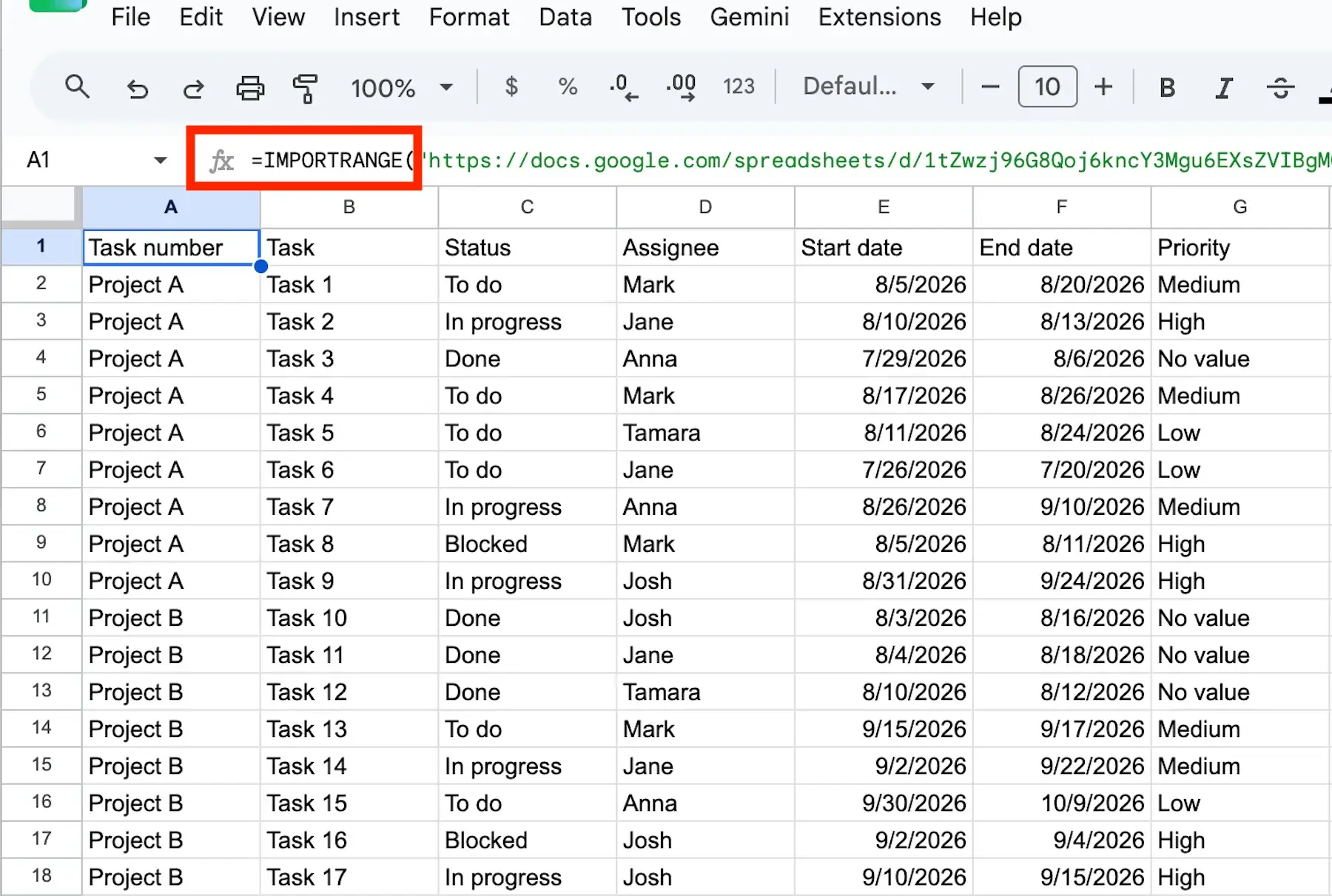
- IMPORT functions — Sheets have various IMPORT functions you can use to add data to your spreadsheet. For example, you can use IMPORTDATA (to import CSV or TSV data), IMPORTRANGE (to import a range of cells), or IMPORTHTML (to import data from an HTML page).
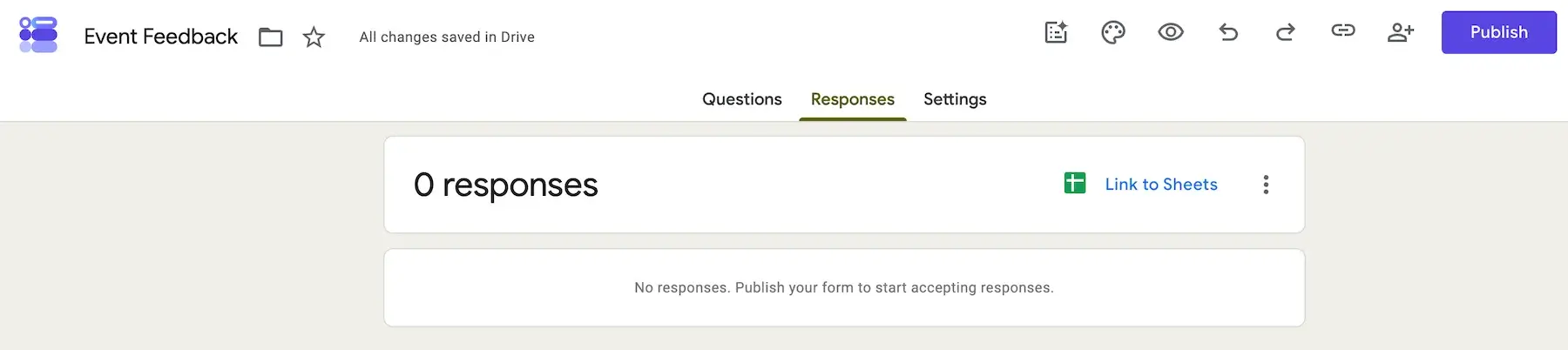
- Google Forms — Forms help you collect a great deal of data that you can transfer to your spreadsheet using the IMPORTRANGE function. With a QUERY function, you can filter, sort, or aggregate specific data you’ll need for your dashboard. Also, if you link your Google Form to a dedicated spreadsheet, Forms send responses directly to the spreadsheet allowing you to collect data easily and manage them as you prefer.
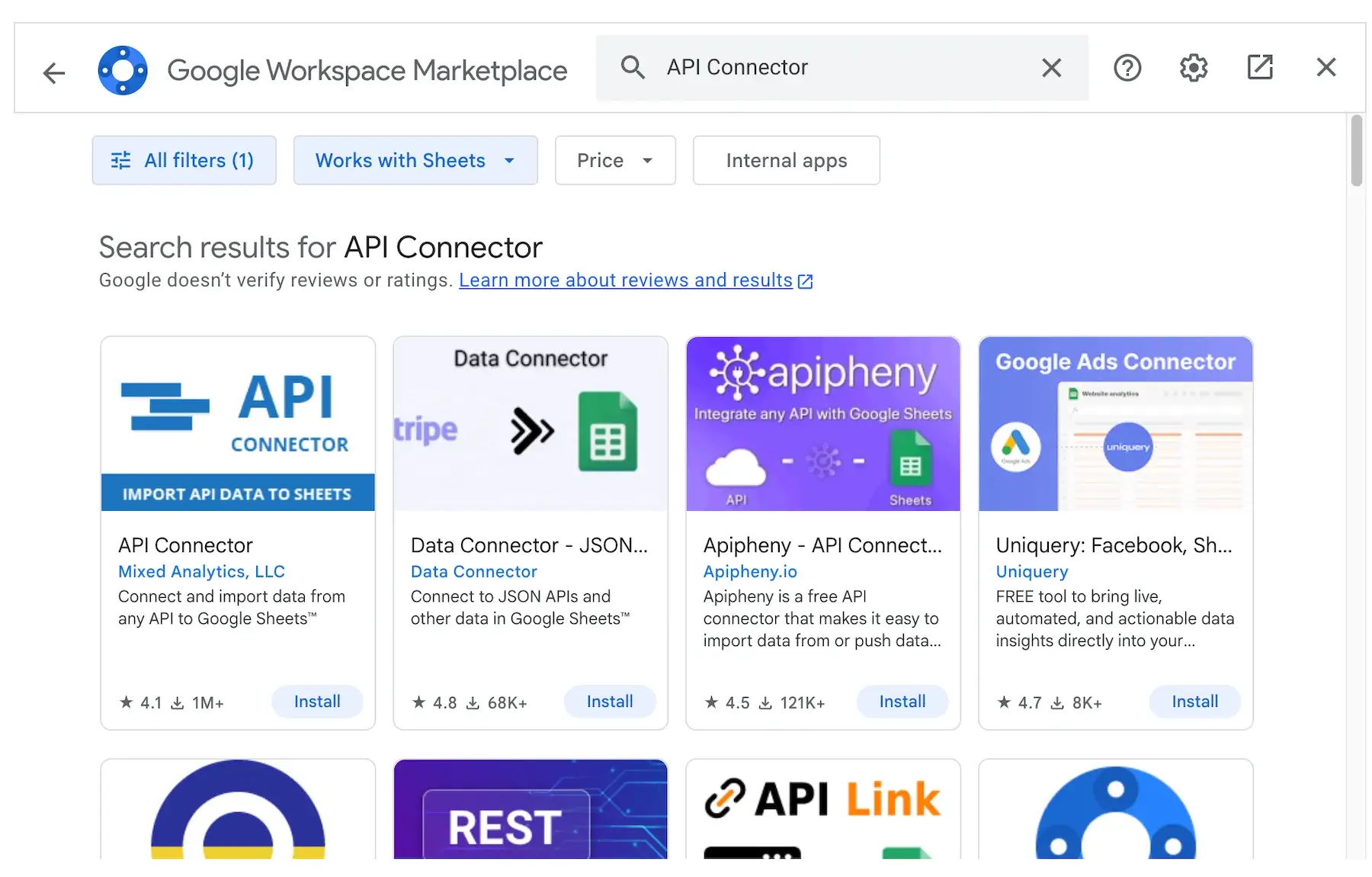
- External data source via an Add-on — Another way to import data to your spreadsheets is via API connectors. To get an add-on, click on Extensions tab in your Sheet and select the “Get add-ons” option. Once the Google Workspace Marketplace window is opened, search for API connectors, and choose the one that works for you. Keep in mind that any updates to your chosen add-on may affect the way your dashboard works.
#2: Summarize with formulas and pivot tables
If you find your spreadsheet messy after all the imports, don’t panic, as you still need to organize the data you want to see in your dashboard.
To do this, you can use some of the functions from the following cheatsheet.
| Formula | What it does on a dashboard |
|---|---|
| =AVERAGE(A1:A10) | Finds the average value in a given range |
| =COUNTIF(C2:C30, “Done”) | Counts rows matching one condition |
| =COUNTIFS(C2:C30, “Done”, D2:D30, ”Marketing”) | Counts against 2+ conditions |
| =SUM(A1:A10) | Sums the total amount across the selected cells |
| =SUMIFS(D2:D5, A2:A5, “Alex”, B2:B5, “IN PROGRESS”, C2:C5, “HIGH”) | Sums values based on multiple conditions |
| =TODAY() | Returns the current date |
| =UNIQUE(A2:A100) | Provides a list of distinct items |
| =SORT(A2:B1000, 2, FALSE) | Sorts the table or cell range values in a descending or ascending order |
| =QUERY(A1:G20, “SELECT A, B, WHERE C = “BLOCKED”) | Allows searching, filtering, sorting, and grouping data |
| =CHOOSE(2, “PRIORITY”, “ASSIGNEE”, “END DATE”) | Returns a specific value from a given list based on a numbered index |
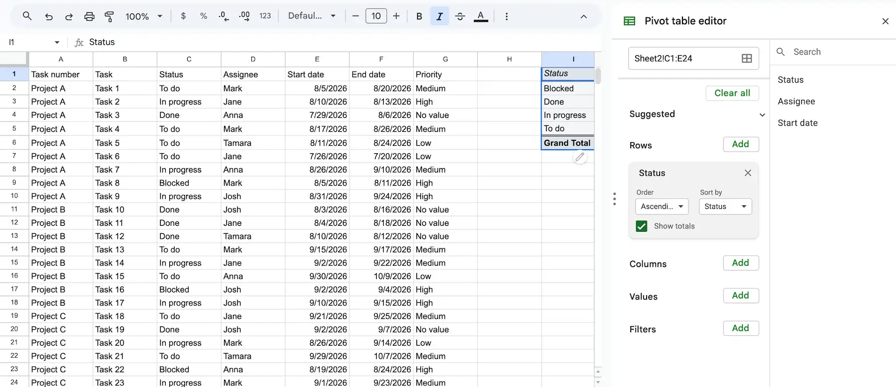
Another useful way to organize your spreadsheet data is to select the cells you need and gather them into a pivot table. These are the steps you should follow:
- Select the cells you want to include in a table.
- Click “Insert” in the top bar and choose the “Pivot table” option.
- Wait for a new window to pop up, and choose whether you want to create your pivot table in a new sheet or in an existing sheet.
- Once you get a new table, use the sidebar editor to customize rows, columns, values, etc.
#3: Build the charts and the dashboard tab
Google Sheets offer many options for data visualization. You can use different forms and methods to present specific data to your audience in a clear and simple way such as:
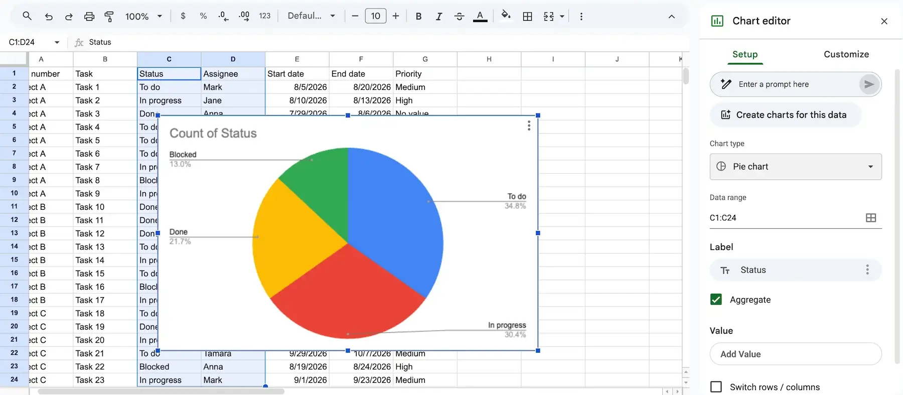
- Charts — Charts are most commonly used in dashboards. You can add charts from the Insert tab in the top bar. Once a blank chart and a sidebar appear on your screen, you can select data range, choose a chart type, and customize each part of your chart per your needs.
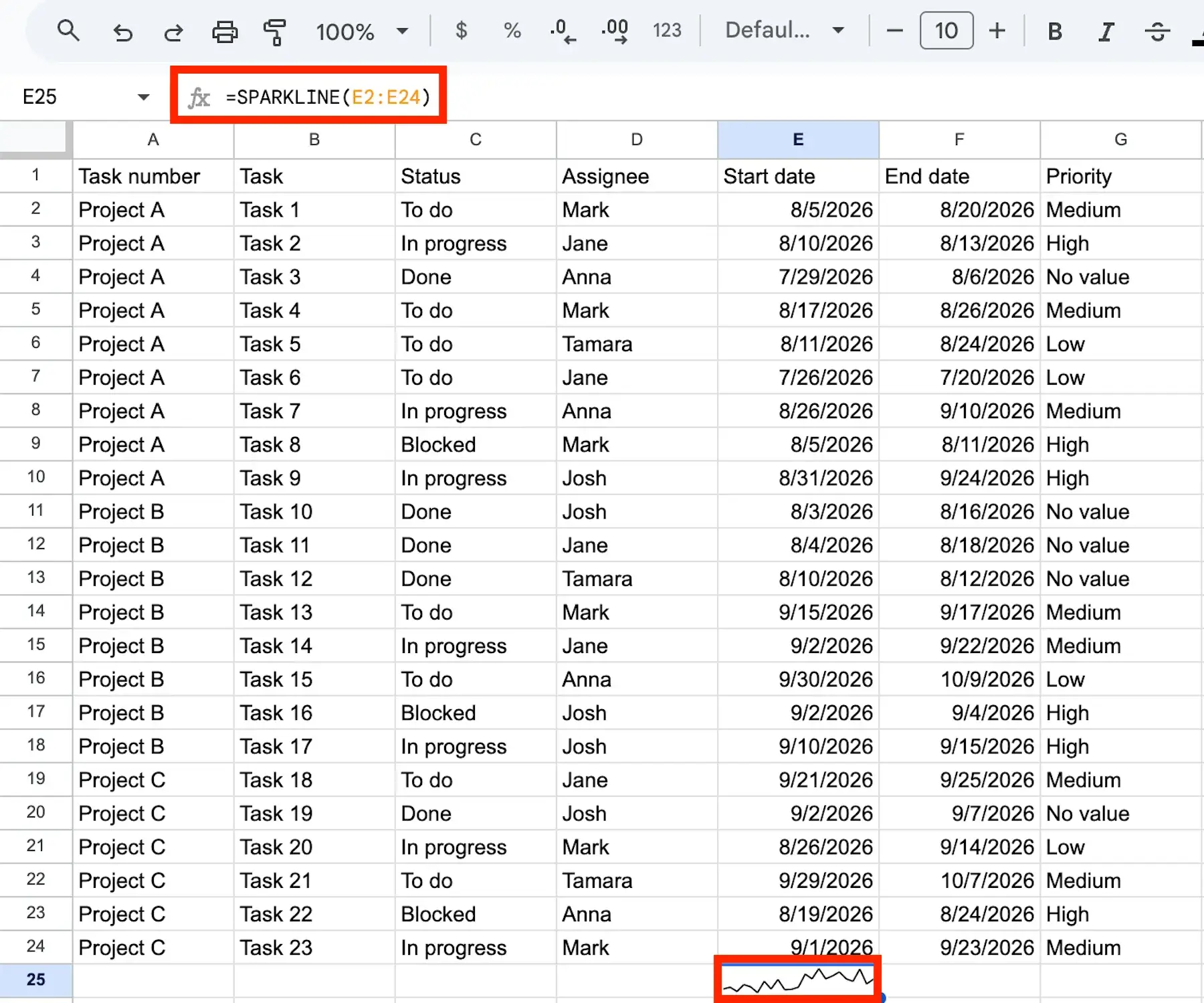
- Sparkline — A simple feature that provides data inside a single cell. The basic formula for a sparkline is =SPARKLINE(data, [options]). You can use them to monitor trends, completion percentages, profit/loss, etc.)
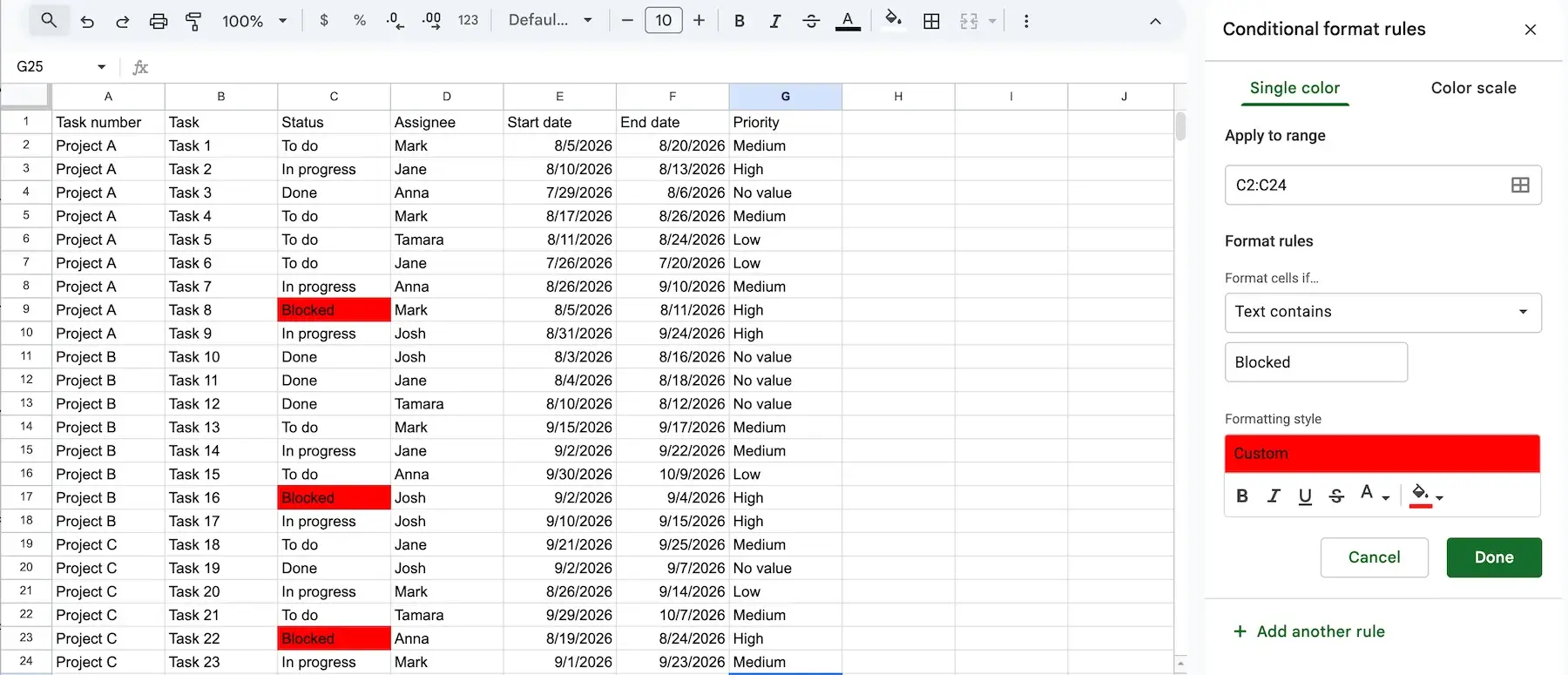
- Conditional formatting — This feature allows you to format cells, rows, or columns so that they could change color once they meet pre-set conditions. Go to the Format tab in the top toolbar, and select Conditional formatting to open the sidebar with customization options. You can use formatting to track due dates and status, highlight thresholds, find errors, color-code budgets, etc.
Mind you, to avoid having charts and tables in the same spreadsheet that keeps your data, you can create a new sheet for your dashboard. Use a simple copy-paste function to transfer your charts and tables and create a centralized space for your key metrics.
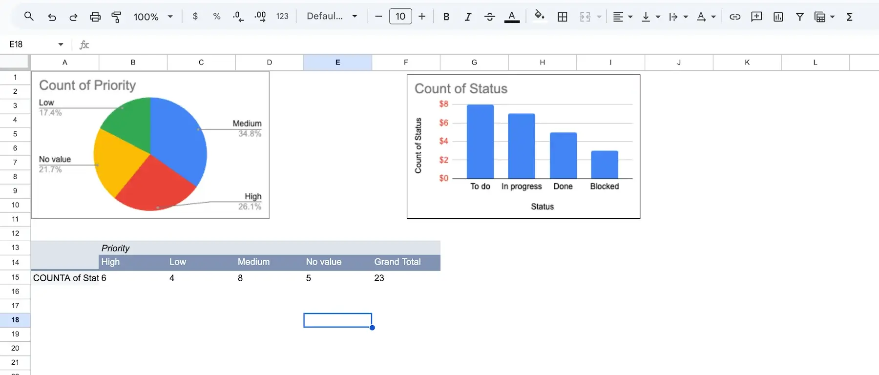
#4: Make it dynamic
While static dashboards get the job done when you need to present monthly summaries or financial reports, the fast-moving markets often require having real-time data at hand for fast decision-making.
So, if your job requires staying up-to-date at all times, you can create a dynamic dashboard in Google Sheets that automatically updates included data. Some of the useful features for such dashboards are:
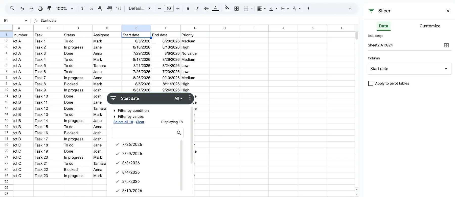
- Slicers — One of the Sheets’ options that helps you organize data by slicing your spreadsheet, in which case only the vital data is displayed. You can add slicers from the Data heading tab by clicking “Add a slicer” option. Easily filter data by value or condition and customize them in the sidebar.
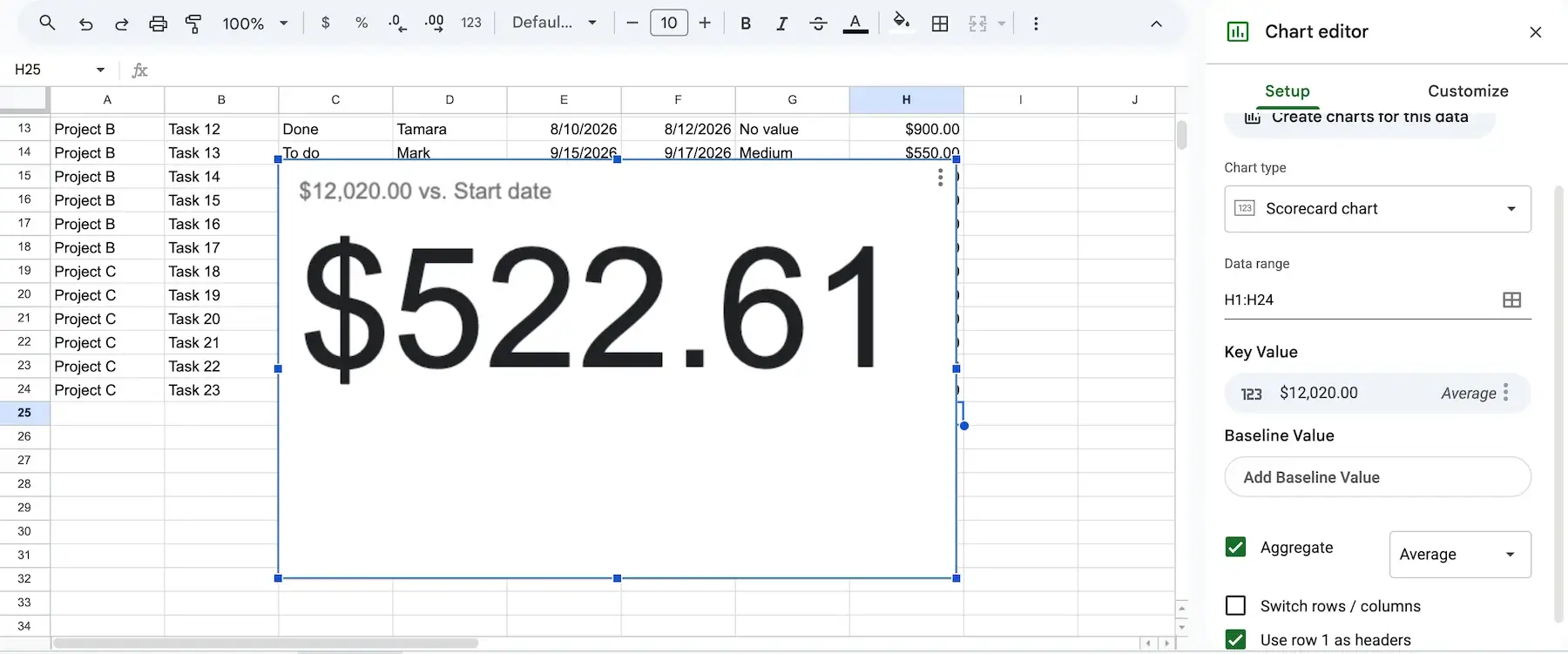
- Scorecards — This type of chart is used to track single KPIs by comparing the key and baseline values. To create scorecards, click the Insert tab and select Chart. In the chart type list, you’ll find the Scorecard chart within the Other section.
- Dropdowns — You can create in-cell lists with predefined options that let you choose items with one click. To create a dropdown list, click on the Insert heading tab and select dropdown. This feature helps you prevent spelling mistakes and avoid manual typing.
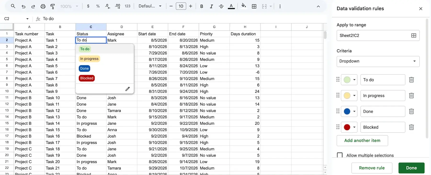
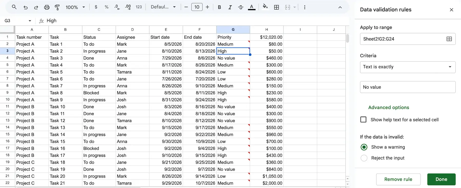
- Data validation — With this feature, you can set boundaries and restrict what your team members or stakeholders can enter in specific cells and rows. Go to the Data tab, and select Data validation. Once the sidebar opens, you can choose cell range, criteria, and more. Keep in mind that Google Sheets only allows one data validation rule per cell.
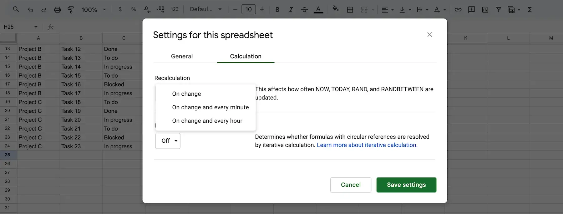
- Live-refresh — This option allows you to set up automatic updates (on change, every minute, or every hour) of specific data without the need to re-enter information or manually reload it. To set up this functionality, go to the Files tab, choose Settings, and then click Calculation.
Using AI in Sheets (2026)
With all the heavy calculations, tons of formulas, and formatting options used in Sheets, it gets harder to manage data as your spreadsheet grows. AI reduces this burden to a great extent, as now you only need to describe what you want and AI will do it instead of you.
Here are the 3 ways to put AI to use in Google Sheets:
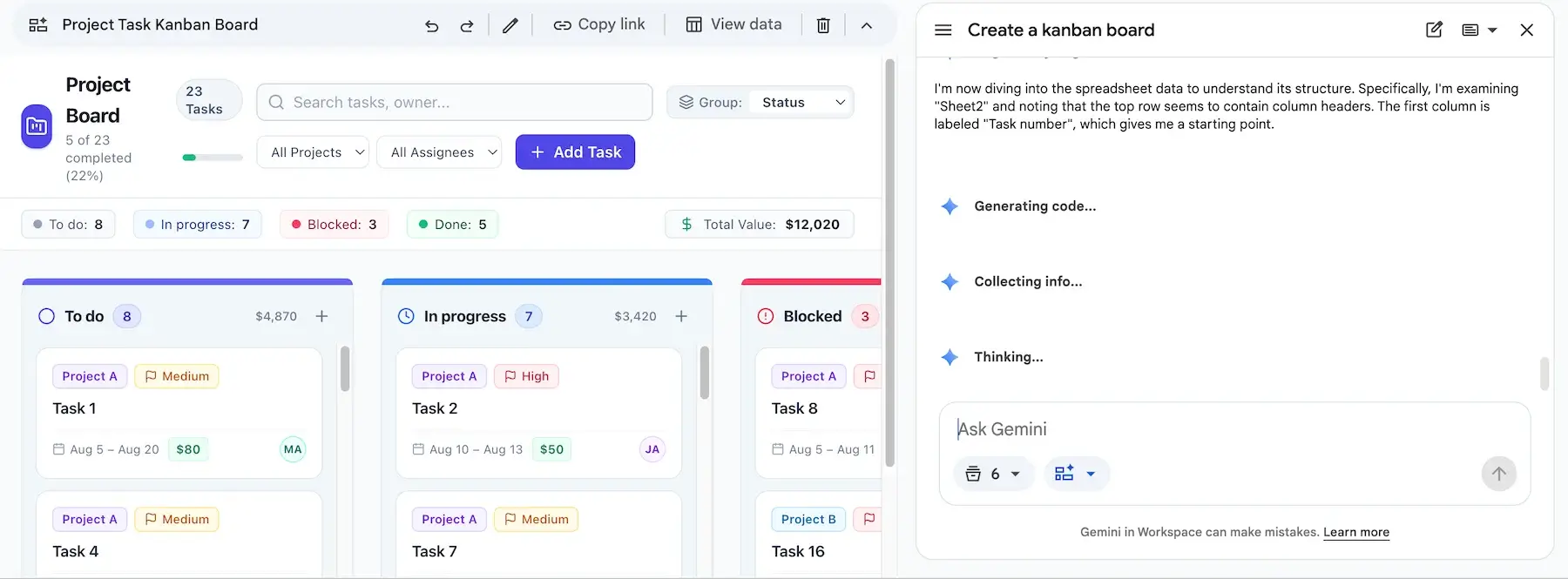
- Built-in Gemini in your Google Workspace — AI is natively integrated into Sheets in Google Workspace’s higher plans (Business Standard, Business Plus, and all Enterprise tiers, at no extra cost), and you can bring it into play by clicking the Gemini sparkling icon in the top-right corner. From the Gemini side panel, you can auto-generate templates, dashboards, and tables, ask for the summary of spreadsheet data, analyze and categorize data, and much more. This built-in AI also powers Sheets Canvas, allowing you to generate interactive layouts — like Kanban boards, heat maps, custom calendars— using simple text prompts.
- Third-party add-ons — From the Extensions top bar tab in your Google Sheets, you can add tools like GPT for Sheets that bring in custom AI functions. You can use many of these add-ons free of charge.
- Google Apps Script + API — This one requires custom JavaScript in your Sheets and lets you connect to any API such as Gemini, OpenAI, Anthropic, etc. If you’re not on Business Standard or higher, there’s still a free path: grab a free API key from Google AI Studio, and connect it via Apps Script.
Free Google Sheets dashboard templates
To save your time and avoid starting your dashboard from scratch, you can try out some of the free Google Sheets dashboard templates. If you want to create a spreadsheet from a template, click on the Files tab, select New and pick From template gallery option in the dropdown menu.
Project timeline template
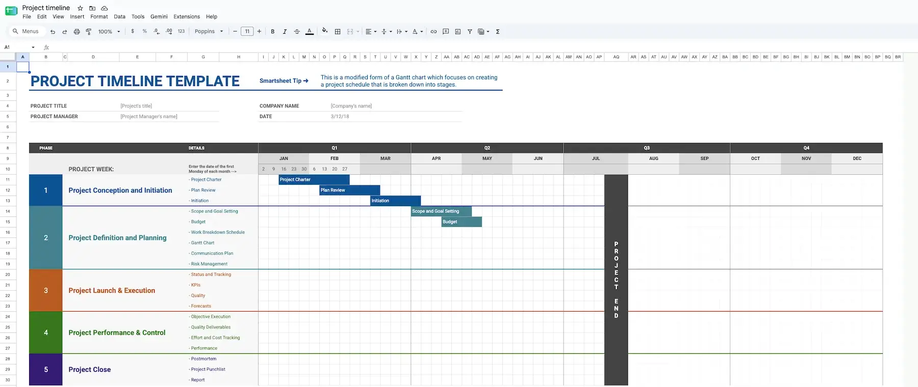
Mostly used by project managers, this template gives you a clear overview of your project progress and dependencies in monthly and quarterly intervals. The Gantt-chart-style template allows you to add dates, create tasks, and mark milestones.
Project tracking template
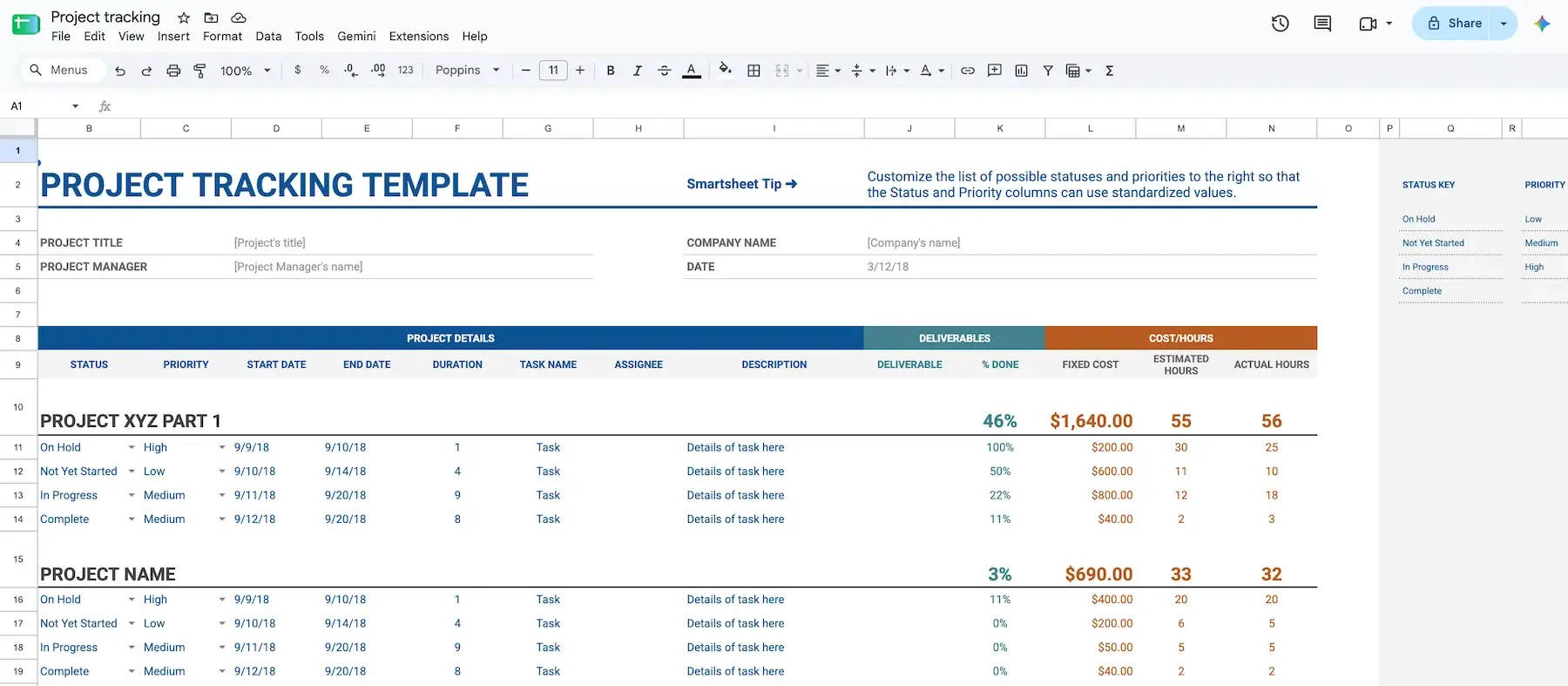
This template is great for project managers and team leads who prefer having all important project details in one place. Here, you can add project details such as status, priority, duration as well as track deliverables, costs, and hours spent on tasks.
Gantt chart template
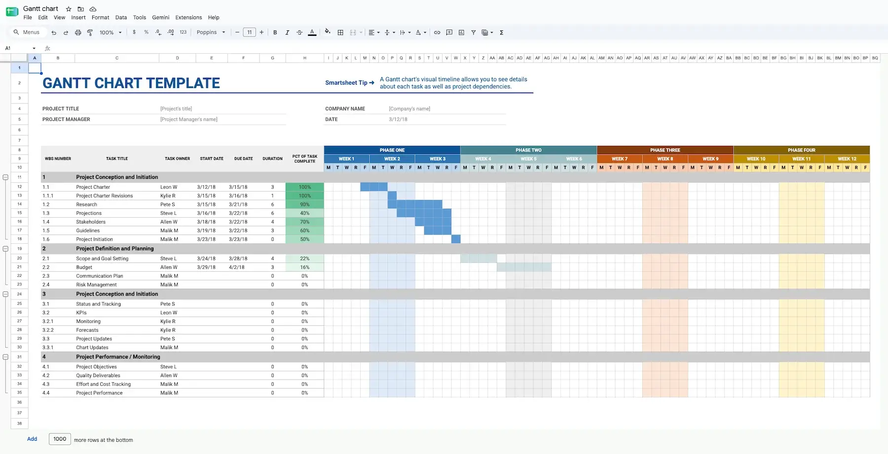
This template offers a clear insight into the project timeline covering all project phases. You can organize tasks by phase, add start and end dates as well as task duration. What’s best, there’s a dedicated column that tracks task completion percentage.
Event marketing timeline template
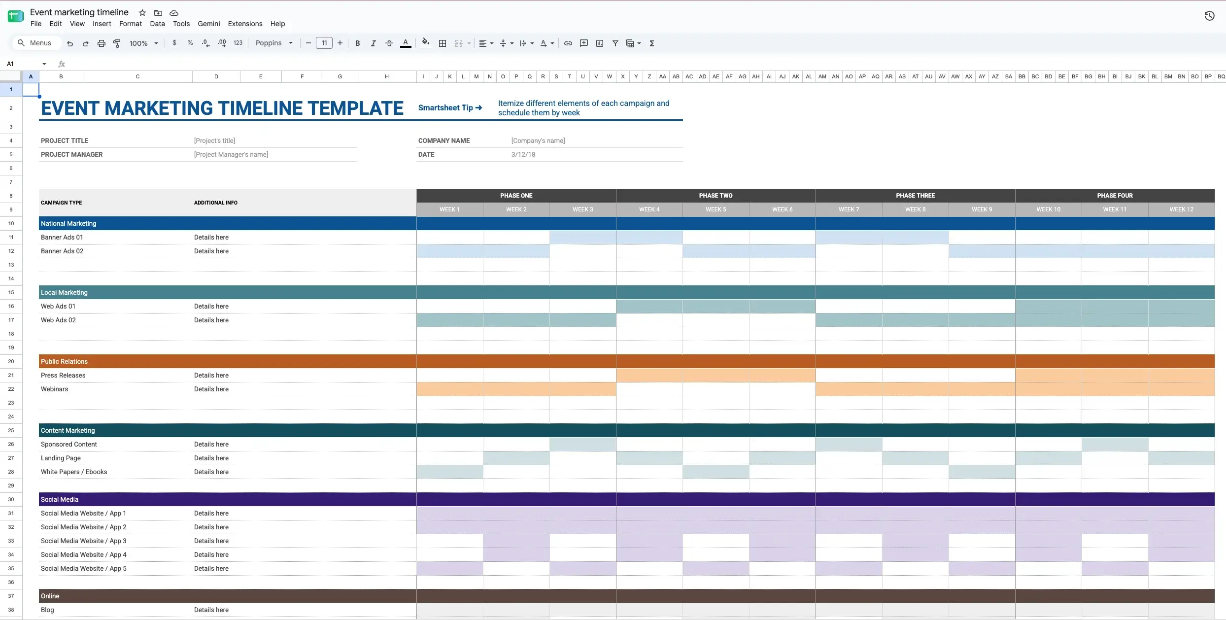
This template covers all segments of your marketing plan, from national and local marketing to social media and sales campaigns. You can track your campaign progress within 12 weeks divided into 4 phases. You can also use the blank parts to add important info such as dates, duration, progress, updates, and more.
💡 PLAKY PRO TIP
Need some more free Google Sheets project management templates? Find the right one in the article below:
Common mistakes and limits of a Sheets dashboard
Although Google Sheets dashboards are great to track and manage data, there are certain challenges you may experience as your project or team grows.
Here are some Sheets dashboard’s limits and issues you should be aware of:
- Performance issues — Sheets can become slow when handling large amounts of data, complex pivot tables, and heavy formulas.
- Cell limits — There’s a 20 million cap on the number of cells in a single spreadsheet.
- Manual entries — Updating data in Sheets is error-prone, as manual entries cause broken formulas, inaccurate reports, and formatting inconsistencies.
- Poor audit trails — If you want to find out who changed a cell, formula, or metric in a spreadsheet, you need to dig into its version history.
- Accidental edits — Sheets allow open editing by default meaning that users can accidentally make changes or delete data.
- Security concerns — If you share your spreadsheet to “Anyone with a link” or miss to set up access controls, it can often result in a data leak and breach.
When to graduate to a work-tracking board
Google Sheets is well-equipped with features for basic project management, small-scale reporting, and data visualization. Built-in charts and graphs help you create dashboards that display your project progress and current results. But, when large data sets come into play and the team gets bigger, dashboards can hardly keep pace.
It’s time to consider whether Sheets can still support your work in the right way in situations when:
- Your dashboard takes 10+ seconds to load.
- Reporting metrics start showing conflicting numbers.
- Keeping data up to date gets challenging.
- Strict access control becomes a must.
If you need a dashboard that doesn’t require manual updates and can track work progress without complicated formulas, a dedicated project management dashboard is the next level.
Have a go with Plaky’s Dashboards
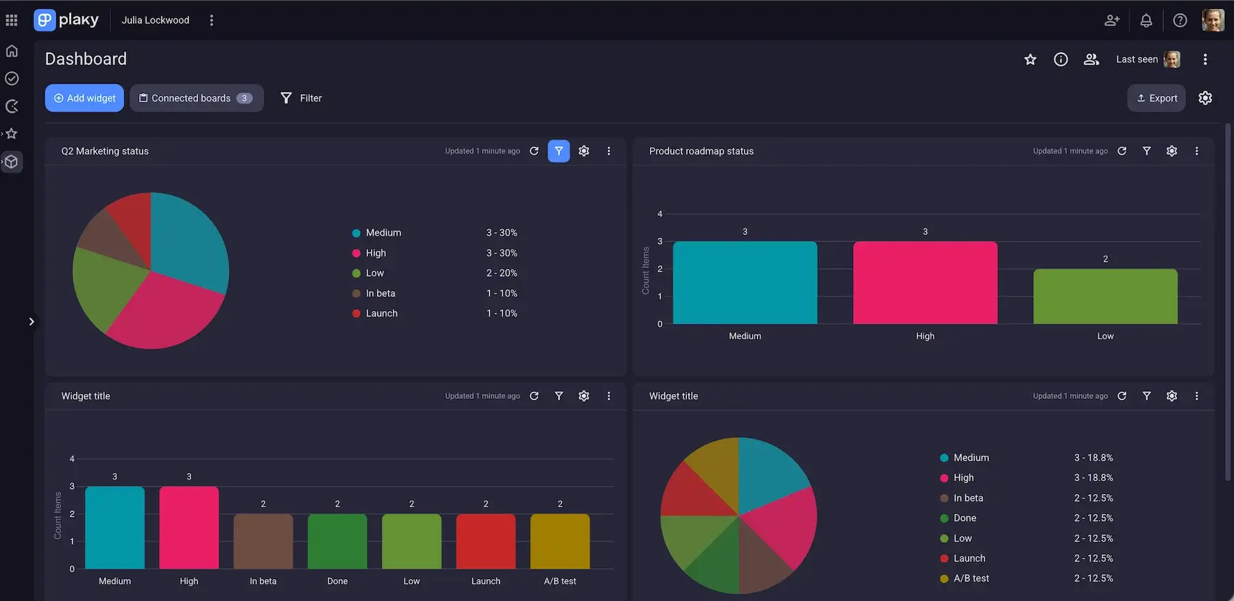
Plaky is a project management tool that brings all project pieces together in one centralized place. It lets you connect boards from the same workspace and visualize key data with pie and bar chart widgets.
With Dashboards in Plaky, you get a single overview that helps you compare project data from multiple Boards and make decisions based on actual data.
Widgets in Plaky’s dashboards automatically refresh every 15 minutes, which keeps your team always in the loop without the need for manual updates.
What’s more, Plaky lets you control access to your dashboards. You can make dashboards private or public and set permissions to define who can view or edit data.
Still, your tier plan determines the number of boards you can connect:
- The Free plan allows 1 Board per Dashboard.
- The Pro plan supports 15 Boards per Dashboard and 30 widgets per Dashboard.
- The Enterprise plan offers 30 Boards per Dashboard and 30 widgets per Dashboard.
FAQ
Now, let’s cover some frequently asked questions about dashboards.
Can you build a dashboard in Google Sheets?
Yes, you can build a dashboard in Google Sheets by organizing your data in charts, graphs, and tables using different formulas, filters, and formatting options. Google Sheets supports a great number of chart types, including column, pie, bar, line, and more allowing you to display data in a practical and easy to understand way.
What should a good dashboard include?
A good dashboard should include a summary of current project data and provide actionable metrics. Also, the data you share in your dashboard should have a clear hierarchy and follow the F-pattern.
An effective dashboard displays primary metrics on top and applies a 5-second rule, which means your coworkers can understand project status within 5 seconds after you open the dashboard.
What are the 4 types of dashboards?
The 4 types of dashboards are:
- Tactical — gather data about short-term performance metrics.
- Strategic — focus on whether project performance aligns with long-term goals.
- Analytical — allow deep analysis of business trends across massive amounts of data.
- Operational — monitor daily performance.
What is the 5-second rule for dashboards?
The 5-second rule for dashboards states that once a dashboard is opened, users should get the picture of the current status, what needs attention, and what actions need to be taken in the first 5 seconds.
What are the common mistakes people make when creating dashboards?
When creating dashboards people tend to crowd them with a bunch of colorful charts covering all project elements. They rarely pay attention to the dashboard type and who they build them for. Also, dashboard creators often leave charts and widgets in the same size making it difficult to understand what needs attention.
How do I create my own dashboard?
Firstly, make sure you have enough raw data for analysis and comparison. It’s best to build your dashboard in a clean spreadsheet/board and decide on the questions your dashboard should answer. Select data ranges and insert relevant charts and tables to a dedicated dashboard while paying attention to place the most important metrics on top.
Take your dashboards to the next level with Plaky by CAKE.com
Google Sheets can handle basic project management, it can hardly follow workflow coordination. Once several people need to update and act on the same work, a shared project board beats a spreadsheet tab.
That’s one of the main reasons people switch to project management tools like Plaky — to enhance team collaboration and track progress in real-time.
With Plaky, you can create a centralized workspace where you can:
- Manage and assign tasks — invite team members to your project board and assign tasks, set deadlines, and define priority status for each task.
- Collaborate with team members — get real-time notifications about task updates and communicate with your team members through in-task Comments.
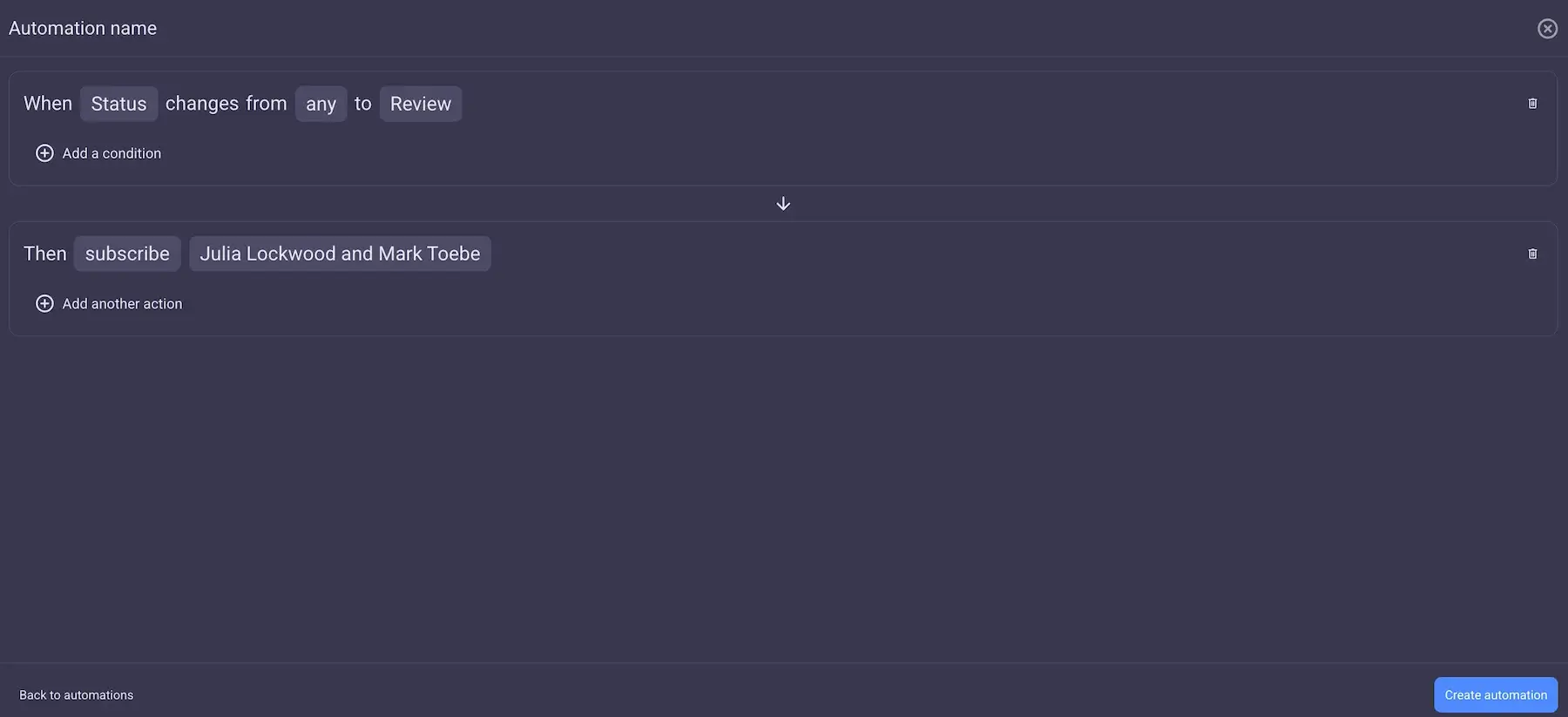
- Automate workflows — use trigger-based Board automations (like subscribing a reviewer when a task status changes to “Review”, or adding a deadline to a task once the status changes from “No value” to “To do”, etc.) to reduce manual work and streamline processes.
- Track progress — monitor your project workflow using different Board views such as spreadsheet-like Table view or Gantt chart view.
- Store files — keep important project documentation within dedicated item cards so that everyone can access them.
Having all project and task data in one place makes it easy to spot bottlenecks, prevent delays, and make business decisions based on up-to-date information. The best way is to create a Dashboard in Plaky, which allows you to connect several boards and analyze all relevant data.
To create a dashboard in Plaky, take the steps below:
- Click on the “+” button in the left sidebar.
- Select New dashboard option from the dropdown menu.
- Enter the Dashboard name and toggle the button to make it private (optional).
- Click Create.
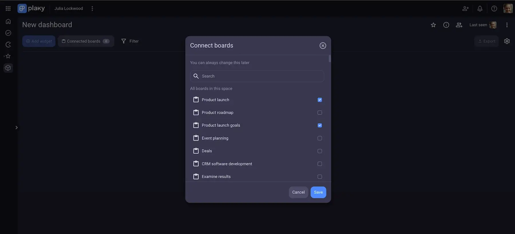
- From the list that appears, select the boards you want to connect.
- Click save to complete the action.
Once Plaky creates your dashboard, start adding pie or bar widgets to visualize data the way you want. Plaky lets you configure each widget allowing you to display the most relevant information.
Plaky is well-known for its ease of use, so you won’t need too much time to learn the ropes. Also, you don’t have to worry about the safety of your data thanks to:
- User role and permissions — with Plaky, you can control who has access to what in your workspace which minimizes accidental changes or deletion of data.
- Top-notch security — your data are completely safe with Plaky thanks to its 24/7 security audits and penetration tests.