A Gantt chart is a very useful tool for project management. But project management software statistics show that as many as a third of users who have access to Gantt charts don’t use them!
So, we created various Gantt chart examples to show how they can make your life easier.
Read on and learn how to apply Gantt charts in practice.
What is a Gantt chart?
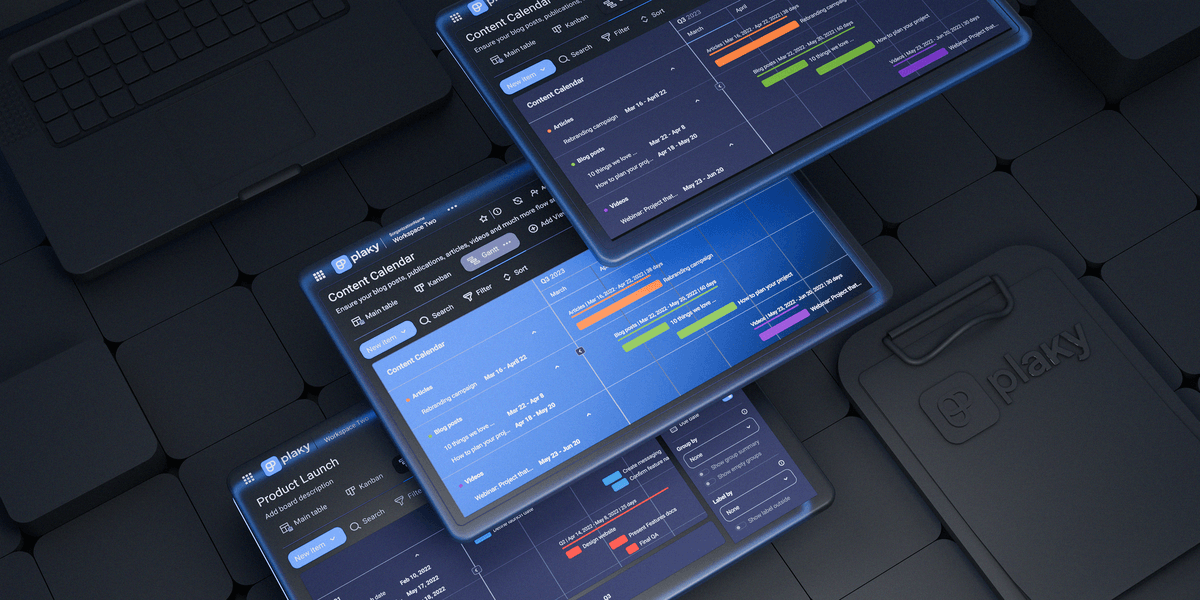
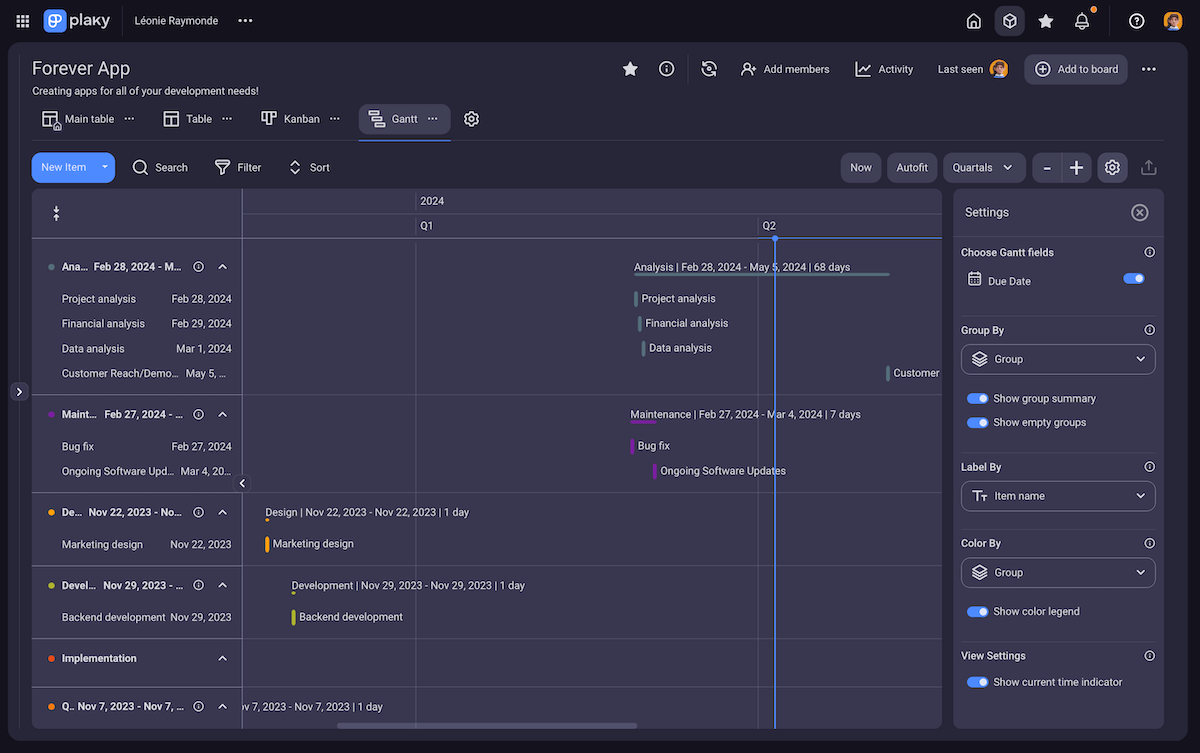
A Gantt chart is a project management tool that visually represents the project timeline in the form of a bar chart.
Each task corresponds to one bar on the chart which can be moved across the timeline, depending on its start and end dates.
Gantt chart is usually used by project managers or business owners, but it can be useful to anyone who needs a clear overview of their workload’s timeline.
8 Gantt chart examples
In the following text, we offer 8 Gantt chart examples for various types of projects, ranging from architecture to social media.
Project management Gantt chart example
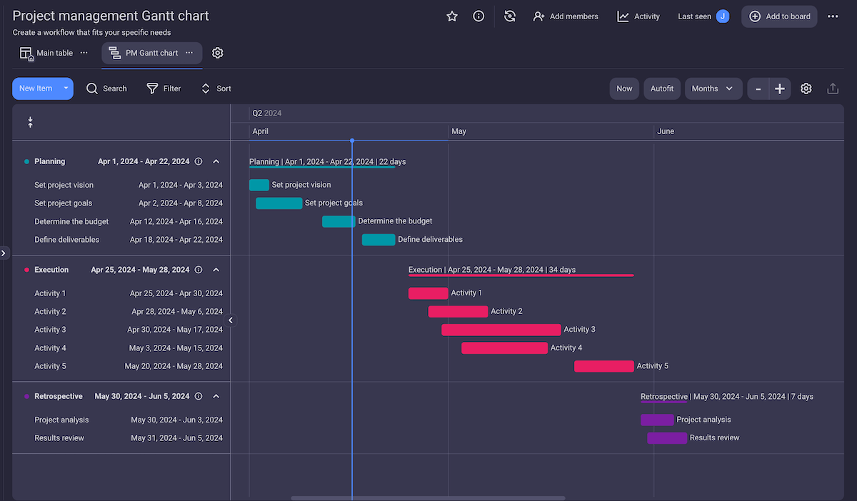
A Gantt chart is an essential tool when managing projects. This project management Gantt chart example created in Plaky by CAKE.com consists of tasks divided into 3 stages:
- Planning stage,
- Execution stage, and
- Retrospective stage.
There is also a vertical date line on the chart, marking today’s date on the timeline to give you a better perspective of tasks’ timelines.
This example is quite general, so any company or any team can use it for their projects.
Gantt chart example for architecture
When designing any type of building, precision is a must. That’s why architectural design projects demand a high level of organization.
A Gantt chart helps you visualize all the steps needed to complete your architectural project, ensuring nothing is looked over or forgotten.
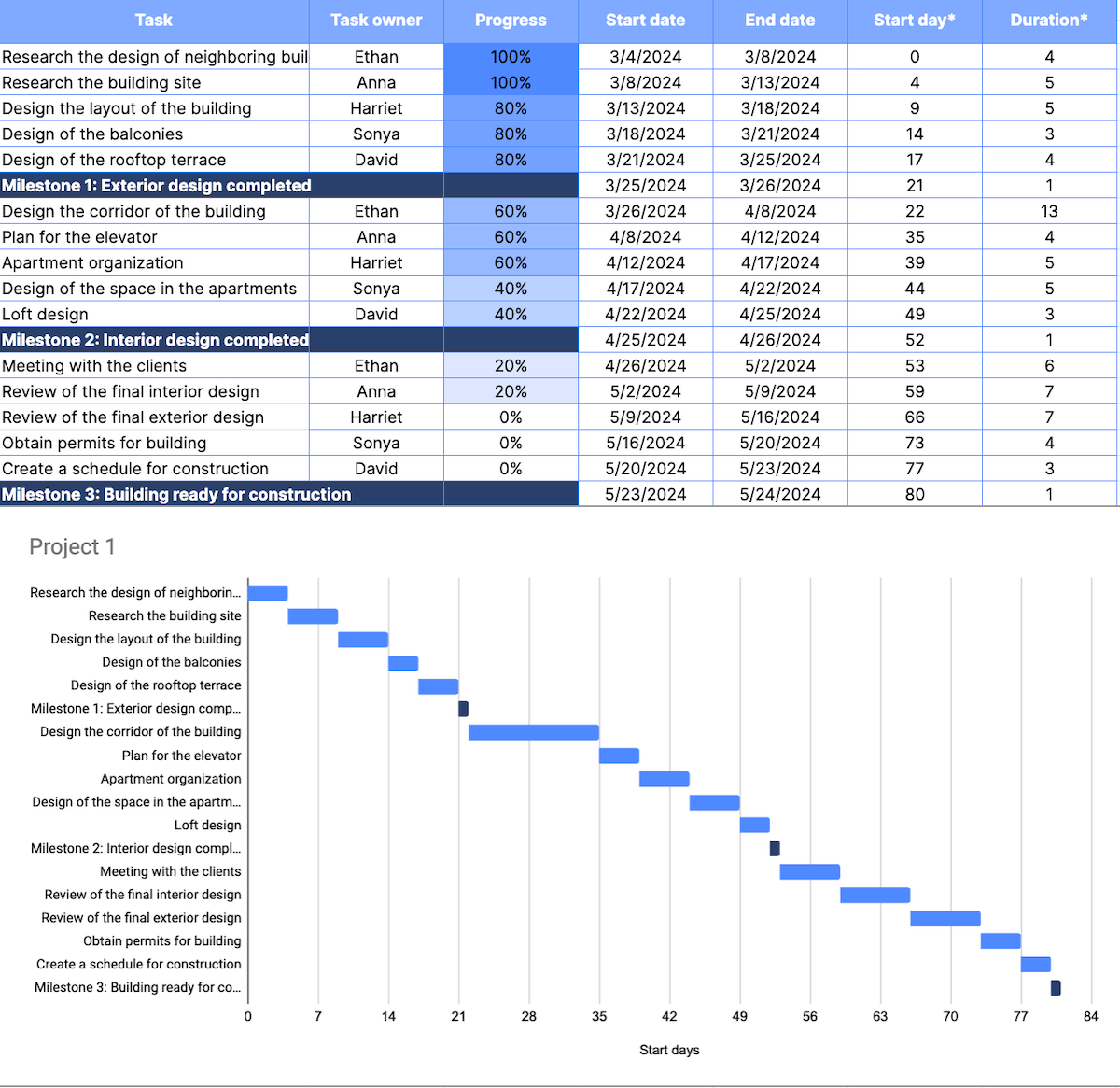
In this Gantt chart example, we created an architectural design project for a building. It includes 3 milestones:
- Exterior design completed,
- Interior design completed, and
- Building ready for construction.
There is also a list of tasks for each milestone, accompanied by task owner, progress, and start and end dates.
💡 Plaky Pro Tip
If you are looking for an example of Gantt chart templates in Excel, you will find several of them in our article:
Social media Gantt chart example
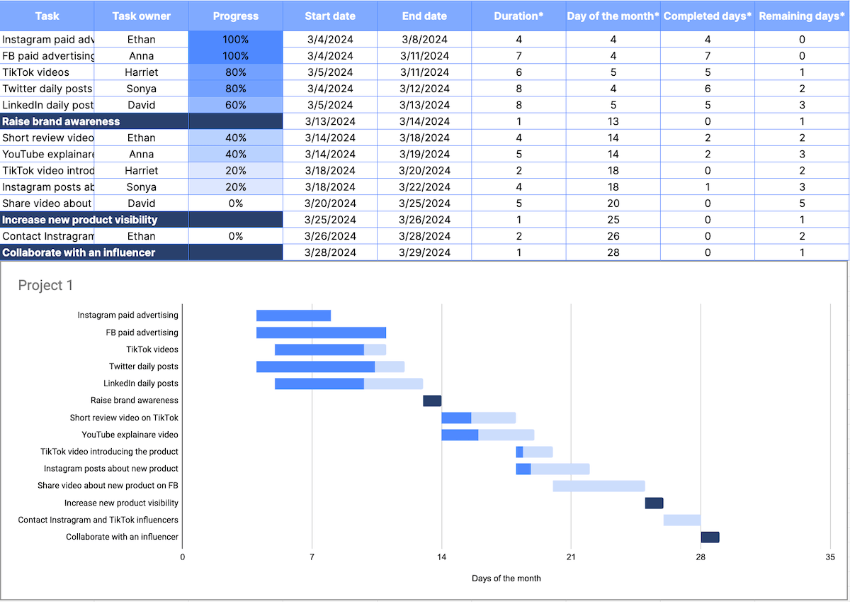
This social media Gantt chart in Google Sheets contains a list of tasks and 3 milestones:
- Raise brand awareness,
- Increase new product visibility, and
- Collaborate with an influencer.
Same as in the previous example, this chart shows you the duration of each task, as well as the start and end dates.
However, it’s more complex and also includes the completed days and the remaining days for each task to help you track the progress of all your tasks.
💡 Plaky Pro Tip
For this example, we used a Google Sheets template which you can find in this article:
Gantt chart example for a construction project
Construction projects are always marked with strict deadlines and strict project schedules. So, if you want to prevent missing deadlines, you need a well-organized project timeline.
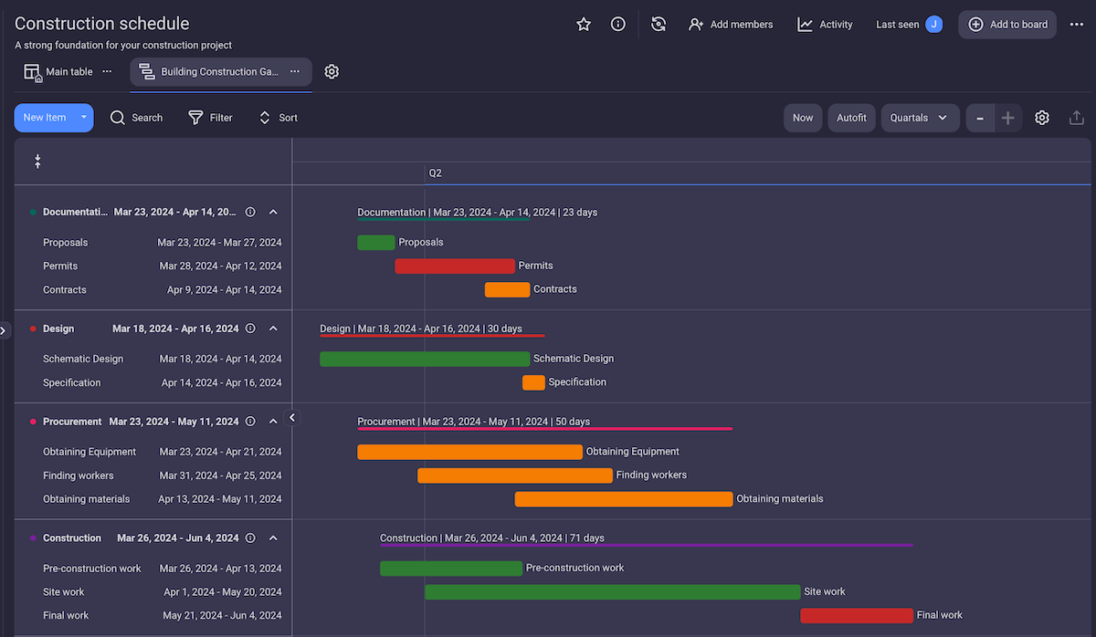
This construction project Gantt chart example created in Plaky includes:
- Tasks divided into 4 groups: Documentation, Design, Procurement, and Construction,
- Task timelines,
- Assignees,
- Priority,
- Budget, and more.
You can use Plaky’s construction schedule template to create a Gantt chart just like this one in a matter of minutes. The template is in the default Table view, but with just a few clicks, you can turn it into a Gantt chart.
Try our construction schedule template
💡 Plaky Pro Tip
Ensure your construction projects run smoothly with Plaky. Learn how to leverage our platform in the guide below:
Event planning Gantt chart example
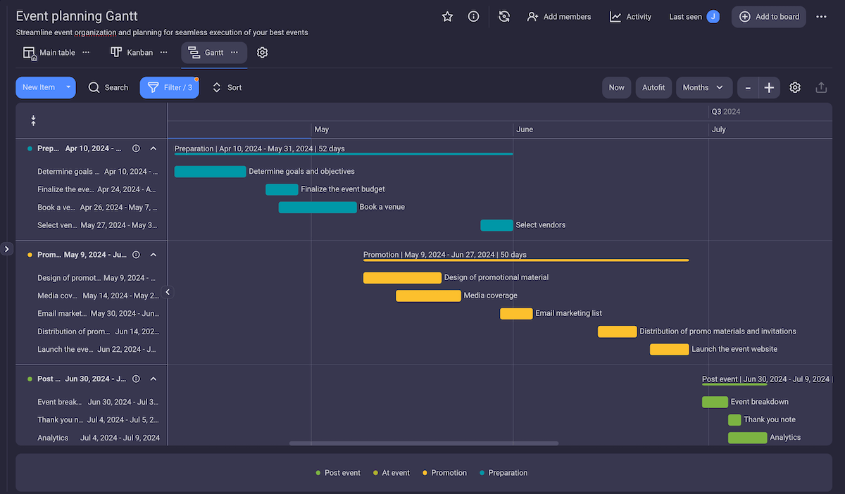
An event planning Gantt chart helps you plan all the details of an event. It consists of tasks divided into 4 groups: preparation, promotion, event tasks, and post-event tasks.
All these tasks contain information such as:
- Assignee,
- Team,
- Timeline,
- Cost,
- Status, etc.
The tasks in the chart are colored by group to make it easier to see where they belong.
With Plaky’s event planning template, you can create a Gantt chart just like this one and save precious time.
Get our event planning template
💡 Plaky Pro Tip
If you’re looking for more event planning templates, check out our article:
Business plan Gantt chart example
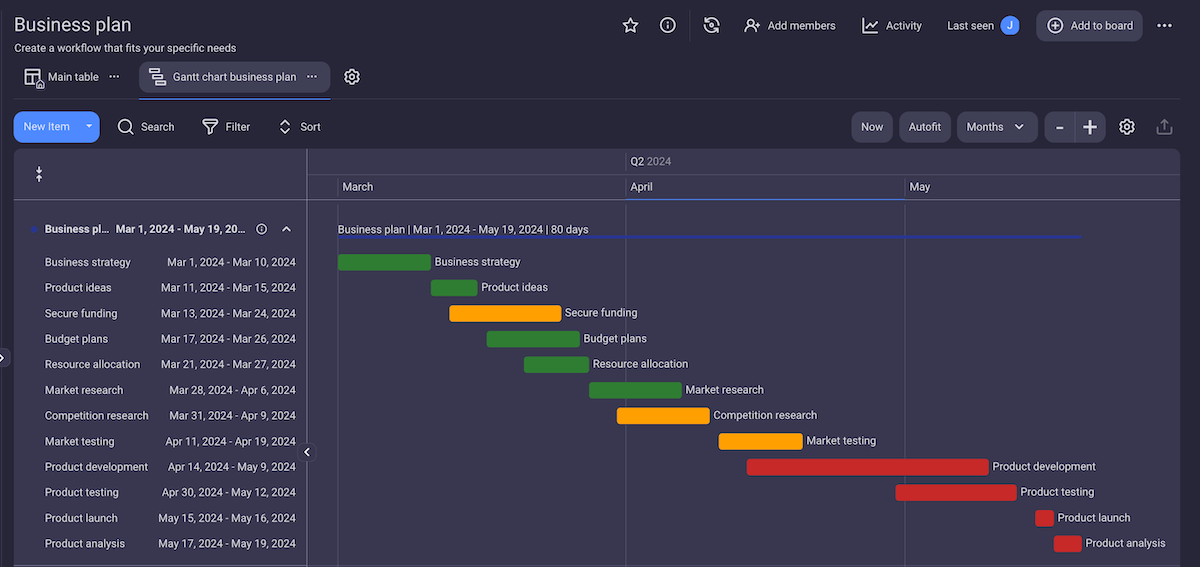
Having a business plan is essential to creating a successful business. Before you even start with the development of your product or service, you must have a detailed and realistic plan.
This business plan Gantt chart example includes all the essential items needed to create a high-quality business plan, such as:
- Business strategy,
- Product ideas,
- Resource allocation,
- Budget plans,
- Product development,
- Market research, and more.
The tasks are colored depending on their status – done tasks are green, tasks in progress are yellow, and those yet to be done are red. However, colors for statuses in Plaky are customizable, so you can choose whichever looks best to you.
Software engineering Gantt chart example
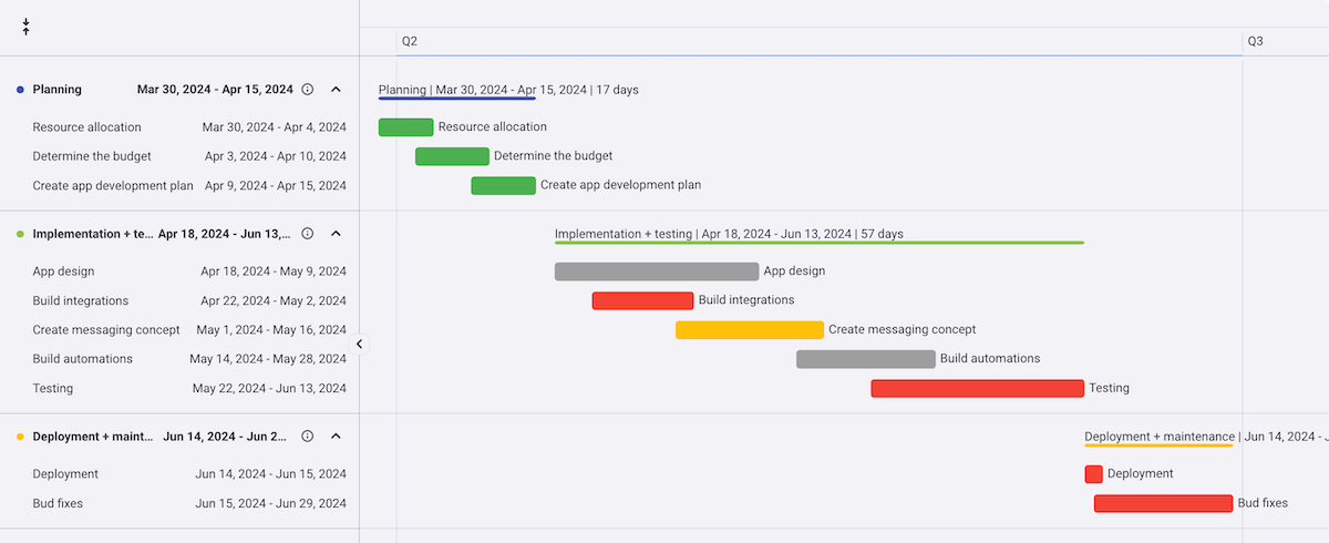
At the start of every software engineering project, you should create a software development plan. This software engineering Gantt chart visually represents this plan and enables you to track all engineering tasks.
The tasks in this example are divided into 3 stages:
- Planning,
- Implementation + testing, and
- Deployment + maintenance.
The task bars are colored according to task status – done, to do, in progress, and stuck – so you can see right away if the tasks are on track.
This example was created from scratch, but Plaky offers various software development templates such as product roadmap, bug tracking, product launch, etc.

Employee onboarding Gantt chart example
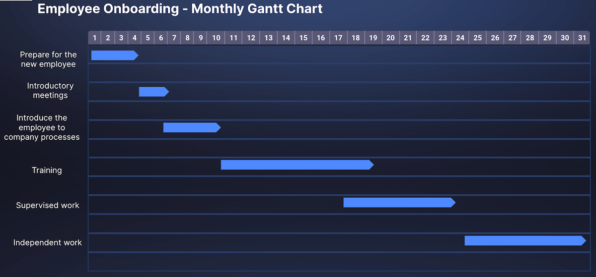
The employee onboarding Gantt chart example presents the timeline of a new employee’s first month at the company.
In this Google Slides Gantt chart example, the timeline is divided into sections representing days of the month.
The tasks are represented on the timeline using arrows. You can click on the arrows and move the tasks across the timeline, as well as shorten or extend the length of a task.
💡 Plaky Pro Tip
You can find the template I used to create this example in the following article:
What are the 5 parts of a Gantt chart?
A Gantt chart usually consists of 5 basic parts:
- Timeline (on the horizontal axis),
- Task list (on the vertical axis),
- Task start and end date,
- Project milestones, and
- Task dependencies.
However, not all Gantt charts have to be the same.
For simpler projects, you might not need to include milestones and dependencies. For more complex projects, on the other hand, you might want to include task progress or subtasks.
How can I create a Gantt chart?
You can create a Gantt chart by following these 6 steps:
- Choose where you want to create a Gantt chart – Excel, Google Sheets, PowerPoint, or project management software,
- Enter the tasks into the chart,
- Enter task timeline information (start date, end date, duration),
- Add any additional information about tasks (e.g. assignee, status, team, etc.)
- Add milestones, and
- Add dependencies.
Keep in mind that creating Gantt charts in Excel, Google Slides, or PowerPoint can be time-consuming and complicated.
On the other hand, if you’re using a project management tool, all you have to do is enter the tasks and their timelines, and after a few clicks, you have a complete Gantt chart.
💡 Plaky Pro Tip
Using a project management tool can make your job much easier. If you are not sure which one to choose, you can find the list of best Gantt chart software in our article:
Why is a Gantt chart important?
A Gantt chart is one of the most popular tools for project managers.
We had the opportunity to talk to Cristiano Bellucci, Technology and Innovation Strategy Lead at Fujitsu, and he listed some of the main reasons why using Gantt charts for project management is important:

- “[A Gantt chart] gives the opportunity to every stakeholder to understand the plan for the future,
- It shows the dependencies among tasks,
- It highlights the responsible people or team, and
- It defines major and minor milestones that help keep track of the advancement of the project and its overall health.”
Another person to share their view on the importance of Gantt charts is the founder and CEO of HackerNoon, David Smooke. He explained how Gantt charts help him in his work:

“A Gantt chart is like a rhetorical roadmap. While a roadmap claims to be where you’re going, a Gantt chart actually shows us where we’ve been — and how much input it took for us to get there. A Gantt chart helped me realize I was consistently underestimating how long projects take to complete.
A Gantt chart provides a bar graph friendly granular view of the project’s life cycle. It shows the dependencies between tasks, which is critical when updating or scaling a system like the HackerNoon CMS that serves millions of people per month.”
Create scalable Gantt charts in Plaky by CAKE.com
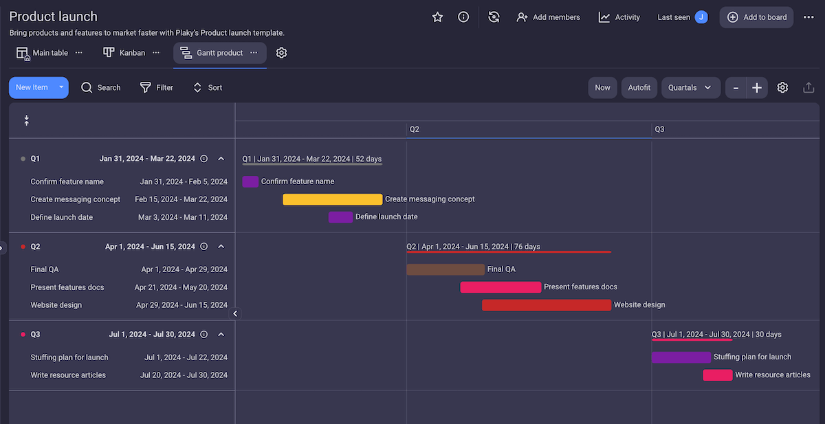
Although a Gantt chart can be created in Excel and PowerPoint, it is much more functional and time-efficient to create it using project management software like Plaky by CAKE.com.
The main advantage of using Plaky’s Gantt chart instead of a spreadsheet is that it’s scalable, meaning it can grow with your project. You can add or remove tasks during your project any time you want without messing up the chart or having to readjust it manually.
Plaky is also highly customizable. At any point during the project, you can:
- Add new task fields (e.g. tags, status, assignee, etc.),
- Filter tasks (e.g. to see only tasks that are in progress or stuck)
- Change the criteria for grouping tasks (e.g. assignee, status, priority, etc.)
- Change the timeline to show days, weeks, months, quarters, or years.
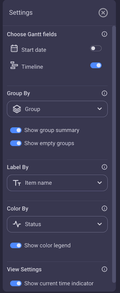
But Plaky’s Gantt chart is more than just a visual representation tool. You can also click on any task in the chart and it will open a task card with all the information connected to it, including comments and files. This way, you get a comprehensive overview of your entire project.
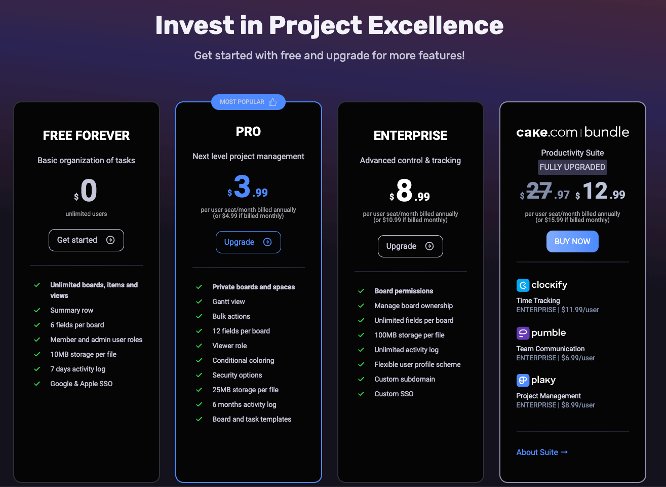
Plaky has a free forever plan, as well 2 paid plans:
- Pro Plan – $3.99 per user seat per month (billed annually), and
- Enterprise Plan – $8.99 per user seat per month (billed annually).
Moreover, for $12.99, you can get the CAKE.com Productivity Bundle, which includes the enterprise plans of the 3 CAKE products:
- Plaky — a project management tool,
- Clockify — time-tracking software, and
- Pumble — a business communication app.
If you want to create scalable and customizable Gantt charts quickly and without any unnecessary steps, get started with Plaky for free today.
Get started with Plaky by CAKE.com

