Chart View
Chart View lets you visualize your projects and tasks by using interactive charts. With this view, you can group tasks by specific fields and see how those compare. For example, you can use Charts to group tasks by completion status, giving you a clear picture of how many tasks are labeled as to do, in progress, or done.
Plaky offers 2 types of charts you can use:
- Pie chart
- Bar chart
This article shows how to create and configure a Chart view.
Create a new Chart View #
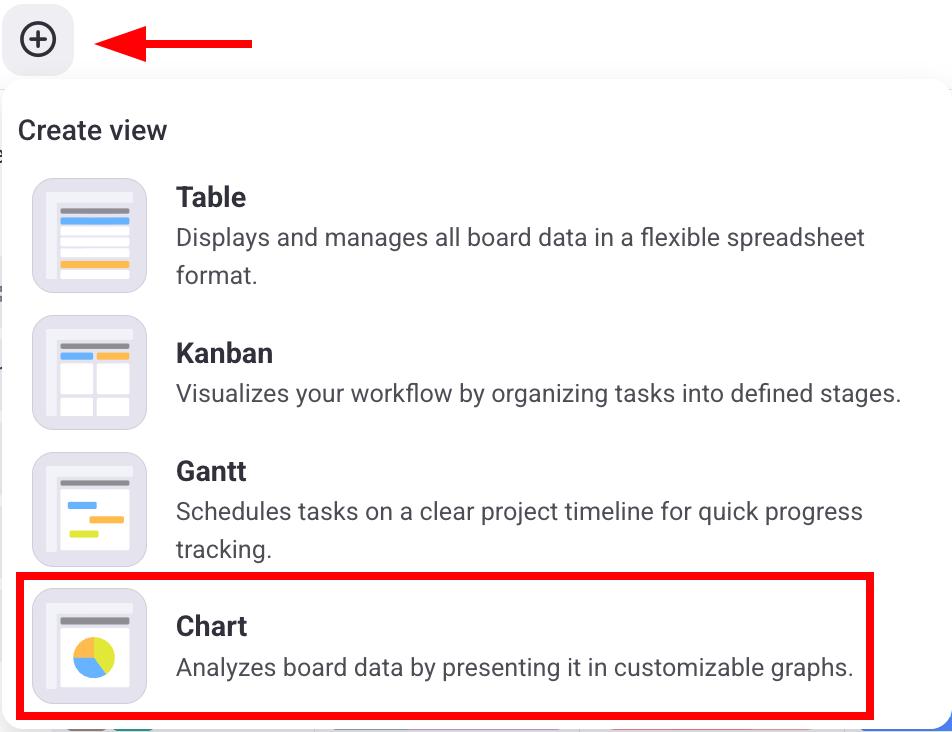
To create a new Charts View, follow these steps:
- Click on the + button
- Select Chart
- Open your Board
- Tap on the Board View Configuration in the top right corner
- Select Views
- Tap on +New view
- Enter View Title
- Select Chart
- Tap on Create to finish the action
- Open your Board
- Tap on the three dots in the top right corner
- Tap on Add view
- Enter the View name
- Select Chart
- Tap on Create to finish the action
Users can create Charts depending on the following board permissions:
| Permissions | Board owner | Board member (edit everything) | Board member (edit content) | Board member (add comments and files) | Viewer |
|---|---|---|---|---|---|
| Create public Chart | ✅ | ✅ | ❌ | ❌ | ❌ |
| Create private Chart | ✅ | ✅ | ✅ | ✅ | ❌ |
| Customize Charts | ✅ | ✅ | ❌ | ❌ | ❌ |
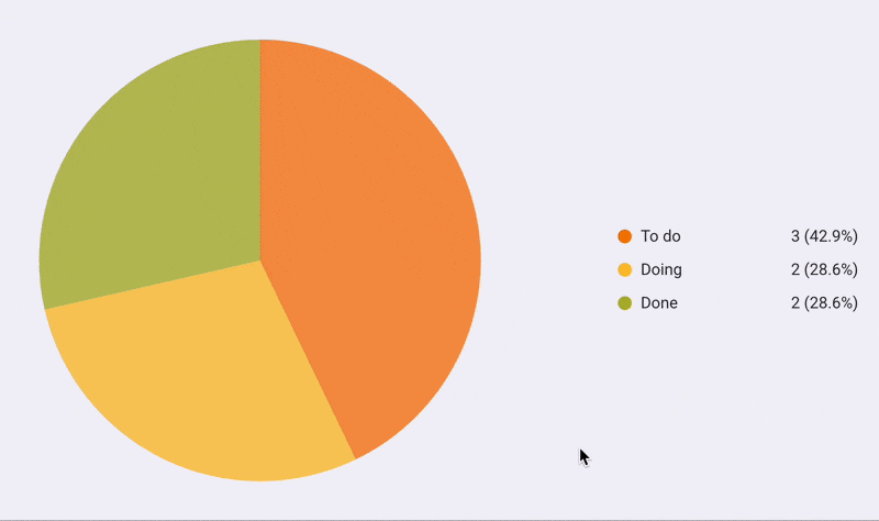
Pie chart #
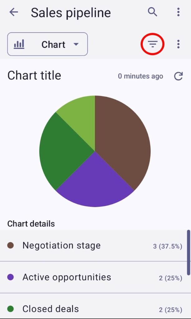
The Pie chart shows the number of projects and tasks grouped by particular Item fields (Status, Tag, and Person) and divided into slices. Every slice represents the number of items that are a part of the label you choose.
On the right side of the Pie chart, you can see labels that display the values of every slice in the chart. Each label has a name, total value, and the percentage the slice contributes to the pie chart.
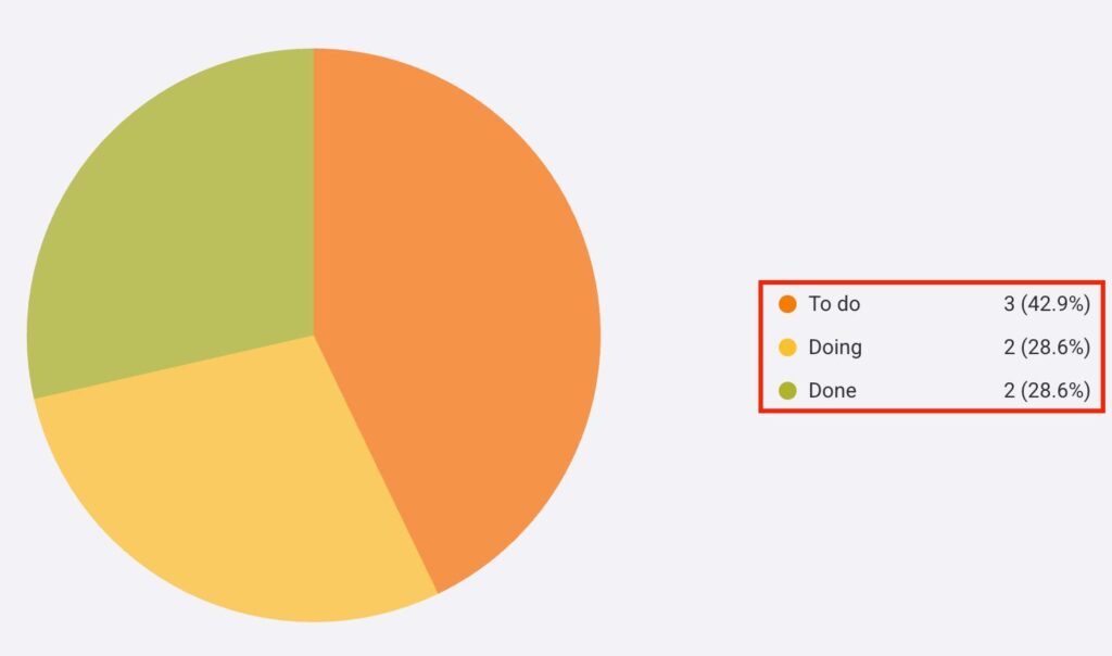
When you hover over a slice on the Pie chart, the selected slice will be highlighted and enlarged. In addition, a tooltip will appear that shows the name, total value, and percentage the slice contributes to the chart.
Bar chart #
The Bar chart lets you view all tasks and subtasks grouped by fields and divided into columns. As with slices on the Pie chart, every column in the Bar chart represents the number of Items in a particular label.
To represent data, the Bar chart uses the X and Y axes. The X axis lists all columns, while the Y axis counts the total number of Items in every column.
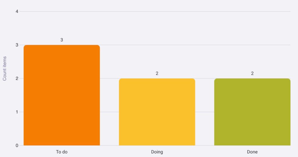
When you hover over a column on the Bar chart, the selected column will have a brighter color, and a tooltip will appear above it. The tooltip will show the name, total value, and the percentage the column contributes to the chart.
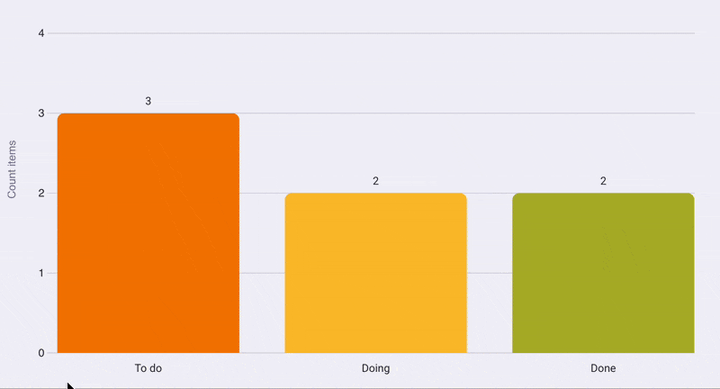
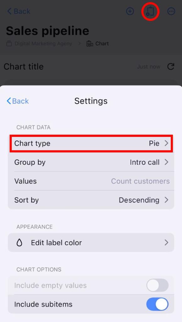
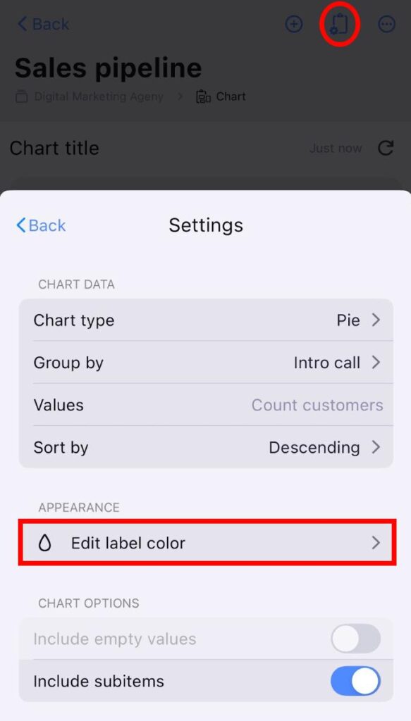
Chart view settings #
The Chart view can be customized according to your preferences by accessing the Settings panel on the right side of the Chart.
Let’s look at the settings you can customize.
Chart type #
You can change the type of chart that will be displayed on the screen. Here’s how you can do this:
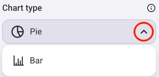
- Click on the gear icon to open the Settings panel
- Click the dropdown arrow in the Chart type section
- Select the Chart type
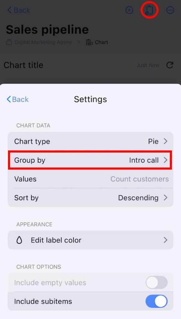
- Tap on Board view configuration
- Ensure that the Chart view is selected
- Tap on Settings
- Tap on Chart type
- Select the Chart type you want
- Open Chart view
- Tap on the three dots next to the filter button
- Select View configuration
- Tap on the Chart type dropdown
- Select the Chart type

The Pie chart will be the default type when creating a new Chart view.
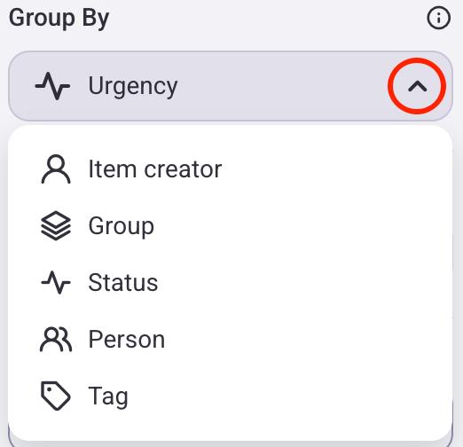
Group Items #
Charts illustrate data depending on how you group items/subitems. You can group items/subitems by:
- Item creator — every slice/column shows the number of Items created by an individual
- Group — every slice/column shows the number of Items in an Item group
- Status — every slice/column shows the number of Items by Status labels
- Person — every slice/column shows the number of Items where users and teams are assigned
- Tag — every slice/column shows the number of items with a specific Tag
Depending on what type of chart you select, the way you group Items will differ.
Here’s how you can do this:
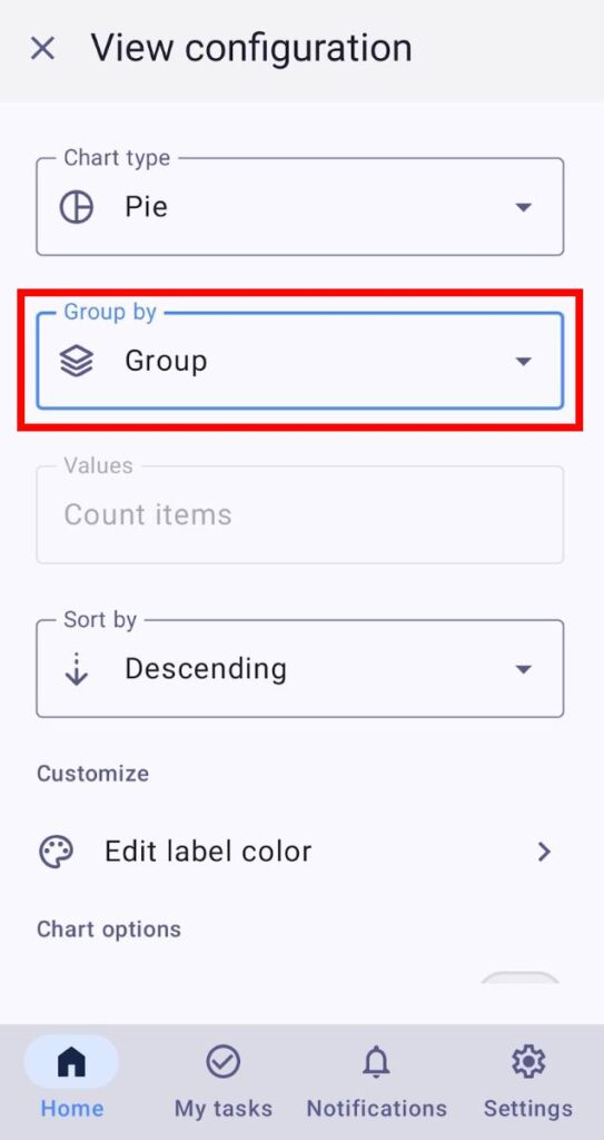
Pie Chart:
- Click on the gear icon to open the Settings panel
- Click on the dropdown arrow under the Group by section
- Choose the criteria you want to group Items by
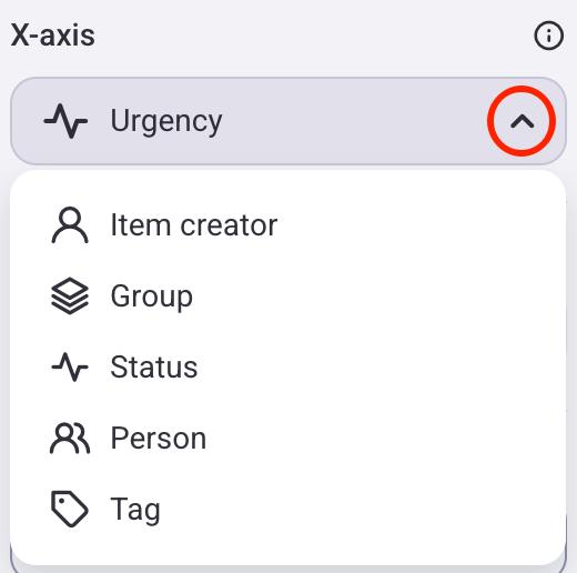
Bar Chart:
When you switch from Pie chart to Bar chart, the X axis will have the same behavior as the Group by setting. For example, if the Pie chart is grouped by Status, the Bar chart’s X axis will also be set to Status.
- Click on the gear icon to open the Settings panel
- Click on the dropdown arrow under the X Axis section
- Choose the criteria you want to group Items by
Pie Chart:
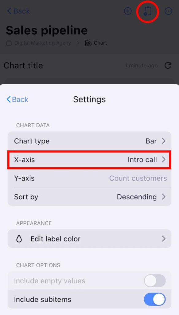
- Tap on Board view configuration
- Ensure that the Chart view is selected
- Tap on Settings
- Tap on Group by
- Choose the criteria you want to group Items by
Bar Chart:
- Tap on Board view configuration
- Ensure that the Chart view is selected
- Tap on Settings
- Tap on X axis
- Choose the criteria you want to group Items by
Pie Chart:
- Open Chart view
- Tap on the three dots next to the filter button
- Select View configuration
- Tap on the Group by dropdown
- Choose the criteria you want to group Items by
Bar Chart:
- Open Chart view
- Tap on the three dots next to the filter button
- Select View configuration
- Tap on the X axis dropdown
- Choose the criteria you want to group Items by
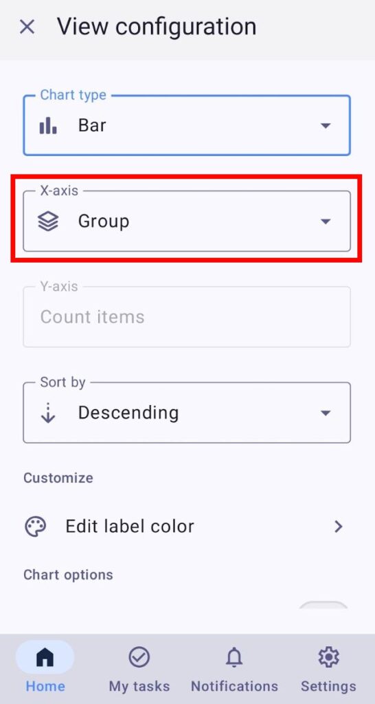
The Item creator and Group values are always visible, while other values must first be created on the Board before they can be selected.
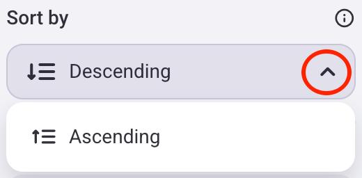
Sort by #
You can select whether the chart values will be sorted in ascending or descending order. Here’s how to do this:
- Click on the gear icon to open the Settings panel
- Click on the dropdown arrow under the Sort by section
- Select if you want to sort items in ascending or descending order
- Tap on Board view configuration
- Ensure that the Chart view is selected
- Tap on Settings
- Tap on Sort by
- Select if you want to sort items in ascending or descending order

- Open Chart view
- Tap on the three dots next to the filter button
- Select View configuration
- Tap on the Sort by dropdown
- Select if you want to sort items in ascending or descending order
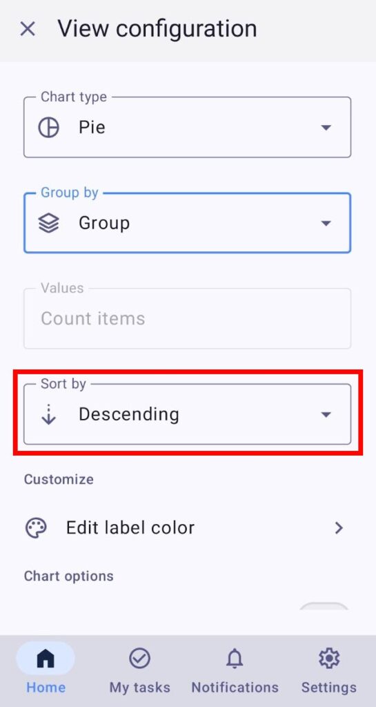
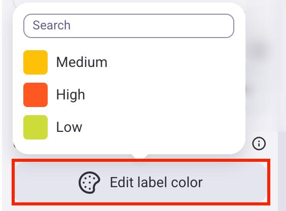
Edit label color #
Charts will inherit the label’s primary color when created. Here’s how you can change this:
- Click on the gear icon to open the Settings panel
- Click on Edit label color
- Select a label
- Choose the new label color
- Tap on Board view configuration
- Ensure that the Chart view is selected
- Tap on Settings
- Tap on Edit label color
- Select a label
- Choose the new label color
- Open Chart view
- Tap on the three dots next to the filter button
- Select View configuration
- Tap on the Edit label color
- Select the label and change the color
- Tap on Save to complete the action
If you change a label color with this option, it will only affect the Chart view.
Include empty values #
You can choose whether you want to show or hide Items with no relevant data in your chart. For example, if you group Items by Person, this option will create a separate slice that shows the number of Items without individuals assigned to them. This can be useful for highlighting the proportion of unassigned tasks in your project.
Here’s how to do this:
- Click on the gear icon to open the Settings panel
- Toggle the Include empty values button
- Tap on Board view configuration
- Ensure that the Chart view is selected
- Tap on Settings
- Toggle the Include empty values button
- Open Chart view
- Tap on the three dots next to the filter button
- Select View configuration
- Toggle the Include empty values button
Include empty values option is turned off by default.
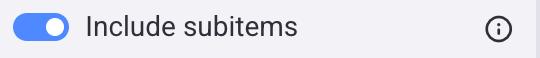
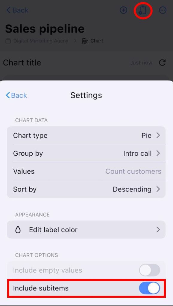
Include subitems #
Subitems can be included in your chart, and they will be counted together with regular items. For example, if you have 2 Items and 5 Subitems, the total value for the label will be 7. This can be useful when you want to see the total workload, including both main tasks and their subtasks.
Here’s how you can include Subitems:
- Click on the gear icon to open the Settings panel
- Toggle the Include subitems button
- Tap on Board view configuration
- Ensure that the Chart view is selected
- Tap on Settings
- Toggle the Include subitems button
- Open Chart view
- Tap on the three dots next to the filter button
- Select View configuration
- Toggle the Include subitems button
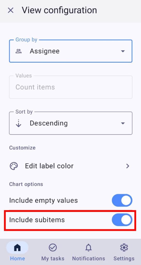
Include subitems option is turned on by default.
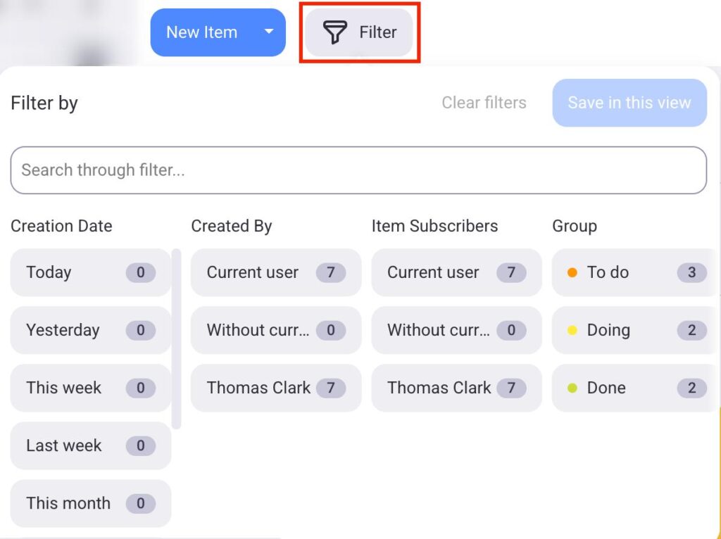
Apply filters #
You can apply Board filters and select which information will be displayed in the Chart view.
To use filters, follow these steps:
- Click the Filter button
- Choose filters that you want to apply to the chart
- Click Save in this view to complete the action
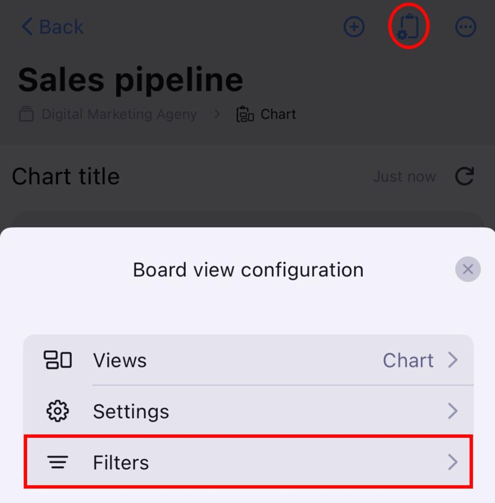
- Tap on Board view configuration
- Ensure that the Chart view is selected
- Tap on Filters
- Select the filters you want
- Tap Save to complete the action
- Open Chart view
- Tap on the Filter button
- Select filters
- Tap Save to complete the action
Items can be filtered by multiple criteria, such as Creation date, Item group, and more.
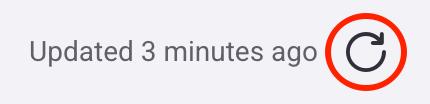
Refresh Chart view #
The chart will refresh automatically every 15 minutes or when you change relevant Board data (e.g., adding a new Item, applying filters, changing chart settings). If you want to update the chart manually, you can click the refresh button in the top right corner or reload the page.