
Dashboard in Plaky
Dashboards let you visualize multiple Boards and compare data across them by using pie and bar charts. This makes tracking projects and tasks much easier and more organized.
How to create a Dashboard #
The number of Boards you can connect depends on your subscription plan
- Free plan: 1 Board per Dashboard
- Pro plan: 15 Boards per Dashboard, and 30 widgets per Dashboard
- Enterprise plan: 30 Boards per Dashboard, and 30 widgets per Dashboard
To create a Dashboard, you need to have at least one Board on a Space.
To create a Dashboard, follow these steps:
- Click on the + button in the left sidebar
- Select New dashboard
- Enter the Dashboard name
- Select if you want the Dashboard to be private (optional)
- Click Create
- Select the Boards you want to connect
- Click Save to complete the action
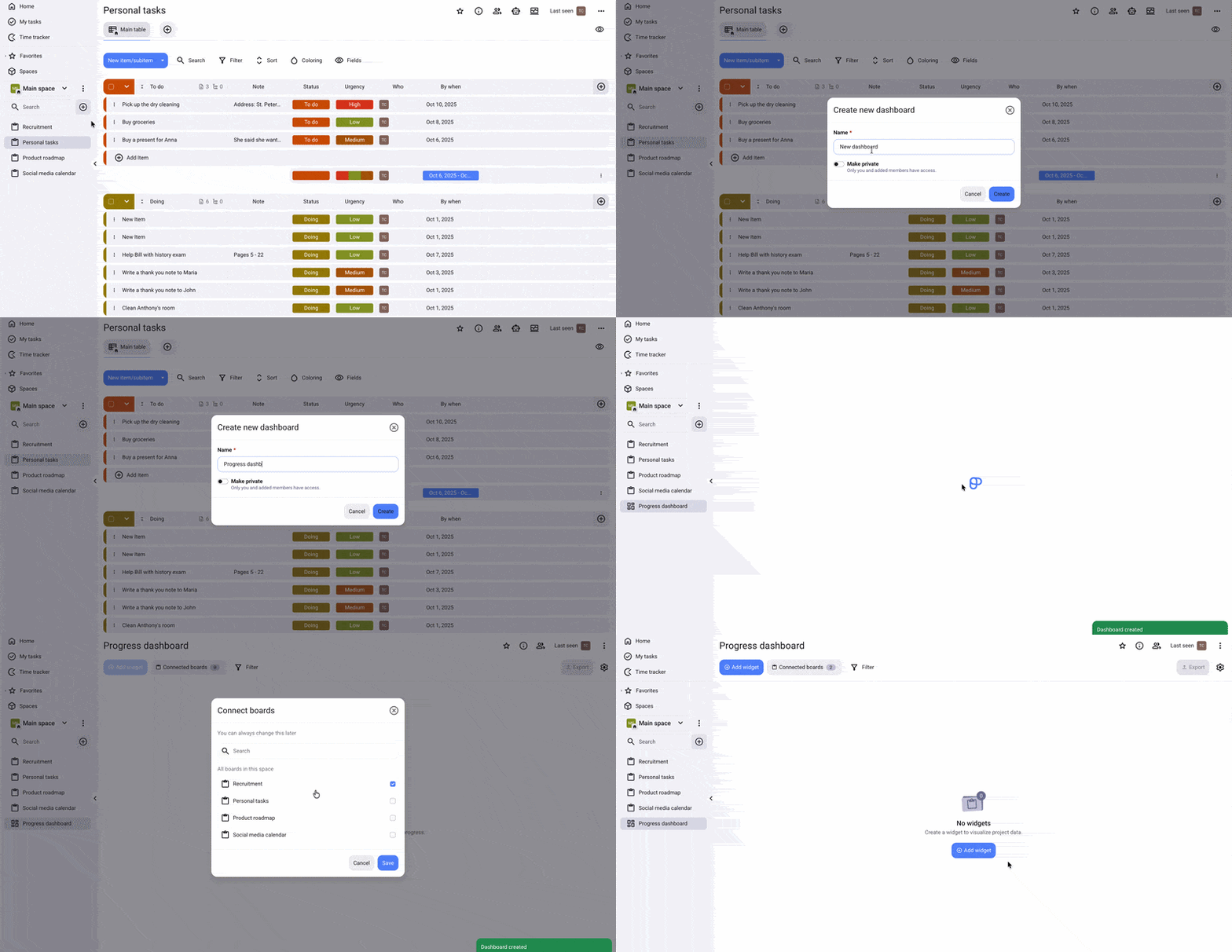
If you didn’t connect Boards when you created the Dashboard, you will have the option to do so when you open the Dashboard.
Add widgets to Dashboard #
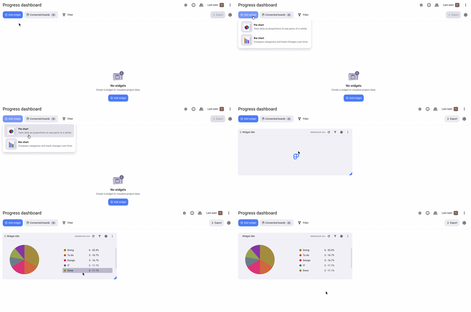
Once you have created the Dashboard, you can add chart widgets to visualize your data more clearly in your Workspace.
Here’s how to add widgets to a Dashboard:
- Open the Dashboard
- Click on + Add widget
- Select Pie or Bar chart
Widget settings #
You can configure each widget to display the information you want on a Dashboard. To access widget settings, click on the gear icon next to a widget. Here, you can configure the following:
Data sources #
You can select from which data sources your widget will pull information. To do this, open the settings panel and click on the Data sources dropdown. Here you can see all the connected Boards and Fields that are by default preselected, and you can then further customize which ones you want to include in the widget. This change will apply only to the selected widget.
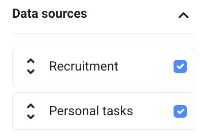
Chart type #
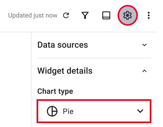
There are 2 different types of charts you can use in your Dashboard:
- Pie chart
- Bar chart
You can pick between the charts by clicking on the dropdown when you open Widget settings.
Grouping and axis configuration #
Whether you are using a pie or bar chart, you will have different options for grouping Items in the chart.
For Pie charts, you can select how Items will be grouped by clicking on the Grouping dropdown.
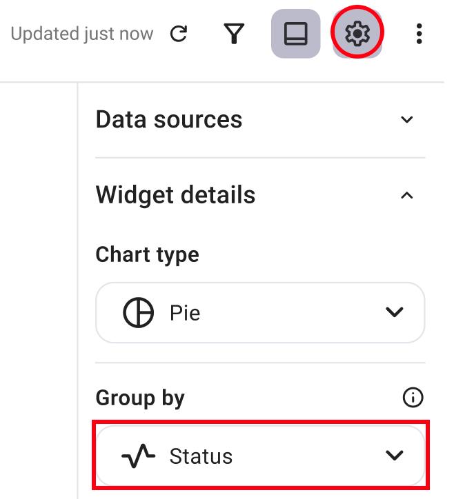
For Bar charts, you can select how Items will be grouped by clicking on X axis dropdown.
Sorting #
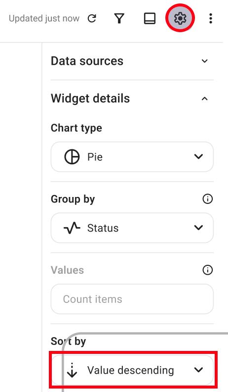
Items can be sorted in ascending or descending order, and you can change this by clicking the Sort by dropdown in the Settings panel.
Edit label color #
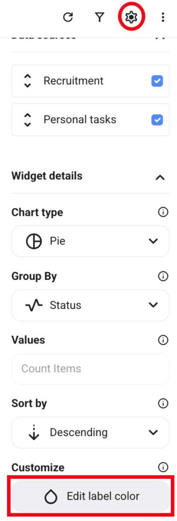
You can change the label colors on a chart so you can easily recognize Item groups. To do this, simply click on the Edit label color button.
Filter #
You can apply filters to the widget and select which Fields will be shown. Here’s how to do this:
- Click on the Filter button
- Click on the Board dropdown to select the Board
- Select what you want to include for that specific Board
- Click Save in this widget
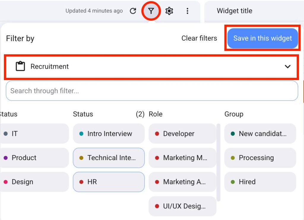
Filters across different Boards are connected together. This means that if you use Filters for Board1, but not for Board2, the widget will display filtered results for Board1 and all results for Board2.
Connected Boards and matching Fields #
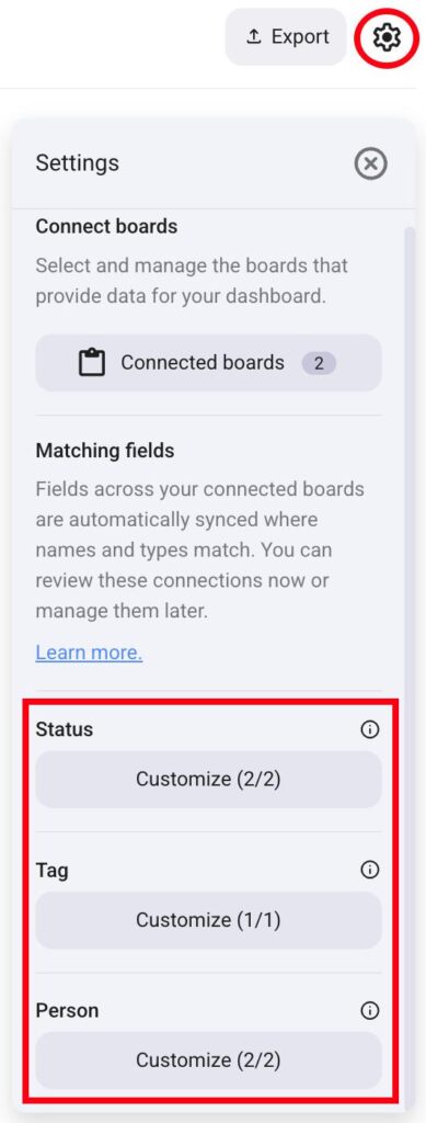
The system will try to automatically map Fields based on their Type and Name.
- Status, Tag, and Person Fields are automatically mapped if they have identical names across different Boards
- If 2 or more Boards have the same name for a certain Field, while other Boards use a different name, the system will by default map only the Fields from the two same Boards
- If there are no 2 Boards with the same name, and all Boards have a different name for a certain Field, the system will not automatically map them
You can override which Boards are connected to the Dashboard and what Fields should match.
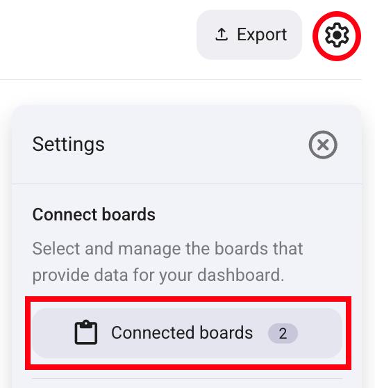
Here’s how you can change Connected Boards:
- Click on the gear icon on the right
- Click on Connected boards
- Check next to the Board you want to connect to the Dashboard
- Click Save to complete the action
To set matching Fields, follow these steps:
- Click on the gear icon on the right
- Click on Customize under a certain Field type
- Click on the dropdown to select the Field
- Click Done to complete the action
Export the Dashboard and share it with others #
Dashboards are an excellent way to showcase your work to coworkers and partners outside of your Plaky Workspace. To do this, you will have to export the Dashboard and then send it forward.
Here’s how to export a Dashboard:
- Click on the Export button on the right
- Select the format (PDF, PNG, ZIP)
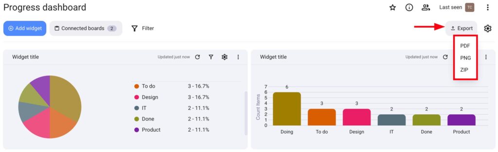
When the export is complete, the Dashboard file will be downloaded to your device, and you can send it to your coworkers and partners.