Vue Graphique
La vue graphique vous permet de visualiser vos projets et tâches à l'aide de graphiques interactifs. Grâce à cet affichage, vous pouvez regrouper les tâches selon des critères spécifiques et les comparer. Par exemple, vous pouvez utiliser les graphiques pour regrouper les tâches par statut d'achèvement, ce qui vous donne une vue claire du nombre de tâches marquées comme « À faire », « En cours » ou « Terminées ».
Plaky propose deux types de graphiques :
- Diagramme circulaire
- Diagramme à barres
Cet article explique comment créer et configurer une vue graphique.
Créer une nouvelle vue graphique #
Pour créer une nouvelle vue, procédez comme suit :
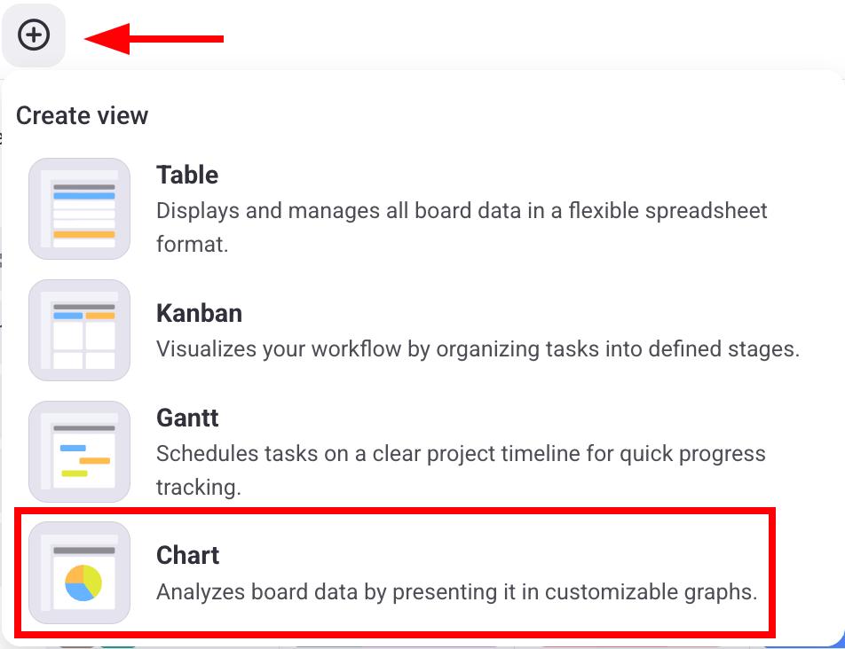
- Cliquez sur le bouton +
- Sélectionnez Graphique
- Ouvrez votre tableau
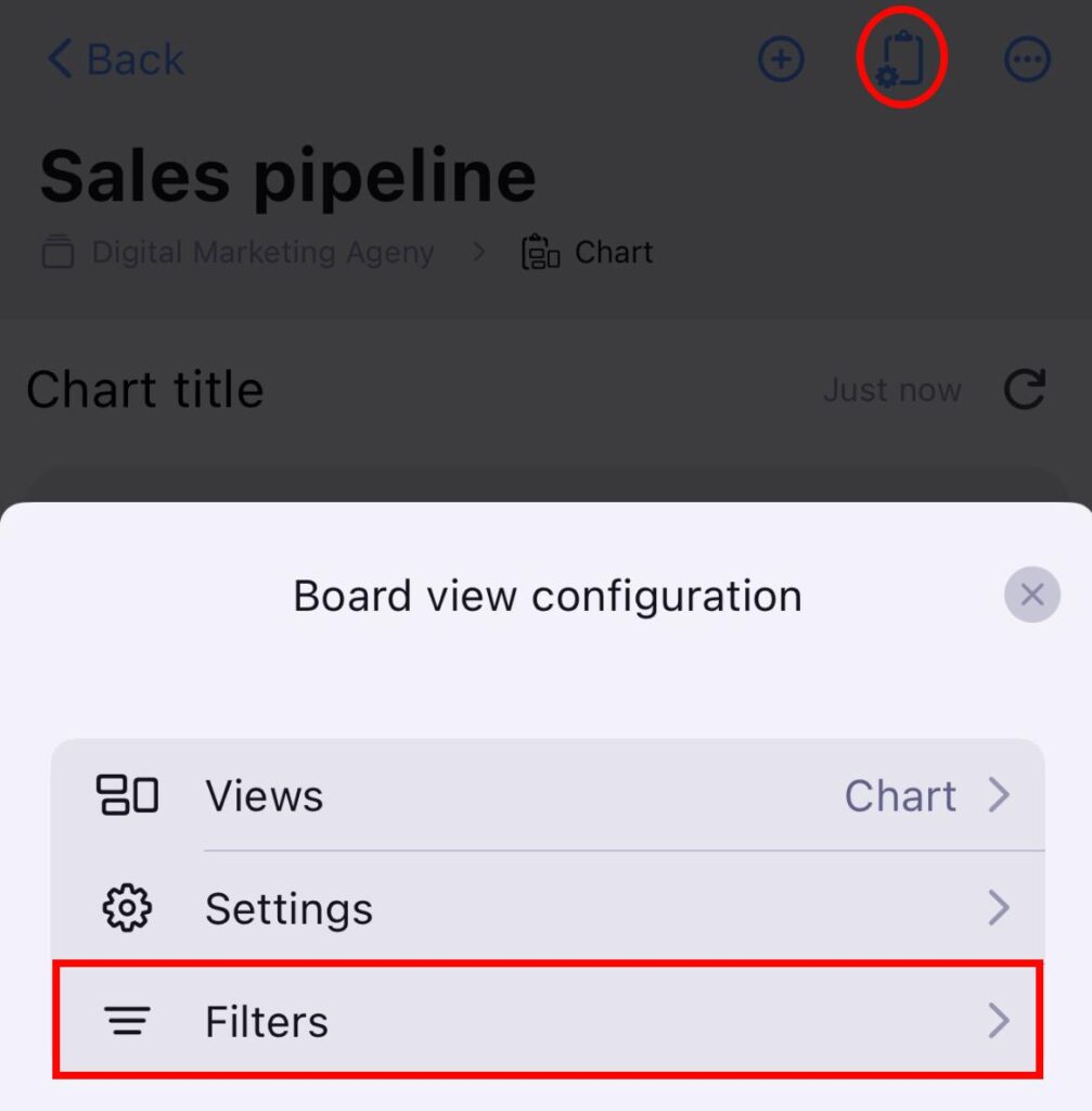
- Appuyez sur Configuration de l’affichage du tableau en haut à droite
- Sélectionnez Affichage
- Sélectionnez + Nouvel affichage
- Saisissez le nom de l’affichage
- Sélectionnez Graphique
- Appuyez sur Créer pour terminer
- Ouvrez votre tableau
- Cliquez sur les trois points dans le coin supérieur droit
- Appuyez sur Ajouter un affichage
- Saisissez le Nom de l’affichage
- Sélectionnez Graphique
- Appuyez sur Créer pour terminer
Les utilisateurs peuvent créer des graphiques en fonction des autorisations du tableau suivantes :
| Autorisations | Propriétaire du tableau | Membre du Tableau (tout modifier) | Membre du Tableau (modifier le contenu) | Membre du Tableau (ajouter des commentaires et des fichiers) | Visionneur |
|---|---|---|---|---|---|
| Créer graphique public | ✅ | ✅ | ❌ | ❌ | ❌ |
| Créer graphique privé | ✅ | ✅ | ✅ | ✅ | ❌ |
| Personnaliser les graphiques | ✅ | ✅ | ❌ | ❌ | ❌ |
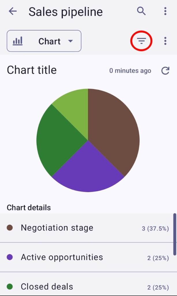
Graphique circulaire #
Ce graphique circulaire présente le nombre de projets et de tâches regroupés par Champs spécifiques (Statut, Étiquette et Personne) et divisés en secteurs. Chaque secteur représente le nombre d'éléments correspondant à l'étiquette sélectionnée.
À droite du graphique, les étiquettes affichent la valeur de chaque secteur. Chaque étiquette comprend un nom, la valeur totale et le pourcentage que représente le secteur dans le graphique.
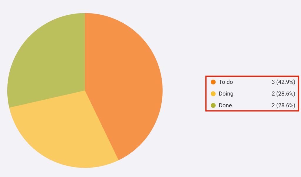
Lorsque vous survolez une partie du graphique circulaire, celle-ci est mise en surbrillance et agrandie. Une infobulle s'affiche alors, indiquant son nom, sa valeur totale et le pourcentage qu'elle représente dans le graphique.
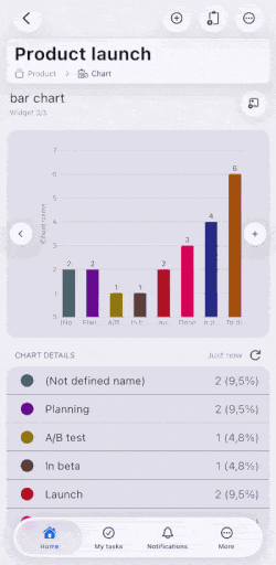
Graphique à barres #
Le graphique à barres permet de visualiser toutes les tâches et sous-tâches regroupées par champs et réparties en colonnes. Comme pour les secteurs du graphique circulaire, chaque colonne du graphique à barres représente le nombre d'éléments associés à une étiquette particulière.
Pour représenter les données, le graphique à barres utilise les axes X et Y. L'axe X liste toutes les colonnes, tandis que l'axe Y compte le nombre total d'éléments dans chaque colonne.
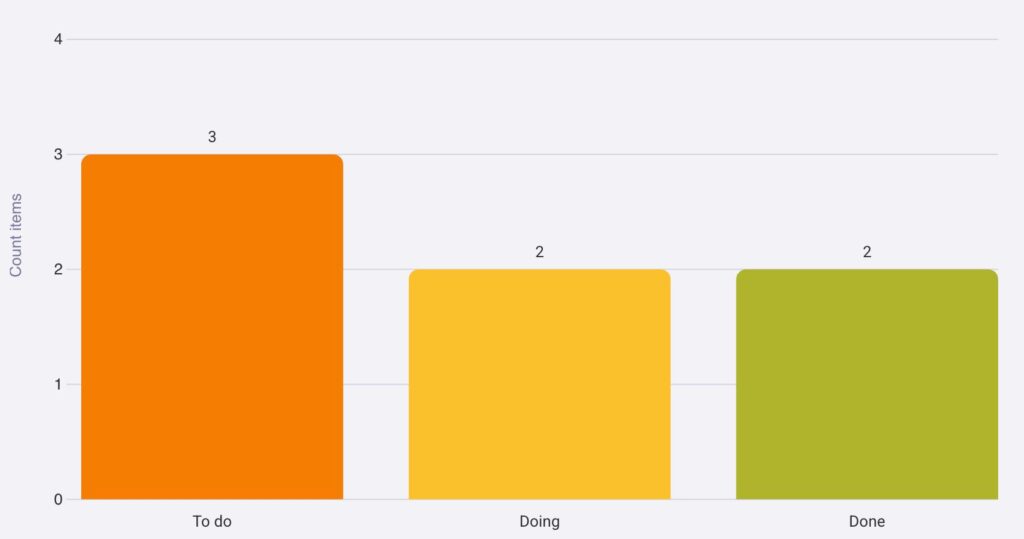
Lorsque vous survolez une colonne du graphique à barres, la colonne prend une couleur plus vive et une infobulle apparaît au-dessus. Cette infobulle indique le nom, la valeur totale et le pourcentage que représente la colonne pour le graphique.
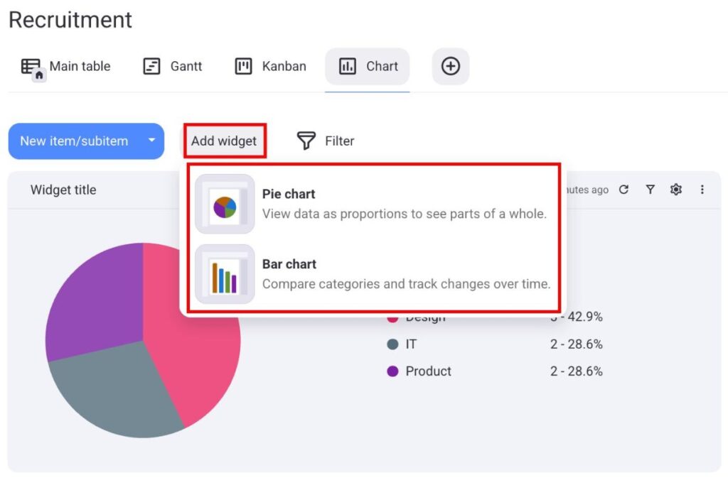
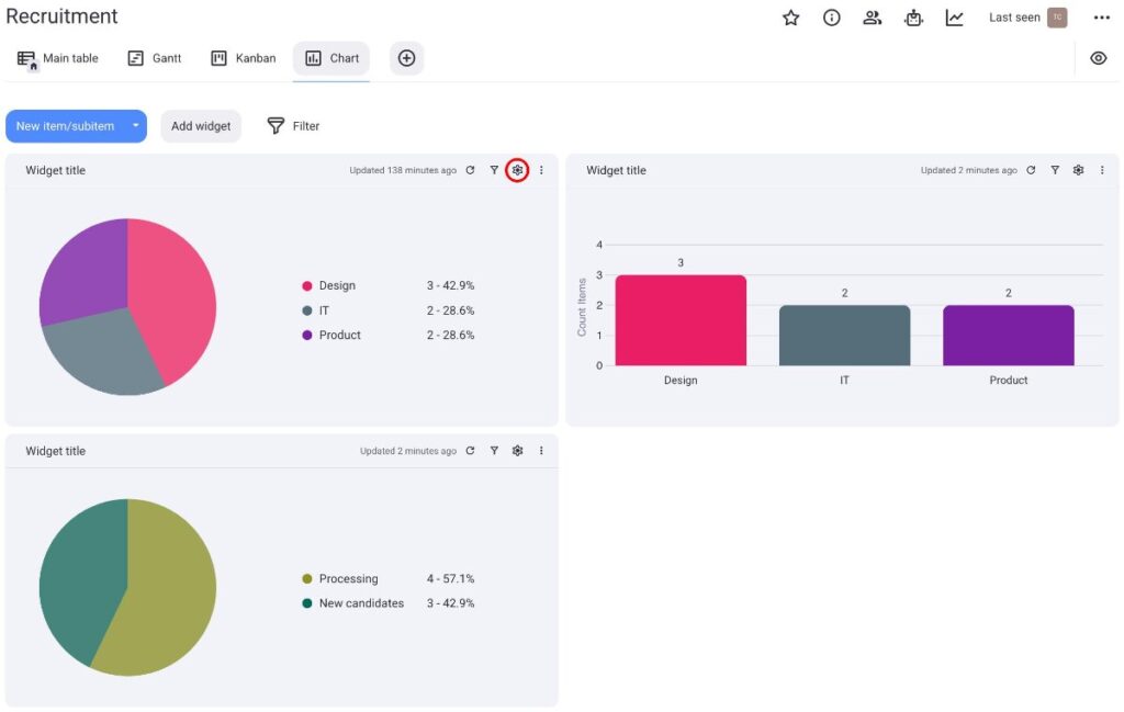
Créer plusieurs widgets de graphique#
Cette fonctionnalité est disponible uniquement avec les plans payants.
Créez plusieurs graphiques sous forme de widgets pour visualiser vos informations simultanément. Cela vous permet d'analyser vos projets plus efficacement et de les comparer selon plusieurs paramètres.
Voici comment procéder :
- Cliquez sur Ajouter widget
- Sélectionnez le graphique que vous souhaitez
Une fois le graphique créé, vous pouvez le configurer de la même manière qu'un graphique ordinaire. De plus, vous pouvez déplacer et redimensionner chaque widget selon vos besoins.
Pour modifier les paramètres du widget, cliquez sur l'icône d'engrenage située à côté.
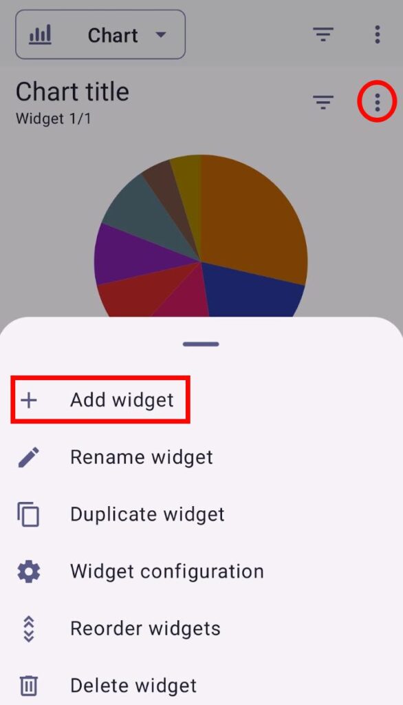
- Appuyez sur le signe + à côté du graphique
- Saisissez le titre du widget
- Sélectionnez un graphique circulaire ou à barres
- Appuyez sur ✓ pour valider
- Ouvrez la vue Graphique
- Appuyez sur les trois points situés dans le coin supérieur droit
- Appuyez sur Ajouter un widget
- Sélectionnez le nom du widget et le type de graphique
- Appuyez sur Créer pour terminer l’action
Une fois le graphique créé, vous pouvez le configurer de la même manière qu’un graphique classique. Pour modifier les paramètres du widget, cliquez sur les trois points situés dans le coin droit.
Vous pouvez passer d’un widget graphique à l’autre en balayant vers la gauche ou vers la droite.
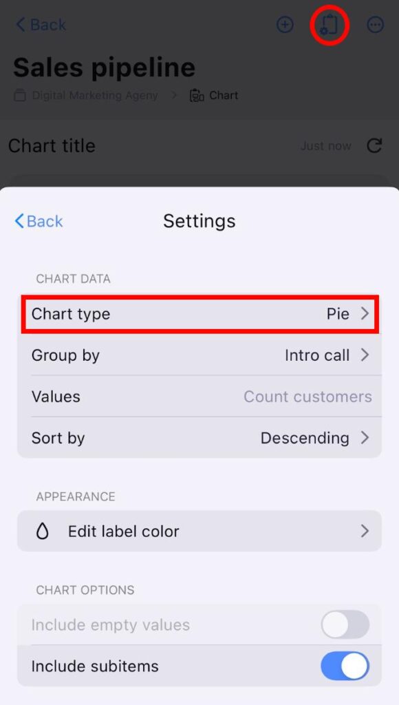
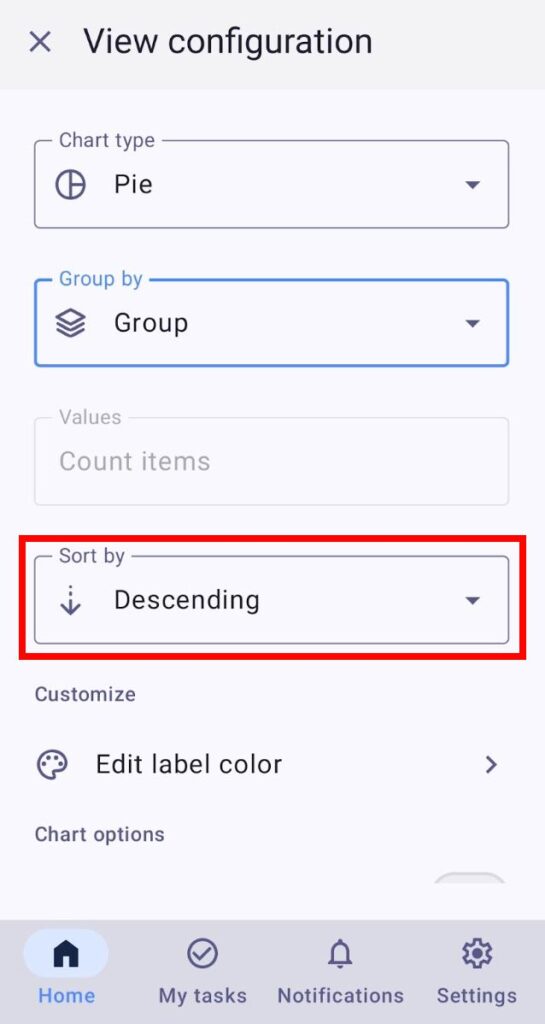
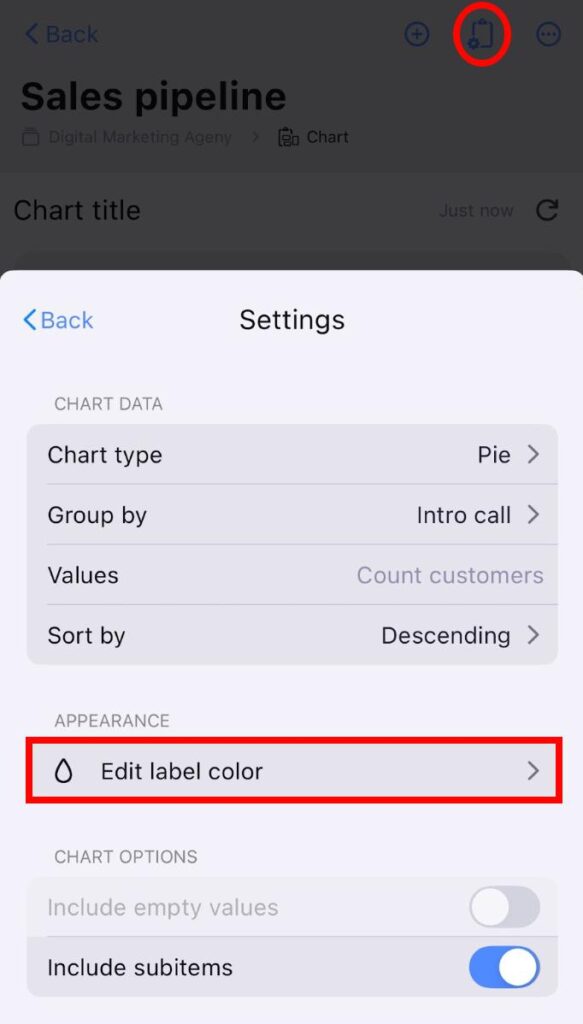
Paramètres de la vue graphique #
Vous pouvez personnaliser la vue graphique selon vos préférences en accédant au panneau Paramètres situé à droite du graphique.
Voici les paramètres personnalisables.
Type de graphique #
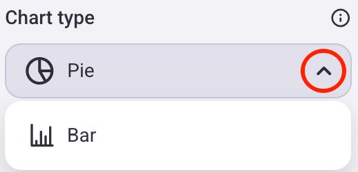
Vous pouvez modifier le type de graphique affiché à l'écran. Voici comment procéder :
- Cliquez sur l'icône d'engrenage pour ouvrir le panneau Paramètres
- Cliquez sur la flèche déroulante dans la section Type de graphique
- Sélectionnez le type de graphique
- Appuyez sur Configuration de l'affichage du tableau
- Assurez-vous que l'affichage Graphique est sélectionné
- Appuyez sur Paramètres
- Appuyez sur Type de graphique
- Sélectionnez le type de graphique souhaité
- Ouvrez l’affichage Graphique
- Appuyez sur les trois points à côté du bouton filtre
- Sélectionnez Configuration de l'affichage
- Appuyez sur la liste déroulante Type de graphique
- Sélectionnez le type de graphique

Le graphique circulaire sera le type par défaut lors de la création d'une nouvelle vue graphique.
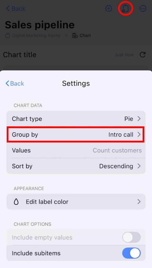
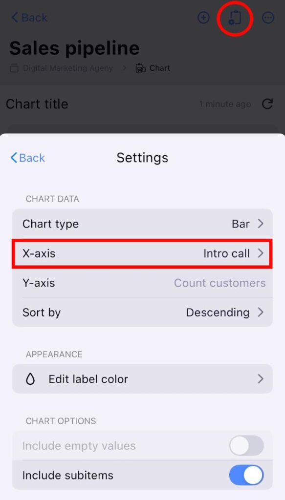
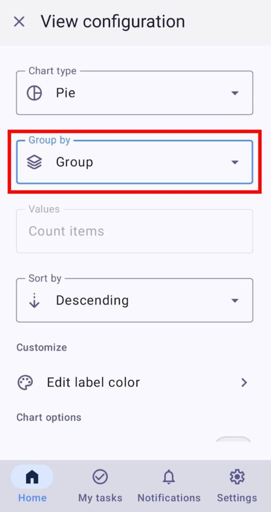
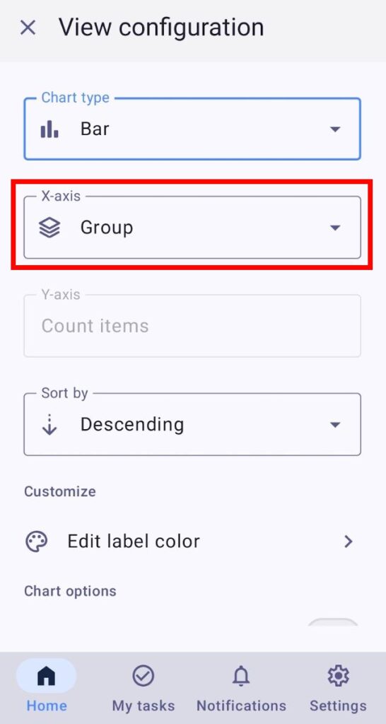
Regroupement des éléments #
Les graphiques illustrent les données en fonction du regroupement des éléments/sous-éléments. Vous pouvez les regrouper par :
- Créateur — chaque section/colonne indique le nombre d’éléments créés par une personne.
- Groupe — chaque section/colonne indique le nombre d’éléments appartenant à un groupe.
- Statut — chaque section/colonne indique le nombre d’éléments par statut.
- Personne — chaque section/colonne indique le nombre d’éléments auxquels des utilisateurs et des équipes sont affectés.
- Étiquette — chaque section/colonne indique le nombre d’éléments associés à une étiquette spécifique.
Le mode de regroupement des éléments varie selon le type de graphique sélectionné.
Voici comment procéder :
Graphique circulaire :
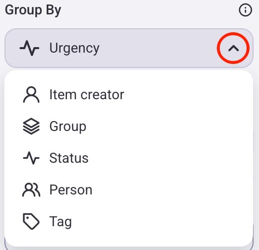
- Cliquez sur l'icône d'engrenage pour ouvrir le panneau Paramètres
- Cliquez sur la flèche déroulante sous la section Grouper par
- Choisissez le critère de regroupement des éléments
Graphique à barres :
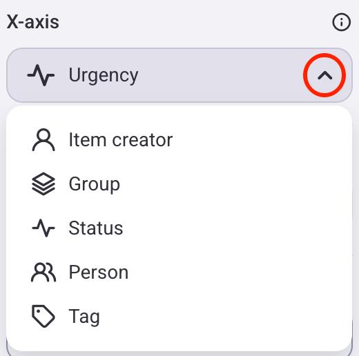
Lorsque vous passez d'un graphique circulaire à un graphique à barres, l'axe X se comporte de la même manière que le paramètre de regroupement. Par exemple, si le graphique circulaire est regroupé par statut, l'axe X du graphique à barres sera également défini sur « Statut ».
- Cliquez sur l'icône d'engrenage pour ouvrir le panneau Paramètres
- Cliquez sur la flèche déroulante sous la section Axe X
- Choisissez le critère de regroupement des éléments
Graphique circulaire :
- Appuyez sur Configuration de l'affichage du tableau
- Assurez-vous que l'affichage Graphique est sélectionné
- Appuyez sur Paramètres
- Appuyez sur Grouper par
- Choisissez le critère de regroupement des éléments
Graphique à barres :
- Appuyez sur Configuration de l'affichage du tableau
- Assurez-vous que l'affichage Graphique est sélectionné
- Appuyez sur Paramètres
- Appuyez sur Axe X
- Choisissez le critère de regroupement des éléments
Graphique circulaire :
- Ouvrez l’affichage Graphique
- Appuyez sur les trois points à côté du bouton filtre
- Sélectionnez Configuration de l'affichage
- Appuyez sur la liste déroulante Grouper par
- Choisissez le critère de regroupement des éléments
Graphique à barres :
- Ouvrez l’affichage Graphique
- Appuyez sur les trois points à côté du bouton filtre
- Sélectionnez Configuration de l'affichage
- Appuyez sur le menu déroulant Axe X
- Choisissez le critère de regroupement des éléments
Les valeurs du créateur d'éléments et du groupe sont toujours visibles, tandis que les autres valeurs doivent d'abord être créées sur le tableau avant d'être sélectionnées.
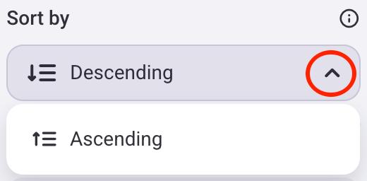
Trier par #
Vous pouvez choisir si les valeurs du graphique sont triées par ordre croissant ou décroissant. Voici comment procéder :
- Cliquez sur l'icône d'engrenage pour ouvrir le panneau Paramètres
- Cliquez sur la flèche déroulante sous la section Trier par
- Choisissez si vous souhaitez trier les éléments par ordre croissant ou décroissant
- Appuyez sur Configuration de l'affichage du tableau
- Assurez-vous que l'affichage Graphique est sélectionné
- Appuyez sur Paramètres
- Appuyez sur Trier par
- Choisissez si vous souhaitez trier les éléments par ordre croissant ou décroissant

- Ouvrez l’affichage Graphique
- Appuyez sur les trois points à côté du bouton filtre
- Sélectionnez Configuration de l'affichage
- Appuyez sur le menu déroulant Trier par
- Choisissez si vous souhaitez trier les éléments par ordre croissant ou décroissant
Modifier la couleur de l'étiquette #
Les graphiques hériteront de la couleur principale de l'étiquette lors de leur création. Voici comment la modifier :
- Cliquez sur l'icône d'engrenage pour ouvrir le panneau Paramètres
- Cliquez sur Modifier la couleur de l'étiquette
- Sélectionnez une étiquette
- Choisissez la nouvelle couleur de l'étiquette
- Appuyez sur Configuration de l'affichage du tableau
- Assurez-vous que l'affichage Graphique est sélectionné
- Appuyez sur Paramètres
- Appuyez sur Modifier la couleur de l'étiquette
- Sélectionnez une étiquette
- Choisissez la nouvelle couleur de l'étiquette
- Ouvrez l’affichage Graphique
- Appuyez sur les trois points à côté du bouton filtre
- Sélectionnez Configuration de l'affichage
- Appuyez sur Modifier la couleur de l'étiquette
- Sélectionnez l'étiquette et modifiez sa couleur
- Appuyez sur Enregistrer pour terminer l'action
Si vous modifiez la couleur d'une étiquette avec cette option, cela n'affectera que la vue Graphique.
Inclure les valeurs vides #
Vous pouvez choisir d'afficher ou de masquer les éléments sans données pertinentes dans votre graphique. Par exemple, si vous regroupez les éléments par personne, cette option créera une section distincte affichant le nombre d'éléments sans personne associée. Cela peut s'avérer utile pour mettre en évidence la proportion de tâches non attribuées dans votre projet.
Voici comment procéder :
- Cliquez sur l'icône d'engrenage pour ouvrir le panneau Paramètres
- Désactivez l'option Inclure les valeurs vides
- Appuyez sur Configuration de l'affichage du tableau
- Assurez-vous que l'affichage Graphique est sélectionné
- Appuyez sur Paramètres
- Désactivez l'option Inclure les valeurs vides
- Ouvrez l’affichage Graphique
- Appuyez sur les trois points à côté du bouton filtre
- Sélectionnez Configuration de l'affichage
- Désactivez l'option Inclure les valeurs vides
L'option Inclure les valeurs vides est désactivée par défaut.
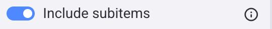
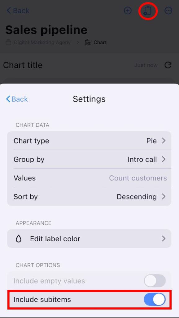
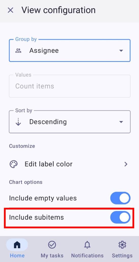
Inclure les sous-éléments #
Vous pouvez inclure des sous-éléments dans votre graphique. Ils seront comptabilisés avec les éléments principaux. Par exemple, si vous avez 2 éléments et 5 sous-éléments, la valeur totale affichée sera de 7. Cela peut s'avérer utile pour visualiser la charge de travail totale, incluant les tâches principales et leurs sous-tâches.
Voici comment inclure les sous-éléments :
- Cliquez sur l'icône d'engrenage pour ouvrir le panneau Paramètres
- Activez/désactivez l'option Inclure les sous-éléments
- Appuyez sur Configuration de l'affichage du tableau
- Assurez-vous que l'affichage Graphique est sélectionné
- Appuyez sur Paramètres
- Désactivez l'option Inclure les sous-éléments
- Ouvrez l’affichage Graphique
- Appuyez sur les trois points à côté du bouton filtre
- Sélectionnez Configuration de l'affichage
- Désactivez l'option Inclure les sous-éléments
L'option d'inclure les sous-éléments est activée par défaut.
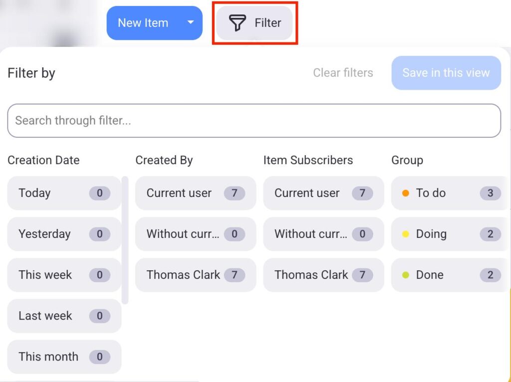
Appliquer des filtres #
Vous pouvez appliquer des Filtres de tableau et sélectionner les informations à afficher dans la vue graphique.
Pour utiliser les filtres, procédez comme suit :
- Cliquez sur le bouton Filtrer
- Choisissez les filtres que vous souhaitez appliquer au graphique
- Cliquez sur Enregistrer pour terminer l'action
- Appuyez sur Configuration de l'affichage du tableau
- Assurez-vous que l'affichage Graphique est sélectionné
- Appuyez sur Filtres
- Sélectionnez les filtres souhaités
- Appuyez sur Enregistrer pour terminer l'action
- Ouvrez l’affichage Graphique
- Appuyez sur le bouton Filtrer
- Sélectionnez les filtres
- Appuyez sur Enregistrer pour terminer l'action
Les éléments peuvent être filtrés selon plusieurs critères, tels que la date de création, le groupe d'éléments, etc.
Actualiser le graphique #
Le graphique s'actualise automatiquement toutes les 15 minutes ou lorsque vous modifiez les données du tableau (par exemple, en ajoutant un élément, en appliquant des filtres ou en modifiant les paramètres du graphique). Pour actualiser le graphique manuellement, cliquez sur le bouton d'actualisation en haut à droite ou rechargez la page.

Exporter les graphiques #
Si vous souhaitez enregistrer des graphiques ou les partager avec des personnes extérieures à votre espace de travail Plaky, vous pouvez le faire en les exportant.
Voici comment procéder :
- Cliquez sur le bouton Exporter situé à côté de l’icône Paramètres
- Choisissez un format (PDF, PNG, ZIP)
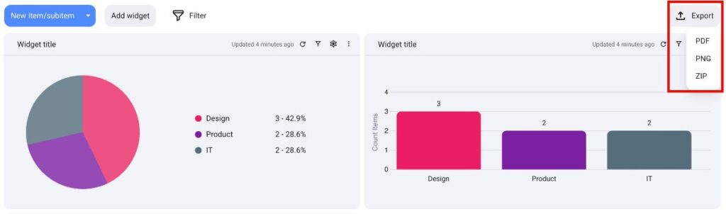
Cela téléchargera automatiquement le fichier contenant toutes les cartes sur votre appareil.
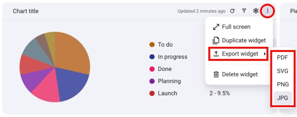
Vous pouvez également exporter les widgets de graphiques individuellement. Voici comment procéder :
- Cliquez sur les trois points situés à côté d’un widget
- Passez la souris sur Exporter le widget
- Sélectionnez le format (PDF, SVG, PNG, JPG)